Pie Charts
The Telerik UI Pie Chart TagHelper and HtmlHelper for ASP.NET Core are server-side wrappers for the Kendo UI Pie Chart widget.
Pie Charts display data as single-series sectors from a two-dimensional circle which is useful for rendering data as a part of the whole.
Getting Started
The Telerik UI Donut Chart component for ASP.NET Core is a Pie Chart variation with the same ability to display a single data series in a two-dimensional circle and is likewise useful for displaying data as a part of the whole.
To create a Pie series in the Chart component, use Pie in the Series configuration.
- Creating the Pie Chart
- Configuring the labels visibility
- Configuring the labels alignment
- Configuring the effects overlay
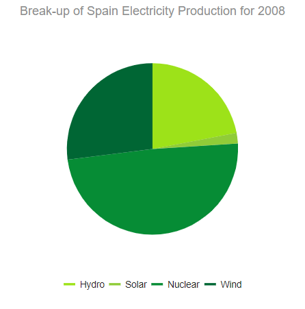
Creating the Pie Chart
The following example demonstrates how to define a single series of type "pie". Additional series are not supported and each data point is an object that specifies the point value, category label, and other properties.
@(Html.Kendo().Chart()
.Name("chart")
.Title("Break-up of Spain Electricity Production for 2008")
.Legend(legend => legend
.Position(ChartLegendPosition.Bottom)
)
.SeriesColors(new string[] { "#03a9f4", "#ff9800", "#fad84a", "#4caf50" })
.Series(series =>
{
series.Pie(new dynamic[] {
new {category="Hydro",value=22,color="#9de219"},
new {category="Solar",value=2,color="#90cc38"},
new {category="Nuclear",value=49,color="#068c35"},
new {category="Wind",value=27,color="#006634"}})
.Overlay(o => o.Gradient(ChartSeriesGradient.RoundedBevel));
})
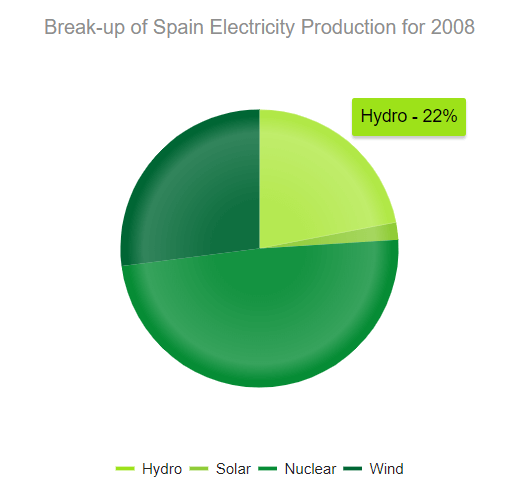
.Tooltip(tooltip => tooltip.
Template("${ category } - ${ value }%").Visible(true)
)
)
    <kendo-chart name="chart" series-colors='new string[] { "#03a9f4", "#ff9800", "#fad84a", "#4caf50" }'>
        <chart-title text="Break-up of Spain Electricity Production for 2008"></chart-title>
        <chart-legend position="ChartLegendPosition.Bottom"></chart-legend>
        <series-defaults type="ChartSeriesType.Pie"></series-defaults>
        <series>
            <series-item data='new dynamic[] {
                        new {category="Hydro",value=22,color="#9de219"},
                        new {category="Solar",value=2,color="#90cc38"},
                        new {category="Nuclear",value=49,color="#068c35"},
                        new {category="Wind",value=27,color="#006634"}}'>
                <overlay gradient="ChartSeriesGradient.RoundedBevel" />
            </series-item>
        </series>
        <tooltip visible="true" template="${ category } - ${ value }%"></tooltip>
    </kendo-chart>
Configuring the Labels Visibility
The Telerik UI for ASP.NET Core Pie Chart enables you to show or hide labels through the Visible() configuration method for the given series.
    .Series(series =>
    {
        series.Pie(new dynamic[] {})
            .Labels(labels => labels
                .Visible(true)
            );
    })
    <series>
        <series-item data='new dynamic[] {}'>
            <labels visible="true"></labels>
        </series-item>
    </series>
Configuring the Labels Alignment
The Telerik UI for ASP.NET Core Pie Chart allows you to configure the label alignment for the series through the Align() configuration method.
    .Series(series =>
    {
        series.Pie(new dynamic[] {})
            .Labels(labels => labels
                .Align(ChartSeriesLabelsAlign.Circle)
            );
    })
    <series>
        <series-item data='new dynamic[] {}'>
            <labels align="ChartSeriesLabelsAlign.Circle"></labels>
        </series-item>
    </series>
The Pie Chart support two modes of label alignment:
-
Circle(default)—The labels are positioned in a circle around the Chart.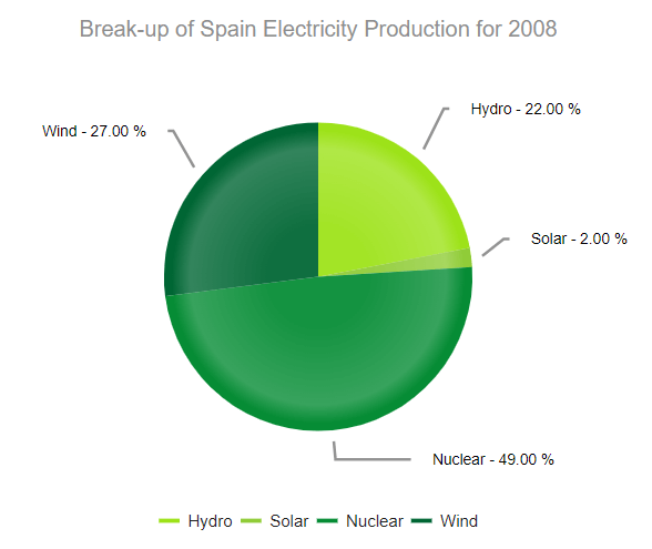
-
Column—The labels are positioned in columns to the left and right of the Chart.
Configuring the Effects Overlay
Each segment has a transparent effect overlay that adds depth to the two-dimensional shape. The overlay transparent gradient is configurable.
    .Series(series =>
    {
       series.Pie(new dynamic[] {})
       .Overlay(o => o.Gradient(ChartSeriesGradient.None));
    })
    <series>
        <series-item data='new dynamic[] {}'>
            <overlay gradient="ChartSeriesGradient.None" />
        </series-item>
    </series>
The Pie Chart supports the following ChartSeriesGradient options:
-
(Default)
RoundedBevel -
SharpBevel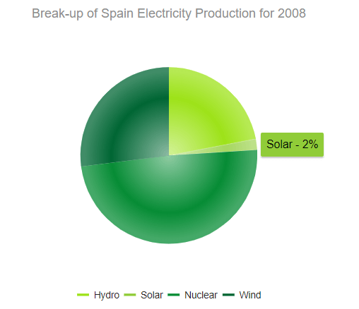
-
None