Bar Charts
The Telerik UI Bar Chart TagHelper and HtmlHelper for ASP.NET Core are server-side wrappers for the Kendo UI Bar Chart widget.
Bar Charts display data through horizontal or vertical bars whose lengths vary according to their value.
Getting Started
Bar Charts are suitable for displaying a comparison between sets of data—for example, a summary of unique and total site visitors over a certain period of time.
The Telerik UI Bullet Chart component for ASP.NET Core is a variation of a Telerik UI Bar Chart. You can use it as a replacement for dashboard gauges and meters. The bullet graph compares a given quantitative measure, such as temperature, against qualitative ranges, such as warm, hot, mild, cool, chilly, cold, and so on, and a symbol marker that encodes the comparative measure, such as the max temperature a year ago.
The Telerik UI Range Bar Chart component for ASP.NET Core is yet another variation of the Telerik UI Bar Chart. It displays data as bars where each bar represents a value range that spans between its minimum and maximum levels. A Range Bar type has floating bars unlike the standard Telerik UI Bar Chart that has bars that are anchored to its x-axis.
To create a Bar series in the Chart component, use Column or Bar in the Series configuration.
Defining the Column Chart
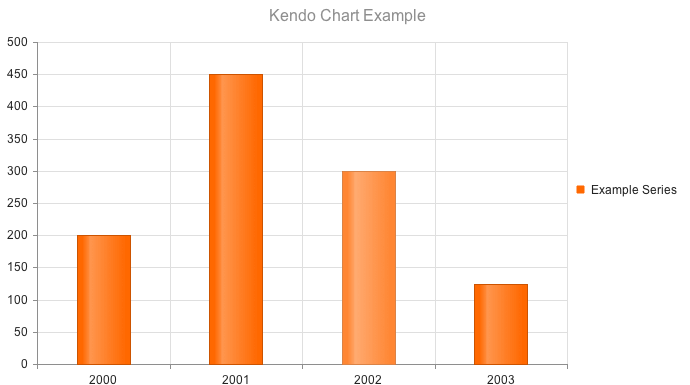
The Telerik UI Column Chart for ASP.NET Core is rendered when the Series is Column.
    @(Html.Kendo().Chart()
        .Name("chart")
        .Title("Kendo Chart Example")
        .Legend(legend => legend
            .Position(ChartLegendPosition.Bottom)
        )
        .Series(series =>
        {
            series.Column(new double[] { 200, 450, 300, 125 }).Name("Example Series");
        })
        .CategoryAxis(axis => axis
                .Categories(new string[] { "2000", "2001", "2002", "2003" })

        )
    )
    @addTagHelper *, Kendo.Mvc
    @{
        var categories = new string[] { "2000", "2001", "2002", "2003" };
    }
    <kendo-chart name="chart">
        <category-axis>
            <category-axis-item categories="categories">
            </category-axis-item>
        </category-axis>
        <series>
            <series-item type="ChartSeriesType.Column"
                        name="Example Series"
                        data="new double[] { 200, 450, 300, 125 }">
            </series-item>
        </series>
        <chart-legend position="ChartLegendPosition.Bottom">
        </chart-legend>
        <chart-title text="Kendo Chart Example">
        </chart-title>
    </kendo-chart>
Defining the Bar Chart
Setting the Series object to "Bar" renders horizontal bars.
    @(Html.Kendo().Chart()
       .Name("chart")
       .Title("Kendo Chart Example")
       .Legend(legend => legend
           .Position(ChartLegendPosition.Bottom)
       )
       .Series(series =>
       {
           series.Bar(new double[] { 200, 450, 300, 125 }).Name("Example Series");
       })
       .CategoryAxis(axis => axis
                .Categories(new string[] { "2000", "2001", "2002", "2003" })
       )
    )
    @addTagHelper *, Kendo.Mvc
    @{
        var categories = new string[] { "2000", "2001", "2002", "2003" };
    }
    <kendo-chart name="chart">
        <category-axis>
            <category-axis-item categories="categories">
            </category-axis-item>
        </category-axis>
        <series>
            <series-item type="ChartSeriesType.Bar"
                        name="Example Series"
                        data="new double[] { 200, 450, 300, 125 }">
            </series-item>
        </series>
        <chart-legend position="ChartLegendPosition.Bottom">
        </chart-legend>
        <chart-title text="Kendo Chart Example">
        </chart-title>
    </kendo-chart>
