Heatmap
Heatmaps use colors to indicate the relative value of data points in two dimensions.
Heatmap, also known as "cluster heat map", are suitable for visualizing the magnitude of a value over two dimensions. The X and Y values are discrete and can be set in any order.
Getting Started
Each data point of a Heatmap is an array that contains X category, Y category and value values.
Creating the Heatmap
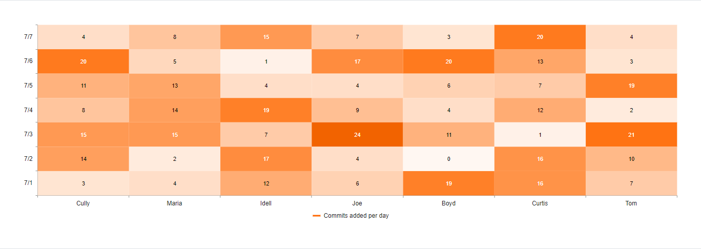
The following example demonstrates how to configure a basic Heatmap.
$("#heatmap").kendoChart({
    series: [{
        name: "Number of commits per day",
        type: 'heatmap',
        data: [
            ['Cully', new Date(2021, 7, 7), 4],['Cully', new Date(2021, 7, 6), 20],['Cully', new Date(2021, 7, 5), 11],['Cully', new Date(2021, 7, 4), 8],['Cully', new Date(2021, 7, 3), 15],['Cully', new Date(2021, 7, 2), 14],['Cully', new Date(2021, 7, 1), 3],
            ['Maria', new Date(2021, 7, 7), 8],['Maria', new Date(2021, 7, 6), 5],['Maria', new Date(2021, 7, 5), 13],['Maria', new Date(2021, 7, 4), 14],['Maria', new Date(2021, 7, 3), 15],['Maria', new Date(2021, 7, 2), 2],['Maria', new Date(2021, 7, 1), 4],
            ['Idell', new Date(2021, 7, 7), 15],['Idell', new Date(2021, 7, 6), 1],['Idell', new Date(2021, 7, 5), 4],['Idell', new Date(2021, 7, 4), 19],['Idell', new Date(2021, 7, 3), 7],['Idell', new Date(2021, 7, 2), 17],['Idell', new Date(2021, 7, 1), 12],
            ['Joe', new Date(2021, 7, 7), 7],['Joe', new Date(2021, 7, 6), 17],['Joe', new Date(2021, 7, 5), 4],['Joe', new Date(2021, 7, 4), 9],['Joe', new Date(2021, 7, 3), 24],['Joe', new Date(2021, 7, 2), 4],['Joe', new Date(2021, 7, 1), 6],
            ['Boyd', new Date(2021, 7, 7), 3],['Boyd', new Date(2021, 7, 6), 20],['Boyd', new Date(2021, 7, 5), 6],['Boyd', new Date(2021, 7, 4), 4],['Boyd', new Date(2021, 7, 3), 11],['Boyd', new Date(2021, 7, 2), 0],['Boyd', new Date(2021, 7, 1), 19],
            ['Curtis', new Date(2021, 7, 7), 20],['Curtis', new Date(2021, 7, 6), 13],['Curtis', new Date(2021, 7, 5), 7],['Curtis', new Date(2021, 7, 4), 12],['Curtis', new Date(2021, 7, 3), 1],['Curtis', new Date(2021, 7, 2), 16],['Curtis', new Date(2021, 7, 1), 16],
            ['Tom', new Date(2021, 7, 7), 4],['Tom', new Date(2021, 7, 6), 3],['Tom', new Date(2021, 7, 5), 19],['Tom', new Date(2021, 7, 4), 2],['Tom', new Date(2021, 7, 3), 21],['Tom', new Date(2021, 7, 2), 10],['Tom', new Date(2021, 7, 1), 7]
        ]
    }],
    legend: {
        position: "bottom"
    },
    xAxis: {
        categories: ['Cully', 'Maria', 'Idell', 'Joe', 'Boyd', 'Curtis', 'Tom'],
        labels: {
            rotation: 'auto'
        },
    },
    yAxis: {
        categories: [new Date(2021, 7, 1),
            new Date(2021, 7, 2),
            new Date(2021, 7, 3),
            new Date(2021, 7, 4),
            new Date(2021, 7, 5),
            new Date(2021, 7, 6),
            new Date(2021, 7, 7)]
    }
});
The following image shows a sample Heatmap.
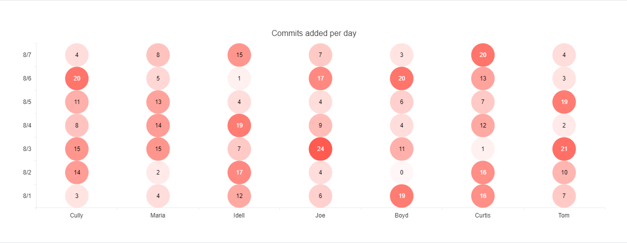
Setting the Marker Type
The default marker type of a Heatmap is rect. You can change this value by using the markers option.
series: [{
    type: 'heatmap',
    markers: {
        type: "circle"
    }
}]
The available built-in options are:
-
rect—The markers appear as rectangles. -
roundedRect—The markers appear as rounded rectangles with a configurable border radius. -
circle—The markers appear as circles. -
triangle—The markers appear as triangles.
For a runnable example on the markers configuration, visit the demo page for the Heatmap Markers.
The following image shows a sample Heatmap with circular markers.