Templates Structure
Using Implicit styles gives you the ability to easily extract and edit the default ControlTemplates of the controls. You can follow this documentation article on how to extract the ControlTemplates.
Like most WPF controls, RadWizard also allows you to template it in order to change the control from the inside. Except for templating the whole control, you can also template particular parts of it. This topic will make you familiar with the template structures of:
RadWizard
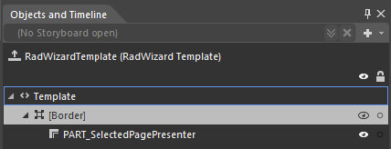
Border - represents the border and the background of RadWizard and is of type Border.
PART_SelectedPagePresenter - hosts the selected page and is of type ContentPresenter.
RadWizardPage
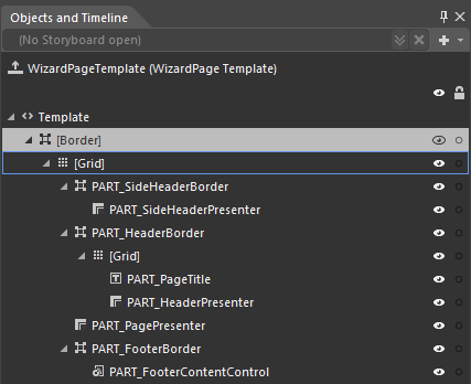
Border - represents the border and the background of WizardPage and is of type Border.
Grid - hosts the elements of the template and is of type Grid.
PART_SideHeaderBorder - represents the border of WizardPage’s SideHeader and is of type Border.
PART_SideHeaderPresenter – displays the content of WizardPage’s SideHeader and is of type ContentPresenter.
PART_HeaderBorder - represents the border of WizardPage’s Header and is of type Border.
Grid - hosts the elements of the header and is of type Grid.
PART_PageTitle – displays the title of a WizardPage and is of type TextBlock.
PART_HeaderPresenter – displays the content of WizardPage’s Header and is of type ContentPresenter.
PART_PagePresenter – displays the content of a WizardPage and is of type ContentPresenter.
PART_FooterBorder - represents the border and the background of WizardPage’s Footer and is of type Border.
PART_FooterContentControl - displays the footer of WizardPage and is of type ContentPresenter.