Change the predefined scroll buttons
RadCarousel does provide a built-in scroll bar that enables you to move the items left, right or directly to the last or first page. However, if the default view does not meet your requirements, you may easily predefine them and change their style. Basically, you need to take a couple of steps:
Set the HorizontalScrollBarVisibility property of RadCarousel to "Hidden";
Define the required CarouselScrollButtons and handle their Click events;
Specify the ResourceDictionary so that the Theme is applied correctly.
Finally, the implementation should be as follows:
<Grid.Resources>
  <ResourceDictionary>
    <ResourceDictionary.MergedDictionaries>
      <ResourceDictionary Source="/Telerik.Windows.Controls.Navigation;component/Themes/GenericOfficeBlack.xaml"/>
    </ResourceDictionary.MergedDictionaries>
  </ResourceDictionary>
</Grid.Resources>
<Grid Background="Black">
  <Grid.RowDefinitions>
    <RowDefinition />
    <RowDefinition Height="30"/>
  </Grid.RowDefinitions>
  <telerik:RadCarousel x:Name="RadCarousel1" HorizontalScrollBarVisibility="Hidden" Background="Black"
     Grid.Row="0"/>
  <StackPanel Grid.Row="1" Orientation="Horizontal" HorizontalAlignment="Center">
    <telerik:CarouselScrollButton x:Name="pageDownButton"  CarouselScrollButtonType="PageLeft" Click="pageDownButton_Click"  Style="{StaticResource CarouselScrollButtonStyle}"/>
    <telerik:CarouselScrollButton x:Name="pageLeftButton" CarouselScrollButtonType="LineUp"
              Click="pageLeftButton_Click"  Style="{StaticResource CarouselScrollButtonStyle}"/>
    <telerik:CarouselScrollButton x:Name="pageRightButton" CarouselScrollButtonType="LineDown"
              Click="pageRightButton_Click"  Style="{StaticResource CarouselScrollButtonStyle}"/>
    <telerik:CarouselScrollButton x:Name="pageUpButton" CarouselScrollButtonType="PageRight"
       Click="pageUpButton_Click"  Style="{StaticResource CarouselScrollButtonStyle}"/>
  </StackPanel>
</Grid>
private void pageDownButton_Click(object sender, RoutedEventArgs e)
{
    this.RadCarousel1.FindCarouselPanel().PageDown();
}
private void pageLeftButton_Click(object sender, RoutedEventArgs e)
{
    this.RadCarousel1.FindCarouselPanel().MoveBy(-1);
}
private void pageRightButton_Click(object sender, RoutedEventArgs e)
{
    this.RadCarousel1.FindCarouselPanel().MoveBy(1);
}
private void pageUpButton_Click(object sender, RoutedEventArgs e)
{
    this.RadCarousel1.FindCarouselPanel().PageUp();
}
Private Sub pageDownButton_Click(sender As Object, e As RoutedEventArgs)
    Me.RadCarousel1.FindCarouselPanel().PageDown()
End Sub

Private Sub pageLeftButton_Click(sender As Object, e As RoutedEventArgs)
    Me.RadCarousel1.FindCarouselPanel().MoveBy(-1)
End Sub

Private Sub pageRightButton_Click(sender As Object, e As RoutedEventArgs)
    Me.RadCarousel1.FindCarouselPanel().MoveBy(1)
End Sub

Private Sub pageUpButton_Click(sender As Object, e As RoutedEventArgs)
    Me.RadCarousel1.FindCarouselPanel().PageUp()
End Sub
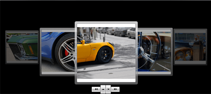
Once you are done, the RadCarousel should be visualized as the image below:
Still, you are free to change the style of the buttons just as you want them to be.