Timeline View
RadScheduler's Timeline view allows you to display appointments in horizontally arranged time slots. Consequently, time slots can be configured by duration and the time scale can be set for minutes to years. User capabilities include creating, adding, and modifying appointments at run-time, appointment and cell selection, resizing, drag and drop, keyboard navigation, a customizable timeline context menu and resource grouping support. To move to the next day or previous month, you can use the back and forward keyboard arrows, or the SchedulerNavigator control.
Structure of Timeline View
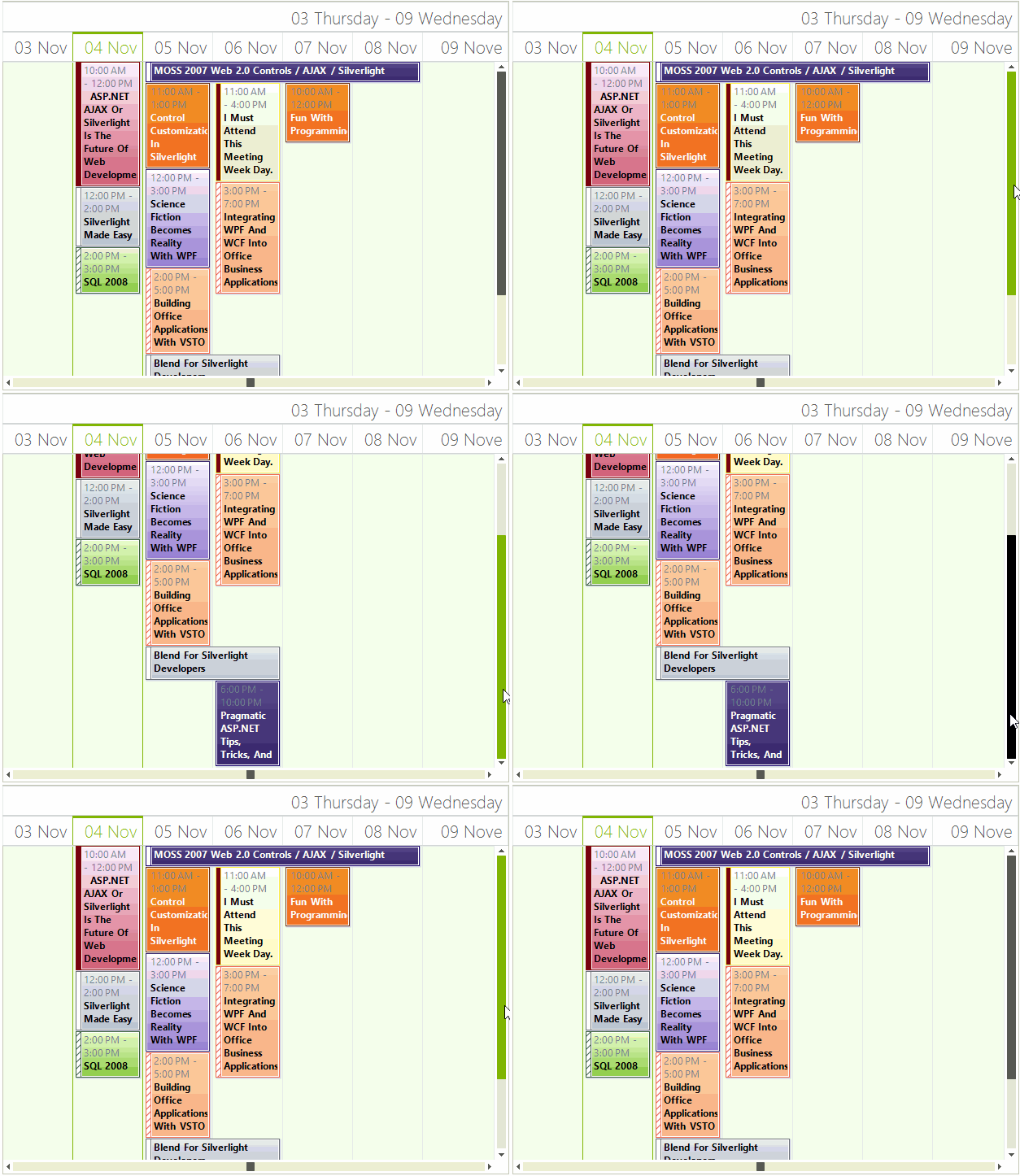
The Timeline View of the scheduler simply has a Header, Columns for every hour/day/week/month and zero or more Appointment Cells.
Figure 1: RadScheduler in Timeline View

Set The Timeline View
The Timeline View can be set it to be the default view which the user sees:
ActiveViewType Timeline
this.radScheduler1.ActiveViewType = Telerik.WinControls.UI.SchedulerViewType.Timeline;
Me.RadScheduler1.ActiveViewType = Telerik.WinControls.UI.SchedulerViewType.Timeline
Get The Timeline View
To get the instance to the scheduler timeline view from the RadScheduler object, either:
- the GetTimelineView method:
GetTimelineView Method
SchedulerTimelineView timelineView = this.radScheduler1.GetTimelineView();
Dim timelineView As SchedulerTimelineView = Me.RadScheduler1.GetTimelineView()
This method returns null if the active view of the scheduler is not SchedulerTimelineView.
- use the the RadScheduler ActiveView property:
ActiveView Property
if (this.radScheduler1.ActiveViewType == SchedulerViewType.Timeline)
{
    SchedulerTimelineView activeTimelineView = (SchedulerTimelineView)this.radScheduler1.ActiveView;
}
If Me.RadScheduler1.ActiveViewType = SchedulerViewType.Timeline Then
    Dim activeTimelineView As SchedulerTimelineView = CType(Me.RadScheduler1.ActiveView, SchedulerTimelineView)
End If
Setting The Time Range and First Date
The time range that the timeline shows can be set with the RangeStartDate and RangeEndDate properties, where RangeEndDate must be bigger than RangeStartDate. The scheduler will not be able to navigate outside this range.
Timeline View Range
The StartDate property sets the first date that is shown in the timeline RangeStartDate and RangeEndDate.
this.radScheduler1.GetTimelineView().RangeStartDate = new DateTime(2010, 1, 20);
this.radScheduler1.GetTimelineView().RangeEndDate = new DateTime(2010, 2, 20);
this.radScheduler1.GetTimelineView().StartDate = new DateTime(2010, 2, 1);
Me.RadScheduler1.GetTimelineView().RangeStartDate = New Date(2010, 1, 20)
Me.RadScheduler1.GetTimelineView().RangeEndDate = New Date(2010, 2, 20)
Me.RadScheduler1.GetTimelineView().StartDate = New Date(2010, 2, 1)
To get the duration between RangeStartDate and RangeEndDate you can use the duration property:
Timeline View Duration
TimeSpan duration = timelineView.Duration;
Dim duration As TimeSpan = timelineView.Duration
Setting The Default Time Scale
The default time scale can be set to any of the predefined values, or the user can select a new scale by simply right-clicking in the time table and selecting the preferable setting from the context menu.
- Year
- Month
- Week
- Day: Тhis is the default value
- Hour
- 15 minutes
To change the time scaling to Hours, for example, you need to use the ShowTimescale method:
Set Time Scale
Timescales scale = Timescales.Hours;
timelineView.ShowTimescale(scale);
Dim scale As Timescales = Timescales.Hours
timelineView.ShowTimescale(scale)
Getting The Scale
To get the currently selected scale, use the GetScaling method. After this you can modify properties of the current scale such as the Format property, which specifies the date-time format of the header cells, and the DisplayedCellsCount property, which specifies the number of cells to be displayed in the view.
Current Scaling
SchedulerTimescale currentScaling = timelineView.GetScaling();
currentScaling.Format = "dd MMM";
currentScaling.DisplayedCellsCount = 8;
Dim currentScaling As SchedulerTimescale = timelineView.GetScaling()
currentScaling.Format = "dd MMM"
currentScaling.DisplayedCellsCount = 8
Navigation and Scrolling
In TimelineView there are two scrollbars which stand for navigation between dates and scrolling through appointments. The horizontal one allows you to scroll fast through the dates in the range specified by the RangeStartDate and RangeEndDate properties. The vertical one appears when there is a cell which contains more appointments than it can fit. This scrollbar allows you to scroll the presenter area so you can view the appointments. You can show or hide any of these scrollbars by using the following properties.
Navigation Element
timelineView.ShowNavigationElement = false;
timelineView.ShowVerticalScrollBar = false;
timelineView.ShowNavigationElement = False
timelineView.ShowVerticalScrollBar = False
Modifying The Size of The Columns
The SchedulerTimelineViewElement allows you to specify different size for the different columns. To manipulate the size of the columns, you can use the SetColumnWidth and GetColumnWidth methods. The values passed to the SetColumnWidth method are proportional and the actual width of the columns is calculated based on them. By default all columns have a value of 1 and therefore if you set a value of 2 to any column, it will stay twice as bigger compared to the others.
Resizing Columns
SchedulerTimelineViewElement viewElement = (SchedulerTimelineViewElement)this.radScheduler1.ViewElement;
viewElement.SetColumnWidth(1, 2);
Dim viewElement As SchedulerTimelineViewElement = CType(RadScheduler1.ViewElement, SchedulerTimelineViewElement)
viewElement.SetColumnWidth(1, 2)
Modifying The Size of The Headers
TimelineView contains two header rows. The first one displays the date range of the view that is currently displayed. The second one holds the header cells for each column and each of them displays the date that corresponds to this column. You can modify the height of both of these headers by using the following properties of the SchedulerTimelineViewElement.
Headers Size
viewElement.ColumnHeaderHeight = 70;
viewElement.ViewHeaderHeight = 35;
viewElement.ColumnHeaderHeight = 70
viewElement.ViewHeaderHeight = 35
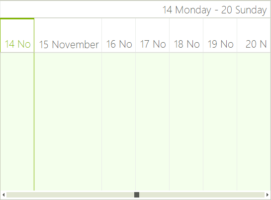
The following picture demonstrates the result of setting the header sizes and resizing the column with index 1.
Figure 2: Headers Size
