Legend
RadChartView has built-in support for legends – descriptions about the charts on the plot. The items displayed in the legend are series specific i.e. for the pie chart the data points are shown in the legend, whereas for line series only one item is shown for each series.
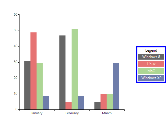
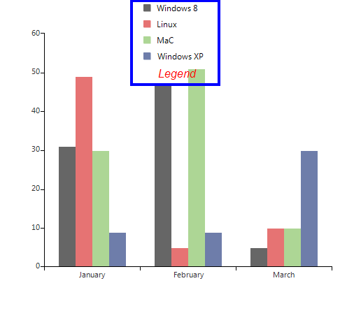
Show Legend
The ShowLegend property of RadChartView controls whether the legend is visible or not. The default value is false. The legend supports showing a legend title, which text can be set via the LegendTitle property.
Show Legend
this.radChartView1.ShowLegend = true;
this.radChartView1.LegendTitle = "Legend";
Me.RadChartView1.ShowLegend = True
Me.RadChartView1.LegendTitle = "Legend"
Figure 1: Show Legend
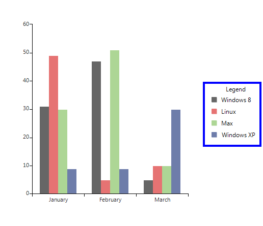
Customize legend
The location of the title can be modified by the TitlePosition property. Additional modification of the title can be introduced by using the TitleElement:
Legend Settings
this.radChartView1.ChartElement.LegendElement.TitlePosition = TitlePosition.Bottom;
this.radChartView1.ChartElement.LegendElement.TitleElement.Font = new Font("Arial", 12, FontStyle.Italic);
this.radChartView1.ChartElement.LegendElement.TitleElement.ForeColor = Color.Red;
Me.RadChartView1.ChartElement.LegendElement.TitlePosition = TitlePosition.Bottom
Me.RadChartView1.ChartElement.LegendElement.TitleElement.Font = New Drawing.Font("Arial", 12, Drawing.FontStyle.Italic)
Me.RadChartView1.ChartElement.LegendElement.TitleElement.ForeColor = Drawing.Color.Red
Figure 2: Legend Settings
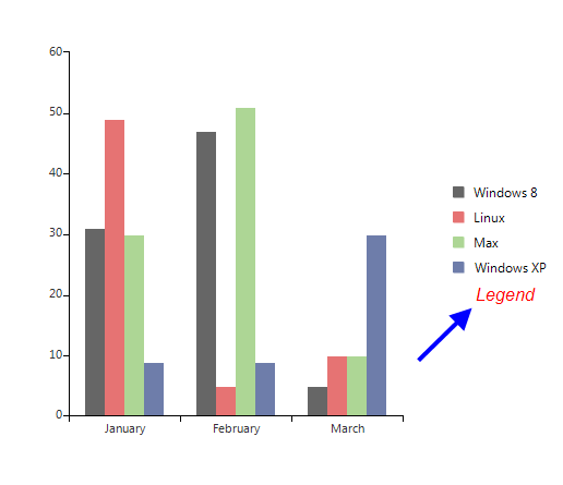
You can dock the legend to each of the four sides of the control by setting the LegendPosition property.
Legend Position
this.radChartView1.ChartElement.LegendPosition = LegendPosition.Bottom;
Me.RadChartView1.ChartElement.LegendPosition = LegendPosition.Bottom
Figure 3: Legend Position
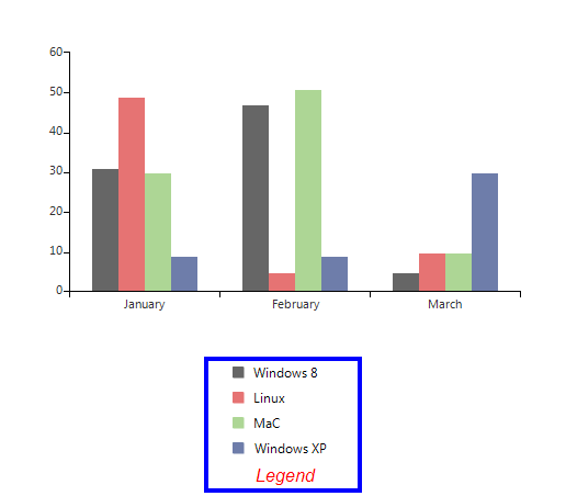
Alternatively, you can set it to float over the chart view. Here is how to set the legend to stay at position 200 , 0 over the chart area.
The LegendOffset property is only taken into consideration when the LegendPosition is set to “Float”.
Float Legend
this.radChartView1.ChartElement.LegendPosition = LegendPosition.Float;
this.radChartView1.ChartElement.LegendOffset = new Point(200, 0);
Me.RadChartView1.ChartElement.LegendPosition = LegendPosition.Float
Me.RadChartView1.ChartElement.LegendOffset = New Point(200, 0)
Figure 4: Float Legend
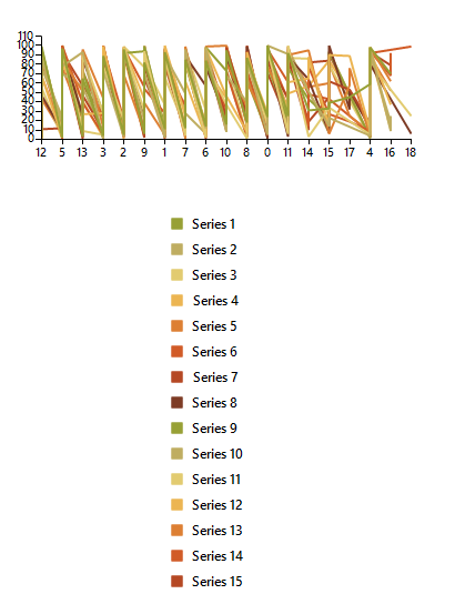
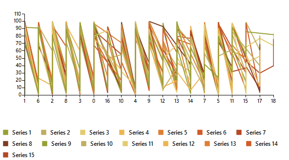
As of R3 2022 SP2 RadChartView supports wrapping for its legend items. It is controlled by the ChartElement.LegendItemsLayout property. The available options are: Stack - the items are positioned in rows or columns(horizontally or vertically) and if necessary a scrollbar is shown. Wrap - the items are positioned in rows or columns, based on the orientation property. When the space is filled, the container automatically wraps items onto a new row or column.
Wrap Legend Items
this.radChartView1.ChartElement.LegendItemsLayout = LegendItemsLayout.Wrap;
this.radChartView1.ChartElement.LegendElement.WrapPanelElement.Orientation = System.Windows.Forms.Orientation.Horizontal;
Me.RadChartView1.ChartElement.LegendItemsLayout = LegendItemsLayout.Wrap
Me.RadChartView1.ChartElement.LegendElement.WrapPanelElement.Orientation = System.Windows.Forms.Orientation.Horizontal
| LegendItemsLayout.Stack | LegendItemsLayout.Wrap |
|---|---|
 |
 |
Setup LegendItem
The elements that provide legend items in the case of the Pie chart are the individual data points. In all other cases it is the series that provide legend items. You can set two properties to each provider which controls their representation in the legend. These two properties are IsVisibleInLegend and LegendTitle.
Legend Properties
LineSeries line = new LineSeries();
line.IsVisibleInLegend = true;
line.LegendTitle = "Windows 8";
Dim line As New LineSeries()
line.IsVisibleInLegend = True
line.LegendTitle = "Windows 8"
Figure 5: Legend Properties
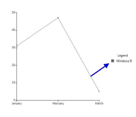
Modify LegendItem title
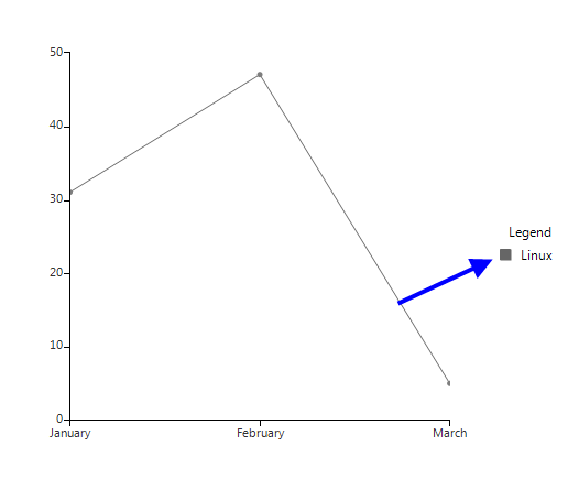
You have access to the items displayed in the legend through the Items property of the chart legend. This collection gives you access to the actual legend items that the provider creates. This means that if you change the text in the legend item, the text in the provider (data point or series), will also change. Let’s say you have added the line series from the previous example to the chart and you change the title of the legend item through the legend’s Items collection with the following code, this will actually change the value in the series legend item:
Change Text
this.radChartView1.ChartElement.LegendElement.Items[0].Title = "Linux";
Me.RadChartView1.ChartElement.LegendElement.Items(0).Title = "Linux"
Figure 6: Changed Text
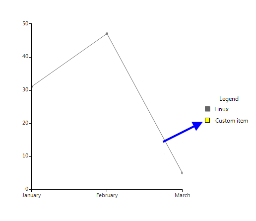
Add/Remove LegendItems
You can add and remove items from the legend through the Items collection. You have to create a new instance of LegendItem which you will add to the Items collection. You can set the desired style of the marker through the Element property of the LegendItem.
Add and Remove Legends
LegendItem item = new LegendItem();
item.Element.BorderColor = Color.Black;
item.Element.BackColor = Color.Yellow;
item.Title = "Custom item";
this.radChartView1.ChartElement.LegendElement.Items.Add(item);
Dim item As New LegendItem()
item.Element.BorderColor = Color.Black
item.Element.BackColor = Color.Yellow
item.Title = "Custom item"
Me.RadChartView1.ChartElement.LegendElement.Items.Add(item)
Figure 7: Added Item
Custom Legend Item
You can use your own legend item elements by handling the VisualItemCreating event of the legend. This allows you to change the way legend items are represented in the legend:
Add a Custom Legend Item
this.radChartView1.ChartElement.LegendElement.VisualItemCreating +=new LegendItemElementCreatingEventHandler(LegendElement_VisualItemCreating);
AddHandler Me.RadChartView1.ChartElement.LegendElement.VisualItemCreating, AddressOf LegendElement_VisualItemCreating
Custom LegendItemElement Implementation:
public class CustomLegendItemElement : LegendItemElement
{
    public CustomLegendItemElement(LegendItem item)
        : base(item)
    {
        this.Children.Remove(this.MarkerElement);
        this.TitleElement.DrawFill = true;
        this.TitleElement.DrawBorder = true;
        this.StretchHorizontally = true;
    }
    protected override void Synchronize()
    {
        base.Synchronize();
        this.SyncVisualStyleProperties(this.LegendItem.Element, this.TitleElement);
        this.TitleElement.ForeColor = Color.White;
    }
}
private void LegendElement_VisualItemCreating(object sender, LegendItemElementCreatingEventArgs e)
{
    e.ItemElement = new CustomLegendItemElement(e.LegendItem);
}
Public Class CustomLegendItemElement
    Inherits LegendItemElement
    Public Sub New(item As LegendItem)
        MyBase.New(item)
        Me.Children.Remove(Me.MarkerElement)
        Me.TitleElement.DrawFill = True
        Me.TitleElement.DrawBorder = True
        Me.StretchHorizontally = True
    End Sub
    Protected Overrides Sub Synchronize()
        MyBase.Synchronize()
        Me.SyncVisualStyleProperties(Me.LegendItem.Element, Me.TitleElement)
        Me.TitleElement.ForeColor = Color.White
    End Sub
End Class
Private Sub LegendElement_VisualItemCreating(sender As Object, e As LegendItemElementCreatingEventArgs)
    e.ItemElement = New CustomLegendItemElement(e.LegendItem)
End Sub
Figure 8: Custom Legend Item