Getting Started Overview
This tutorial will walk you through creating a Web page that uses RadCalendar controls. It shows how to:
Use a RadDateTimePicker control
Apply skins to change the overall look and feel of the control
Apply styles to tweak the appearance of the control
Configure the selection and navigation behavior of the RadDateTimePicker control
Add messages to appear when nothing is entered in the RadDateTimePicker
Specify formats for display and editing.
Adding a RadDateTimePicker control
Drag a RadDateTimePicker control from the toolbox onto your Web Page, below the RadDatePicker control.
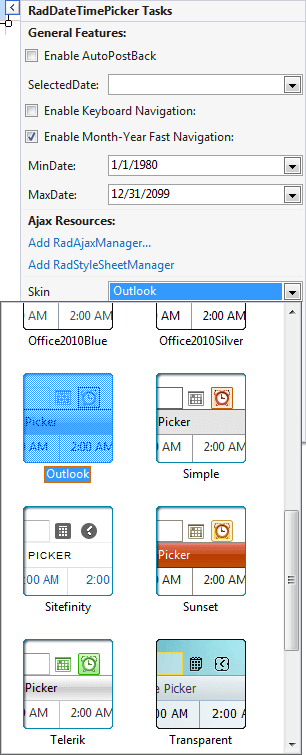
In the properties pane for the RadDateTimePicker, set the Skin property to "Outlook":
In the Behavior section of the properties pane, locate the Calendar property. As you did with the RadDatePicker control, set the Calendar.CalendarTableStyle.BackColor property to "#DDEEFF" and the Calendar. ShowOtherMonthDays property to False.
-
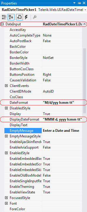
Locate the DateInput property. This lets you configure the embedded RadDateInput control. Change the following properties for the embedded RadDateInput control:
- Set the value of the DateFormat property to "M/d/yyyy h:mm tt". This tells the RadDateInput control how to format its value when it has input control (when the user can edit its value).
- Set the value of the DisplayDateFormat property to "MMM d, yyyy h:mm tt". This tells the RadDateInput control how to format its value when it does not have input focus (when the user is not editing its value.)
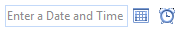
- Set the EmptyMessage property to " Enter a date and time ". This tells the RadDateInput control to display the specified prompt when its value has not been set.
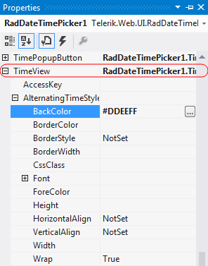
Expand the TimeView property. This lets you configure the properties of the embedded RadTimeView control that acts as a popup for choosing time values. Set its BackColor property to "#DDEEFF". This gives it the time selection popup the same background color that we gave the popup RadCalendar control.
Running the application
Run the application. When it first starts up, the RadDateTimePicker* control will show an empty message, because no value has been assigned yet. The picker will be using the "Outlook" skin.
Scroll the popup calendar on the RadDateTimePicker control using the navigation controls in its title bar. Note that you cannot navigate before the minimum date you have specified or after the maximum date.
Select a date and time value for the control. Note the formatting changes depending on whether the controls have focus.