DataForm for Xamarin.Android: Customizing RadDataForm's Editors
Each editor in RadDataForm consists of the following elements:
- Header
- Core editor
- Validation message
- Validation icon
Each of these elements can be customized individually for each editor. They (except core editor) can also be specified once to be used for every editor in the DataForm
Custom layouts
Specifying individual parts for a specific editor is done via the @DataFormProperty annotation. For example:
[DataFormProperty(
    EditorLayout = Resource.Layout.editor_main_layout,
    CoreEditorLayout = Resource.Layout.core_editor,
    HeaderLayout = Resource.Layout.editor_header_layout,
    ValidationLayout = Resource.Layout.editor_validation_layout)]
public string Name {
    get {
        return name;
    }
    set {
        name = value;
    }
}
Notice one additional attribute of the annotation, the EditorLayout. This is the main layout of the editor which contains each of the sub-elements described above. This can be used if the app design requires the header to be on the right of the editor or if the validation message should be on top of the core editor for example. The main layout's purpose is to allow custom positioning of the sub elements of each editor.
Finally along with the fine grained options above, one main layout can be specified and reused for every editor. For example:
// Set the same main layout for every editor.
dataForm.EditorsMainLayout = Resource.Layout.editors_main_layout;

// Set the same header layout for every editor.
dataForm.EditorsHeaderLayout = Resource.Layout.editors_header_layout;

// Set the same validation layout for every editor.
dataForm.EditorsValidationLayout = Resource.Layout.editors_validation_layout;
To illustrate the main layout and its sub elements consider this image:

Here "Date" is the header. The red highlighted text field is the core editor which is a date picker in this case and finally the red message below is the validation message. When there is a validation icon specified it will be displayed to the right of the core editor.
Editor customizations
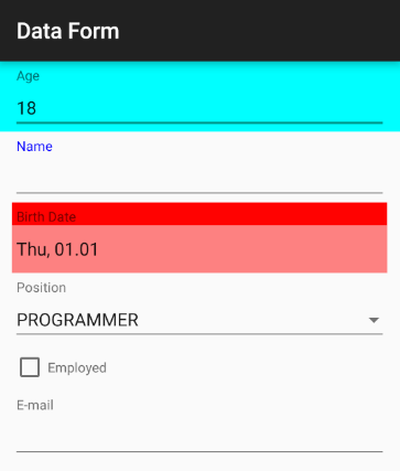
Another way to customize the editors is with DataForm's EditorCustomization property. It allows you to define a procedure that will be applied for each editor and you will get a chance to alter the appearance for the editors that meet a certain requirement.
Here is an example:
dataForm.EditorCustomizations = new EditorCustomizationsExample();
// ...
class EditorCustomizationsExample : Java.Lang.Object, IProcedure {
    public void Apply (Java.Lang.Object p0)
    {
        EntityPropertyViewer entityPropertyViewer = (EntityPropertyViewer)p0;
        switch (entityPropertyViewer.Property().Name()) {
            case "Name":
                TextView headerView = (TextView)entityPropertyViewer.HeaderView;
                headerView.SetTextColor (Color.Blue);
                EditText editorView = (EditText)entityPropertyViewer.EditorView;
                editorView.SetTextColor (Color.Blue);
                break;
            case "Age":
                entityPropertyViewer.RootLayout().SetBackgroundColor(Color.Cyan);
                break;
            case "BirthDate":
                entityPropertyViewer.HeaderView.
                    SetBackgroundColor(Color.Red);
                entityPropertyViewer.EditorView.
                    SetBackgroundColor(Color.ParseColor("#AAFF4444"));
                break;
        }
    }
}
And here's the result:
