Explore Control Features
Once you have your first control working in your project, it's time to see what else it can do. This article provides a short overview of how to get started with finding control functionality and features.
Demos
To get an overview of what each control offers, the fastest way will be to explore our Live Demos availabile free in Google Play Store, App Store and Microsoft Store.
Documentation
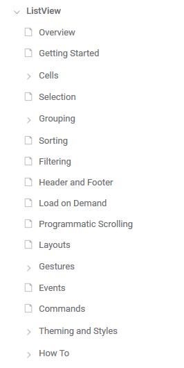
Each control documentation consists of different sections to help you get started with the control and explore its key features. For some of the more complex ones you can also find additional articles that will help you get the best out of it. Things like feature usage and styling options.
Figure 1: Typical control documentation structure

Control Features
In this example we are going to look Selection as one of the key features in the ListView control.
RadListView component exposes selection feature. It allows users to select one or many items out of the ItemsSource of the control. This feature provides both visual and programmatic feedback for the actions of the user.
This article will show the basic properties RadListView provides for working with selection.
Selection Configuration
RadListView provides three selection modes, which allow you to manipulate the type of selection. This is controlled by the SelectionMode property which has the following entries:
-
SelectionMode (Telerik.XamarinForms.DataControls.ListView.SelectionMode):
- None - This mode doesn't allow users to select an item.
- Single - This is the default selection mode. It allows users to select only one item.
- Multiple - This mode allows users to select more than one item.
Check below how you can set SelectionMode in XAML and code-behind:
<telerikDataControls:RadListView x:Name="listView"
                                 SelectionMode="Multiple" />
var listView = new RadListView();
listView.SelectionMode = Telerik.XamarinForms.DataControls.ListView.SelectionMode.Multiple;
You can also configure how the selection to be triggered by the end users through the SelectionGesture property:
-
SelectionGesture (Telerik.XamarinForms.DataControls.ListView.SelectionGesture):
- Tap - Users need to tap on an item to select it. This is the default SelectionGesture value;
- Hold - Users need to tap & hold on an item to select it.
<telerikDataControls:RadListView x:Name="listView"
                                 SelectionGesture="Hold" />
var listView = new RadListView();
listView.SelectionGesture = Telerik.XamarinForms.DataControls.ListView.SelectionGesture.Hold;
Getting Selected Items
RadListView exposes the following properties for getting the selected item or items in case of multiple selection:
- SelectedItems (ObservableCollection<object>): Read-only collection used to get the currently selected items;
- SelectedItem (object): Specifies the last selected item of the ListView.
Selection Events
-
SelectionChanged: An event that is triggered whenever the SelectedItems collection is changed. The SelectionChanged event handler receives two parameters:
- The sender argument which is of type object, but can be cast to the RadListView type.
- A NotifyCollectionChangedEventArgs object which provides information on the collection changed event. For more details check NotifyCollectionChangedEventArgs Class topic.
Styling
You can customize the way selected items look by applying SelectedItemStyle property to the RadListView instance. For detailed information on the approach go to Items Styles topic in ListView documentation.
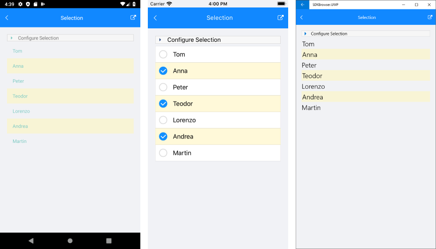
Here is how the RadListView control looks like on different platforms when multiple items are selected:
Figure 1: Result in Android, iOS and Windows

Next Steps
Now that you have the Telerik UI for Xamarin controls running in your project, you may want to explore their features, customize their behavior or change their appearance. Below you can find guidance on getting started with such tasks: