Key Features
The purpose of this help article is to show you the key features of the RadShadow control.
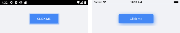
Setting Shadow Color
Through the Color property you can paint the shadow that wraps around your views – you can make it consistent with the colors of the surrounded controls, or you can just use a softer color to make the shadow look more natural.
Here is a quick example of a colored shadow around RadButton:
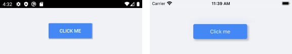
<telerikPrimitives:RadShadow Color="#4488F6"
                             ShadowOpacity="0.7"
                             OffsetX="4"
                             OffsetY="4">
    <telerikInput:RadButton Text="Click me"
        TextColor="White"
        BackgroundColor="#4488F6"
        HeightRequest="44"/>
</telerikPrimitives:RadShadow>
Check the result below:
Defining Transparency
Through ShadowOpacity you can control the color transparency level of the RadShadow. The defined value should be between 0 and 1, by default ShadowOpacity is set to 0.26.
<telerikPrimitives:RadShadow ShadowOpacity="0.7">
    <telerikInput:RadButton Text="Click me"
        TextColor="White"
        BackgroundColor="#4488F6"
        HeightRequest="44"/>
</telerikPrimitives:RadShadow>
And how it looks:
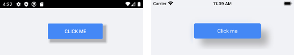
Defining Shadow Position
RadShadow exposes OffsetX and OffsetY properties used to specify the shadow’s position relative to the position of the view that is casting it. Positive x/y offsets will shift the shadow to the right and down, while negative offsets shift the shadow to the left and up.
By default, OffsetX and OffsetY are set to 0.00, so that the shadow appears on all sides of the View it surrounds.
<telerikPrimitives:RadShadow OffsetX="20"
                             OffsetY="20">
    <telerikInput:RadButton Text="Click me"
        TextColor="White"
        BackgroundColor="#4488F6"
        HeightRequest="44"/>
</telerikPrimitives:RadShadow>
Check the result below:
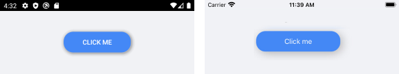
Applying Corner Radius
The CornerRadius property represents the degree to which the corners of the Shadow are rounded- this is useful in cases RadShadow wraps around a view with rounded edges.
Check below a quick example with RadButton with CornerRadius applied:
<telerikPrimitives:RadShadow CornerRadius="20"
                             OffsetX="4"
                             OffsetY="4">
    <telerikPrimitives:RadShadow.BackgroundColor>
        <OnPlatform x:TypeArguments="Color" Default="Default">
            <On Platform="UWP" Value="#F1F2F5"/>
        </OnPlatform>
    </telerikPrimitives:RadShadow.BackgroundColor>
    <telerikInput:RadButton Text="Click me"
        TextColor="White"
        BackgroundColor="#4488F6"
        HeightRequest="44"
        CornerRadius="20"/>
</telerikPrimitives:RadShadow>
In this way the shadow looks consistent with the rounded button:
Applying Blur Radius
Through the BlurRadius property you can specify the shadow blur-level - the higher the number, the more blurred it will be, and the further out the shadow will extend.
By default, the BlurRadius is 10.
<telerikPrimitives:RadShadow BlurRadius="3"
                             OffsetX="4"
                             OffsetY="4">
    <telerikInput:RadButton Text="Click me"
        TextColor="White"
        BackgroundColor="#4488F6"
        HeightRequest="44"/>
</telerikPrimitives:RadShadow>
You may notice some differences in blur effect depending on the target platform. This is due to the different native implementations of the Shadow BlurRadius – on iOS it is implemented as a Gaussian blur, while on Android and UWP the shadow blur effect is determined by the elevation of the surrounded view.