Groups Styling
The RadDataForm group headers appearance can be customized with the GroupHeaderStyle property of type DataFormGroupHeaderStyle.
The DataFormGroupHeaderStyle class exposes the following properties:
- Background: Specifies the background of the group headers.
- BackgroundImageSource (ImageSource): Sets a background image for the group header.
- Foreground: Determines the group header text color.
- Height: Specifies the group header height.
- IsCollapsible: Indicates whether the group will be collapsible.
- IsCollapsed: Specifies whether the group is collapsed. When setting it to "False", the groups will be collapsed by default.
- Padding: Sets the group header content padding.
- TextAlignment: Specifies the group header text alignment.
Example
Here is an example that demonstrates how to style the data form group headers.
<telerikInput:RadDataForm Source="{Binding}">
    <telerikInput:RadDataForm.GroupHeaderStyle>
        <telerikDataForm:DataFormGroupHeaderStyle Background="#90C9E9"
                                                  Foreground="Black"
                                                  Height="60"
                                                  Padding="20"
                                                  TextAlignment="Center" />
    </telerikInput:RadDataForm.GroupHeaderStyle>
</telerikInput:RadDataForm>
var groupHeaderStyle = new DataFormGroupHeaderStyle
{
    Background = Color.FromHex("#90C9E9"),
    Foreground = Color.Black,
    Height = 60,
    Padding = new Thickness(20),
    TextAlignment = TextAlignment.Center
};

var dataForm = new RadDataForm
{
    Source = new Customer(),
    GroupHeaderStyle = groupHeaderStyle
};
Don't forget to add the following namespaces:
xmlns:telerikInput="clr-namespace:Telerik.XamarinForms.Input;assembly=Telerik.XamarinForms.Input"
xmlns:telerikDataForm="clr-namespace:Telerik.XamarinForms.Input.DataForm;assembly=Telerik.XamarinForms.Input"
using Telerik.XamarinForms.Input;
using Telerik.XamarinForms.Input.DataForm;
Here is the source item class:
public class Customer
{
    [DisplayOptions(Group = "Basic Info", Header = "First Name")]
    public string FirstName { get; set; } = "John";

    [DisplayOptions(Group = "Basic Info", Header = "Last Name")]
    public string LastName { get; set; } = "Doe";

    [DisplayOptions(Group = "Additional Info", Header = "Age")]
    public int Age { get; set; } = 24;

    [DisplayOptions(Group = "Additional Info", Header = "Is New")]
    public bool IsNew { get; set; } = true;

    [DisplayOptions(Group = "Additional Info", Header = "Country")]
    public string Country { get; set; } = "unknown";
}
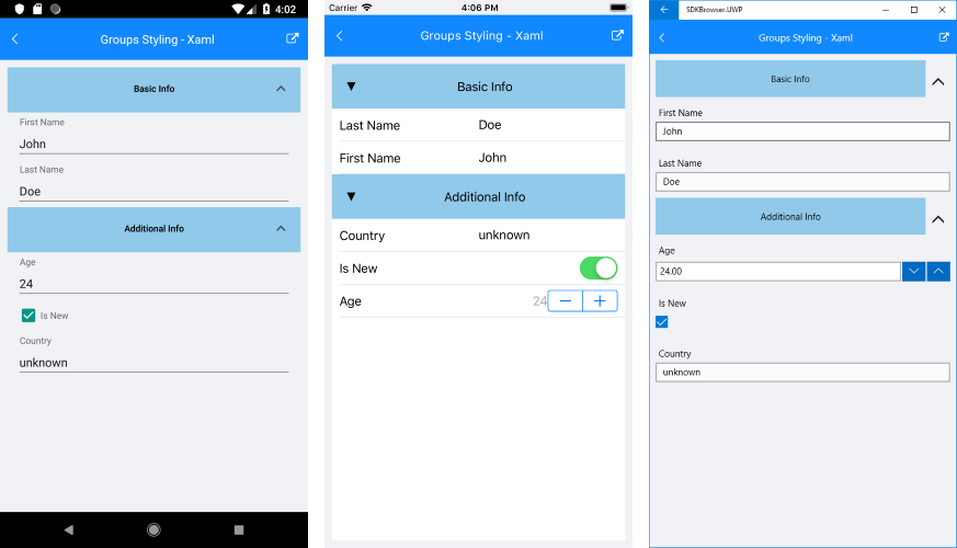
And this is how the DataForm Group Styling looks:
Sample examples demonstrating groups styling of DataForm control can be found inside the RadDataForm -> Styling section within the SDK Samples Browser application.