Set TextColor for Disabled RadButton
You can set text color when the button is enabled/disabled using a Style or Custom Renderer.
Using Style
<Style x:Key="ButtonStyle"
       TargetType="telerikInput:RadButton">
<Style.Triggers>
    <Trigger TargetType="telerikInput:RadButton" Property="IsEnabled" Value="True">
        <Setter Property="TextColor" Value="Black" />
        <Setter Property="BackgroundColor" Value="Gray" />
    </Trigger>
    <Trigger TargetType="telerikInput:RadButton" Property="IsEnabled" Value="False">
        <Setter Property="TextColor" Value="White" />
        <Setter Property="BackgroundColor" Value="LightGray" />
    </Trigger>
</Style.Triggers>
</Style>
and the Button definition:
<input:RadButton Style="{StaticResource ButtonStyle}"
                 x:Name="Button"
                 Text="TelerikXamarinButton"/>
Custom Renderer Approach
You can create custom renderers for the different platforms and set the color directly on the native elements. This article will guide you on how to achieve the behavior on the different platforms.
1. As a first step, in order to use a custom renderer for the RadButton, you should create a custom class that inherits from RadButton. Eventually, you can target your custom element within the custom renderer.
Here is the custom class:
public class MyRadButton : RadButton
{
}
And how it is declared within your page:
<myButton:MyRadButton x:Name="btn"
                      BackgroundColor="DarkOrange"
                      HorizontalOptions="FillAndExpand"
                      FontSize="Medium"
                      IsEnabled="False"
                      BorderRadius="15"
                      Text="Button is disabled!"/>
2. Once you have added the 'custom' control to your application, you can create the following custom renderers for the different platforms in order to alter the TextColor when the button is disabled:
iOS Renderer
[assembly: Xamarin.Forms.ExportRenderer(typeof(MyRadButton), typeof(CustomButtonRenderer))]
namespace SDKBrowser.iOS.Examples.ButtonControl.HowToCategory.ButtonDisabledTextColorExample
{
    public class CustomButtonRenderer : Telerik.XamarinForms.InputRenderer.iOS.ButtonRenderer
    {
        public CustomButtonRenderer() : base()
        {
        }

        protected override void OnElementChanged(ElementChangedEventArgs<Xamarin.Forms.Button> e)
        {
            base.OnElementChanged(e);
            if (Control != null)
            {
                Control.SetTitleColor(UIColor.Gray, UIControlState.Disabled);
                Control.SetTitleColor(UIColor.Red, UIControlState.Normal);
            }
        }
    }
}
Android Renderer
[assembly: Xamarin.Forms.ExportRenderer(typeof(MyRadButton), typeof(CustomButtonRenderer))]
namespace SDKBrowser.Droid.Examples.ButtonControl.HowToCategory.ButtonDisabledTextColorExample
{
    public class CustomButtonRenderer : Telerik.XamarinForms.InputRenderer.Android.ButtonRenderer
    {
        public CustomButtonRenderer(Android.Content.Context context) : base(context)
        {
        }

        protected override void OnElementChanged(ElementChangedEventArgs<Xamarin.Forms.Button> e)
        {
            base.OnElementChanged(e);
            this.ModifyTextColor();
        }

        protected override void OnElementPropertyChanged(object sender, PropertyChangedEventArgs e)
        {
            base.OnElementPropertyChanged(sender, e);
            if (e.PropertyName == Xamarin.Forms.Button.IsEnabledProperty.PropertyName)
            {
                this.ModifyTextColor();
            }
        }

        private void ModifyTextColor()
        {
            if (this.Element.IsEnabled == true)
            {
                this.Control.SetTextColor(Android.Graphics.Color.Red);
            }
            else
            {
                this.Control.SetTextColor(Android.Graphics.Color.Gray);
            }
        }
    }
}
UWP Renderer
[assembly: ExportRenderer(typeof(MyRadButton), typeof(CustomButtonRenderer))]
namespace SDKBrowser.UWP.Examples.ButtonControl.HowToCategory.ButtonDisabledTextColorExample
{
    public class CustomButtonRenderer : Telerik.XamarinForms.InputRenderer.UWP.ButtonRenderer
    {
        public CustomButtonRenderer() : base()
        {
        }

        protected override void OnElementChanged(ElementChangedEventArgs<Xamarin.Forms.Button> e)
        {
            base.OnElementChanged(e);
            if (e.NewElement != null)
            {
                this.ModifyTextColor();
            }
        }

        protected override void OnElementPropertyChanged(object sender, PropertyChangedEventArgs e)
        {
            base.OnElementPropertyChanged(sender, e);
            if (e.PropertyName == Xamarin.Forms.Button.IsEnabledProperty.PropertyName)
            {
                ModifyTextColor();
            }
        }

        private void ModifyTextColor()
        {
            if (this.Element.IsEnabled == true)
            {
                this.Control.Foreground = new SolidColorBrush(Windows.UI.Color.FromArgb(255, 255, 0, 0));
            }
            else
            {
                this.Control.Foreground = new SolidColorBrush(Windows.UI.Color.FromArgb(255, 165, 0, 0));
            }
        }

    }
}
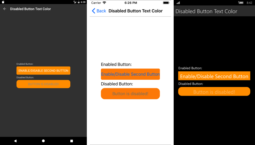
Figure 1 shows the appearance of the disabled RadButton once the custom renderers have been added to your application.
Figure 1: Text Color of disabled RadButton