Key Features
The purpose of this help article is to show you the key features of the RadBorder control.
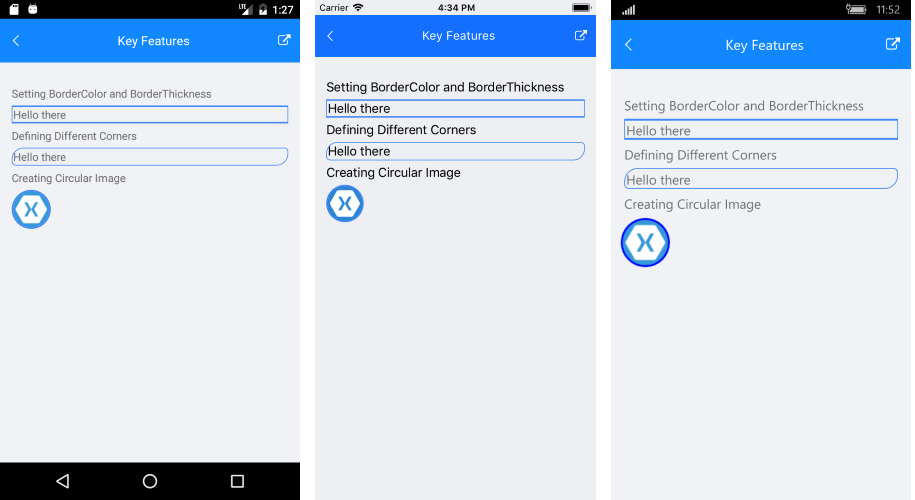
Setting Border Color
You can use the BorderColor property to specify the color of RadBorder. The property has no effect if BorderThickness is set to “0”.
Setting Border Thickness
The BorderThickness property is of type Xamarin.Forms.Thickness and is used to set the borders’ width. Type Thickness gives you the option to define different border on each side of the surrounded element.
Here is a quick example on how to use BorderColor and BorderThickness properties:
<telerikPrimitives:RadBorder BorderColor="#4488F6" BorderThickness="1, 2, 1, 2">
    <Label Text="Hello there" Margin="2" />
</telerikPrimitives:RadBorder>
Where:
xmlns:telerikPrimitives="clr-namespace:Telerik.XamarinForms.Primitives;assembly=Telerik.XamarinForms.Primitives"
Defining Different Corners
The CornerRadius property represents the degree to which the corners of the Border are rounded. CornerRadius is of type Xamarin.Forms.Thickness so it allows you to set separate values on the four corners of the border.
<telerikPrimitives:RadBorder BorderColor="#4488F6" BorderThickness="1"
         CornerRadius="15, 5, 15, 5">
    <Label Text="Hello there" Margin="2" />
</telerikPrimitives:RadBorder>
Additionally, the wrapped content will be clipped according to each side’s specified corner radius. The next example shows how you could have circle image by wrapping Image control with RadBorder.
<telerikPrimitives:RadBorder HorizontalOptions="Start" CornerRadius="25" BorderThickness="2" BorderColor="Red">
    <Image Source="XamarinIcon.png" WidthRequest="50" HeightRequest="50" />
</telerikPrimitives:RadBorder>
Here is the end result: