SideDrawer for Xamarin Mobile Blazor Bindings
RadSideDrawer for Xamarin Mobile Blazor Bindings is designed to enable users to visualize a hidden view in their applications. That view can host navigation UI, common settings or any other UI of your choice. It can be visualized using a flick gesture and can be shown from all four sides of the screen.
The SideDrawer is part of Telerik UI for Xamarin, a
professional grade UI component library for building modern and feature-rich applications. To try it out sign up for a free 30-day trial.
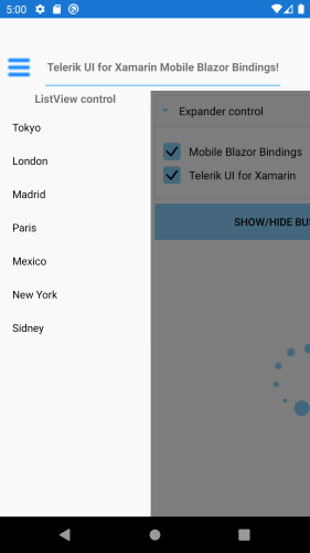
Figure 1: RadSideDrawer Overview
Key features
Below you can find the SideDrawer keyfeatures described:
Drawer positions
The drawer can be shown from any of the four edges of the screen. You can define its position through the DrawerLocation property. For more details on this read Properties topic.
RadSideDrawer control exposes the following properties:
- DrawerContent: Specifies the drawer (initially hidden) content.
- MainContent: Specifies the (initially visible) content of the component.
- IsOpen (bool): Specifies a value indicating if the drawer content is visible.
- DrawerLength (double): Defines how much the drawer content should be extended over the main content in opened position.
-
DrawerLocation (Telerik.XamarinForms.Primitives.SideDrawer.SideDrawerLocation): Specifies the location from which the drawer will be opened. The following options are available:
- Left
- Right
- Top
- Bottom
AreGesturesEnabled (bool): Specifies ability for gestures to open and close the drawer.
- TouchTargetThreshold (double): Defines the touchable area (number of pixels from the screen edges) that will allow to open the DrawerContent.
Effects and transitions
RadSideDrawer supports transition animations that are applied to the opening and closing view. We provide several predefined animations that can be easily set or changed at runtime to meet our customers’ requirements.
The desired transition can be set through DrawerTransitionType property of the SideDrawer.
-
DrawerTransitionTypeis enumeration of typeTelerik.XamarinForms.Primitives.SideDrawerTransitionTypeand exposes the following members:- Push (the default one)
- Fade
- Reveal
- ReverseSlideOut
- ScaleUp
- SlideAlong
- SlideInOnTop
- Custom
DrawerTransitionDuration (double): Defines the duration of the chosen transition.
- DrawerTransitionFadeOpacity (double): Defines the opacity of the fade layer of the component. This controls the fade layer opacity on Android or the dim opacity on iOS.
Example
Here is an example how to set DrawerTransitionType property:
<RadSideDrawer DrawerLength="200"
               DrawerTransitionType="Telerik.XamarinForms.Primitives.SideDrawerTransitionType.Push">
                ...........
</RadSideDrawer>