Border for Xamarin Mobile Blazor Bindings
With the new Telerik Border for Xamarin Mobile Blazor Bindings component you will have full control over the look & feel of the border that wraps around your blazor component/view. You could surround any view such as Label, Image, and other, and specify different border thickness and corner radius on each side.
Figure 1: RadBorder Overview

Key features
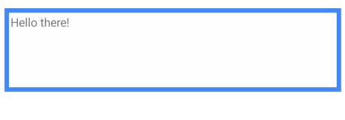
- BorderThickness and BorderColor: RadBorder provides a BorderThickness property which you can use together with BorderColor in order to have various types of borders around your views.
<RadBorder BorderColor="@Color.FromHex("#4488F6")"
           BorderThickness="new Thickness(5)"
           HeightRequest="100">
    <Label Text="Hello there!"
            Margin="new Thickness(2)" />
</RadBorder>

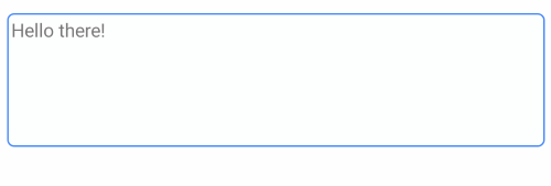
- Defining different corner radius on each side: Through the CornerRadius property you could specify separate corner radius value on all four angles of RadBorder.
<RadBorder BorderColor="@Color.FromHex("#4488F6")"
           CornerRadius="new Thickness(5)"
           HeightRequest="100">
    <Label Text="Hello there!"
            Margin="new Thickness(2)" />
</RadBorder>
Here is the result:
