How to Remove or Change the Selected and Highlighted Backgrounds of the RadTreeViewItems
Environment
| Product Version | 2020.1.302 |
| Product | RadTreeView for WPF |
Description
How to remove or change the selection and highlight appearance of the RadTreeViewItems.
Solution
To change the appearance of the TreeView items when they are selected or hovered, you need to extract and modify the control template of the RadTreeViewItem element.
Once you've extracted the respective template for the required theme(s), you need to find the needed triggers or visual states (depending on the theme) which are responsible for the selected and/or hovered state of the items.
Here's an example of how to apply such a modification in the Fluent theme:
<!-- IsSelected general setters -->
<Trigger Property="IsSelected" Value="True">
    <Setter TargetName="Header" Property="Foreground" Value="Red"/>
    <Setter Property="mat:MaterialAssist.MouseOverBrush" Value="{telerik1:FluentResource ResourceKey=AccentMouseOverBrush}"/>
    <Setter TargetName="BorderVisual" Property="Background" Value="Transparent"/>
</Trigger>

<!-- Hovered -->
<Trigger Property="IsMouseOver" Value="True" SourceName="HeaderRow">
    <Setter TargetName="BorderVisual" Property="Background" Value="Salmon"/>
</Trigger>
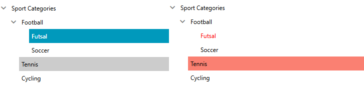
The figure below shows the appearance of the items after this modification is applied.