Change Style of Filtered Column Headers
Environment
| Product Version | 2021.2.511 |
| Product | RadGridView for WPF |
Description
How to highlight the header cells of a filtered column.
Solution
To style the header cells of a column after it has been filtered, you can handle the CollectionChanged event of RadGridView's FilterDescriptors collection.
Example 1: Subscribe to the CollectionChanged event
this.GridView.FilterDescriptors.CollectionChanged += OnFilterDescriptorsCollectionChanged;
Example 2: Handle the CollectionChanged event
private void OnFilterDescriptorsCollectionChanged(object sender, NotifyCollectionChangedEventArgs e)
{
    switch (e.Action)
    {
        case System.Collections.Specialized.NotifyCollectionChangedAction.Add:
            if (e.NewItems.Count == 1)
            {
                var columnFilterDescriptor = e.NewItems[0] as IColumnFilterDescriptor;
                if (columnFilterDescriptor != null)
                {
                    var column = columnFilterDescriptor.Column;
                    column.HeaderCellStyle = App.Current.Resources["FilteredHeaderCellStyle"] as Style;
                }
            }
            break;
        case System.Collections.Specialized.NotifyCollectionChangedAction.Remove:
            if (e.OldItems.Count == 1)
            {
                var columnFilterDescriptor = e.OldItems[0] as IColumnFilterDescriptor;
                if (columnFilterDescriptor != null)
                {
                    var column = columnFilterDescriptor.Column;
                    column.HeaderCellStyle = App.Current.Resources["FilteredHeaderCellStyle"] as Style;
                }
            }
            break;
    }
}
Example 3: Define the style for the affected header cells in App.xaml
<Style x:Key="FilteredHeaderCellStyle" TargetType="telerik:GridViewHeaderCell">
    <Setter Property="Foreground" Value="Red"/>
</Style>
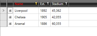
Figure 1: The highlighted header cell of the filtered column