Style Aggregate Results Displayed in the GroupHeaderRow
Environment
| Product | RadGridView for WPF |
Description
How to change the style of the aggregates based on the results.
Solution
The approach would differ depending on the value of the ColumnAggregatesAlignment property of the RadGridView. If its value is NoAlignment (which is the default), the aggregate results are shown in GridViewAggregateResultCell elements. If its value is NextToGroupKey or BelowToGroupKey, the results are displayed in GridViewGroupHeaderCell elements. This article will show how you can conditionally style both elements.
Example 1 demonstrates a sample model and viewmodel that will be used for demonstration purposes.
Example 1: The model and viewmodel
public class Product
{
    public Product(string name, int id)
    {
        this.Name = name;
        this.ID = id;
    }
    public string Name
    {
        get;
        set;
    }

    public int ID
    {
        get;
        set;
    }

    public static ObservableCollection<Product> GetProducts()
    {
        ObservableCollection<Product> products = new ObservableCollection<Product>();
        var id = 0;
        for (int i = 1; i < 7; i++)
        {
            products.Add(new Product("Socks", ++id));
        }
        products.Add(new Product("T-shirts", ++id));
        products.Add(new Product("Shoes", ++id));
        products.Add(new Product("Hats", ++id));

        return products;
    }
}

public class ViewModel
{
    private ObservableCollection<Product> products;

    public ObservableCollection<Product> Products
    {
        get
        {
            if(this.products == null)
            {
                this.products = Product.GetProducts();
            }

            return this.products;

        }
    }
}
Public Class Product
    Public Sub New(ByVal name As String, ByVal id As Integer)
        Me.Name = name
        Me.ID = id
    End Sub
    Public Property Name() As String

    Public Property ID() As Integer

    Public Shared Function GetProducts() As ObservableCollection(Of Product)
        Dim products As New ObservableCollection(Of Product)()
        Dim _id = 0
        For i As Integer = 1 To 6
            id += 1
            products.Add(New Product("Socks", _id))
        Next i

        id += 1
        products.Add(New Product("T-shirts", _id))

        id += 1
        products.Add(New Product("Shoes", _id))

        id += 1
        products.Add(New Product("Hats", _id))

        Return products
    End Function
End Class

Public Class ViewModel
    Private _products As ObservableCollection(Of Product)

    Public ReadOnly Property Products() As ObservableCollection(Of Product)
        Get
            If Me._products Is Nothing Then
                Me._products = Product.GetProducts()
            End If

            Return Me._products
        End Get
    End Property
End Class
Styling the GridViewAggregateResultCell elements
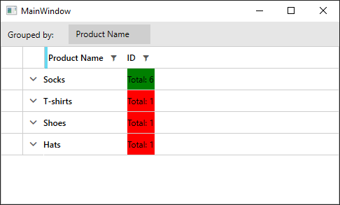
This approach is valid when the ColumnAggregatesAlignment of the RadGridView is NoAlignment. Example 2 shows how to create a style targeting GridViewAggregateResultCell and change its Background depending on its DataContext.
Example 2: Conditionally styling GridViewAggregateResultCell
<Grid>
    <Grid.DataContext>
        <local:ViewModel />
    </Grid.DataContext>

    <Grid.Resources>
        <local:AggregateResultsListItemCountToBackgroundConverter x:Key="AggregateResultsListItemCountToBackgroundConverter" />

        <!-- If you are using the NoXaml dlls, you should base the style on the default one for the theme like so-->
        <!-- <Style TargetType="telerik:GridViewAggregateResultCell" BasedOn="{StaticResource GridViewAggregateResultCellStyle}">-->
        <Style TargetType="telerik:GridViewAggregateResultCell">
            <Setter Property="Background" Value="{Binding ., Converter={StaticResource AggregateResultsListItemCountToBackgroundConverter}}" />
        </Style>
    </Grid.Resources>
    <telerik:RadGridView x:Name="grid" ColumnAggregatesAlignment="NoAlignment"  GroupRenderMode="Flat" ItemsSource="{Binding Products}" AutoGenerateColumns="False" >
        <telerik:RadGridView.Columns>
            <telerik:GridViewDataColumn DataMemberBinding="{Binding Name}" Header="Product Name" />
            <telerik:GridViewDataColumn DataMemberBinding="{Binding ID}" >
                <telerik:GridViewDataColumn.AggregateFunctions>
                    <telerik:CountFunction Caption="Total: " />
                </telerik:GridViewDataColumn.AggregateFunctions>
            </telerik:GridViewDataColumn>
        </telerik:RadGridView.Columns>
        <telerik:RadGridView.GroupDescriptors>
            <telerik:ColumnGroupDescriptor Column="{Binding Path=Columns[\Name], ElementName=grid}" DisplayContent="Product Name" />
        </telerik:RadGridView.GroupDescriptors>
    </telerik:RadGridView>
</Grid>
Example 3: AggregateResultsListItemCountToBackgroundConverter implementation
public class AggregateResultsListItemCountToBackgroundConverter : IValueConverter
{
    public object Convert(object value, Type targetType, object parameter, CultureInfo culture)
    {
        var aggregateResult = value as AggregateResult;

        if (aggregateResult.ItemCount <= 1)
        {
            return Brushes.Red;
        }
        else
        {
            return Brushes.Green;
        }
    }

    public object ConvertBack(object value, Type targetType, object parameter, CultureInfo culture)
    {
        throw new NotImplementedException();
    }
}
Public Class AggregateResultsListItemCountToBackgroundConverter
    Implements IValueConverter

    Public Function Convert(ByVal value As Object, ByVal targetType As Type, ByVal parameter As Object, ByVal culture As CultureInfo) As Object
        Dim aggregateResult = TryCast(value, AggregateResult)

        If aggregateResult.ItemCount <= 1 Then
            Return Brushes.Red
        Else
            Return Brushes.Green
        End If
    End Function

    Public Function ConvertBack(ByVal value As Object, ByVal targetType As Type, ByVal parameter As Object, ByVal culture As CultureInfo) As Object
        Throw New NotImplementedException()
    End Function
End Class
Figure 1: Result from Example 2 in the Fluent theme
Styling the GridViewGroupHeaderCell elements
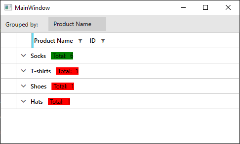
This approach is valid when the ColumnAggregatesAlignment of the RadGridView is NextToGroupKey or BelowToGroupKey. Example 4 shows how to create a style targeting GridViewGroupHeaderCell and change its Background depending on its DataContext.
Example 4: Conditionally styling GridViewGroupHeaderCell
<Grid>
    <Grid.DataContext>
        <local:ViewModel />
    </Grid.DataContext>

    <Grid.Resources>
        <local:IsNullConverter x:Key="IsNullConverter" />
        <local:ItemCountToBackgroundConverter x:Key="ItemCountToBackgroundConverter" />

        <!-- If you are using the NoXaml dlls, you should base the style on the default one for the theme like so-->
        <!-- <Style TargetType="telerik:GridViewGroupHeaderCell" BasedOn="{StaticResource GridViewGroupHeaderCellStyle}">-->

        <Style TargetType="telerik:GridViewGroupHeaderCell">
            <!-- Apply this style only to GridViewGroupHeaderCell elements that have some Content-->
            <Style.Triggers>
                <DataTrigger Binding="{Binding Content, Converter={StaticResource IsNullConverter}, RelativeSource={RelativeSource Mode=Self}}" Value="False">
                    <Setter Property="Background" Value="{Binding ., Converter={StaticResource ItemCountToBackgroundConverter}}" />
                </DataTrigger>
            </Style.Triggers>
        </Style>
    </Grid.Resources>
    <telerik:RadGridView x:Name="grid" ColumnAggregatesAlignment="NextToGroupKey"  GroupRenderMode="Flat" ItemsSource="{Binding Products}" AutoGenerateColumns="False" >
        <telerik:RadGridView.Columns>
            <telerik:GridViewDataColumn DataMemberBinding="{Binding Name}" Header="Product Name" />
            <telerik:GridViewDataColumn DataMemberBinding="{Binding ID}" >
                <telerik:GridViewDataColumn.AggregateFunctions>
                    <telerik:CountFunction Caption="Total: " />
                </telerik:GridViewDataColumn.AggregateFunctions>
            </telerik:GridViewDataColumn>
        </telerik:RadGridView.Columns>
        <telerik:RadGridView.GroupDescriptors>
            <telerik:ColumnGroupDescriptor Column="{Binding Path=Columns[\Name], ElementName=grid}" DisplayContent="Product Name" />
        </telerik:RadGridView.GroupDescriptors>
    </telerik:RadGridView>
</Grid>
Example 5: Implementation of converters used in Example 4
public class ItemCountToBackgroundConverter : IValueConverter
{
    public object Convert(object value, Type targetType, object parameter, CultureInfo culture)
    {
        var group = value as QueryableCollectionViewGroup;

        if (group.ItemCount > 5)
        {
            return Brushes.Green;
        }
        else
        {
            return Brushes.Red;
        }
    }

    public object ConvertBack(object value, Type targetType, object parameter, CultureInfo culture)
    {
        throw new NotImplementedException();
    }
}

public class IsNullConverter : IValueConverter
{
    public object Convert(object value, Type targetType, object parameter, CultureInfo culture)
    {
        return value == null;
    }

    public object ConvertBack(object value, Type targetType, object parameter, CultureInfo culture)
    {
        throw new InvalidOperationException("IsNullConverter can only be used OneWay.");
    }
}
Public Class ItemCountToBackgroundConverter
    Implements IValueConverter

    Public Function Convert(ByVal value As Object, ByVal targetType As Type, ByVal parameter As Object, ByVal culture As CultureInfo) As Object
        Dim group = TryCast(value, QueryableCollectionViewGroup)

        If group.ItemCount > 5 Then
            Return Brushes.Green
        Else
            Return Brushes.Red
        End If
    End Function

    Public Function ConvertBack(ByVal value As Object, ByVal targetType As Type, ByVal parameter As Object, ByVal culture As CultureInfo) As Object
        Throw New NotImplementedException()
    End Function
End Class

Public Class IsNullConverter
    Implements IValueConverter

    Public Function Convert(ByVal value As Object, ByVal targetType As Type, ByVal parameter As Object, ByVal culture As CultureInfo) As Object
        Return value Is Nothing
    End Function

    Public Function ConvertBack(ByVal value As Object, ByVal targetType As Type, ByVal parameter As Object, ByVal culture As CultureInfo) As Object
        Throw New InvalidOperationException("IsNullConverter can only be used OneWay.")
    End Function
End Class
Figure 2: Result from Example 3 in the Fluent theme