ContainerShapes
This tutorial will walk you through the functionality and the main features of the RadDiagramContainerShape.
Overview
Please note that the examples in this tutorial are showcasing Telerik Windows8 theme. In theSetting a Theme article you can find more information on how to set an application-wide theme.
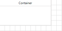
The RadDiagramContainerShape allows you to place multiple shapes into one container shape. The RadDiagramContainerShapes are, much like groups, a way to logically combine other shapes but add to this the capability to have a visual wrapper including a header. You can drag shapes in and out of a ContainerShape during runtime and take advantage of its built-in auto-sizing logic that can extend the size of a container to wrap a shape. The Diagramming Framework provides a visual feedback when a shape is being dragged over a RadDiagramContainerShape and even if part of the shape is outside the bounds of the container, the framework internally handles the drop and expands the size of the container to place the shape inside the content area of the container.

Please note the position and size of the containers takes into account the positions and sizes of all of its child shapes. In other words, even if fixed Position, Height and Width are set for the container, they will be coerced to cover all child shapes which is positioned outside the bounds of the container.
A container can be compared with a HeaderedItemsControl but is also a true diagramming shape which can be connected and handled like other shapes.
The RadDiagramContainerShape derives from the DiagramShapeBase class and this is why it exposes similar properties to those of the RadDiagramShape. To get familiar with the RadDiagramShape features and properties, please refer to the Diagram Shapes tutorial.
Setting a header
The RadDiagramContainerShape header is controlled via the Content property:
Example 1: Specify container shape element in XAML
<Grid>
    <telerik:RadDiagram>
        <telerik:RadDiagramContainerShape Content="Container" />
    </telerik:RadDiagram>
</Grid>

If you bind the Content property to a business property, you can use the ContentTemplate to apply a DataTemplate and control the way your business data is displayed in the header of the RadDiagramContainerShape:
Example 2: Bind Content property of the container shape
<Grid>
    <telerik:RadDiagram>
        <telerik:RadDiagramContainerShape Content="{Binding}">
            <telerik:RadDiagramContainerShape.ContentTemplate>
                <DataTemplate>
                    <TextBlock Text="{Binding Header}" />
                </DataTemplate>
            </telerik:RadDiagramContainerShape.ContentTemplate>
        </telerik:RadDiagramContainerShape>
    </telerik:RadDiagram>
</Grid>
Edit Mode
By default you can edit the header of the RadDiagramContainerShape out-of-the-box by double-clicking on the container or by hitting F2. If you'd like to disable the editing functionality, you can set the IsEditable property to False.
You can manually put the RadDiagramContainerShape in an edit mode by setting its IsInEditMode property to True. This is the property that gets and sets the edit mode of the container.
Populating with Items
The main purpose of the RadDiagramContainerShape is to allow you to drop shapes on it thus grouping them in one container. This is why dragging and dropping shapes onto the container is the main approach for populating its __Items__collection.
You can also populate it manually in xaml:
Example 3: Declarativity populate container shape with items
<telerik:RadDiagram>
    <telerik:RadDiagramContainerShape  x:Name="containerShape" Content="Container">
        <telerik:RadDiagramShape Content="Shape1" />
    </telerik:RadDiagramContainerShape>
</telerik:RadDiagram>
Or in code-behind:
Example 4: Populate container shape with items in code behind
containerShape.Items.Add(new RadDiagramShape() { Content = "Shape 1"});
containerShape.Items.Add(New RadDiagramShape() With {.Content = "Shape 1"})
You can also populate the RadDiagramContainerShape from a collection of business items. You can use the ItemsSource property to bind it to your data objects. For example, if the RadDiagram.DataContext contains a collection of business nodes:
Example 5: Create ViewModel which will hold custom collection of business objects
public class MainViewModel
{
    public ObservableCollection<NodeViewModelBase> Nodes { get; set; }

    public MainViewModel()
    {
        this.Nodes = new ObservableCollection<NodeViewModelBase>();
        for (int i = 1; i < 6; i++)
        {
            this.Nodes.Add(new NodeViewModelBase()
            {
                Content = String.Format("Shape {0}", i),
                Position = new Point(i * 20, i * 45)
            });
        }
    }
}

public partial class ContainerShapeSample : UserControl
{
    public ContainerShape()
    {
        InitializeComponent();
        this.xDiagram.DataContext = new MainViewModel();
    }
}
Public Class MainViewModel
    Public Property Nodes() As ObservableCollection(Of NodeViewModelBase)
        Get
            Return m_Nodes
        End Get
        Set
            m_Nodes = Value
        End Set
    End Property
    Private m_Nodes As ObservableCollection(Of NodeViewModelBase)

    Public Sub New()
        Me.Nodes = New ObservableCollection(Of NodeViewModelBase)()
        For i As Integer = 1 To 5
            Me.Nodes.Add(New NodeViewModelBase() With { .Content = [String].Format("Shape {0}", i),
                                                        .Position = New Point(i * 20, i * 45)
                                                      })
        Next
    End Sub
End Class

Public Partial Class ContainerShapeSample
    Inherits UserControl
    Public Sub New()
        InitializeComponent()
        Me.xDiagram.DataContext = New MainViewModel()
    End Sub
End Class
You can display that collection in a RadDiagramContainerShape:
Example 6: Bind ItemsSource property of container shape
<telerik:RadDiagram x:Name="xDiagram">
    <telerik:RadDiagram.ShapeStyle>
        <Style TargetType="telerik:RadDiagramShape">
            <Setter Property="Position" Value="{Binding Position, Mode=TwoWay}" />
        </Style>
    </telerik:RadDiagram.ShapeStyle>
    <telerik:RadDiagram.ShapeTemplate>
        <DataTemplate>
            <TextBlock Text="{Binding Content}" />
        </DataTemplate>
    </telerik:RadDiagram.ShapeTemplate>
    <telerik:RadDiagramContainerShape x:Name="cShape"
                                Content="Container"
                                ItemsSource="{Binding Nodes}" />
</telerik:RadDiagram>

Container Bounds
You can get the bounds of the RadDiagramContainerShape through the ContainerBounds property, which is of type Rect and it gets the width, height and location of the container’s bounds.
Collapsible ContainerShapes
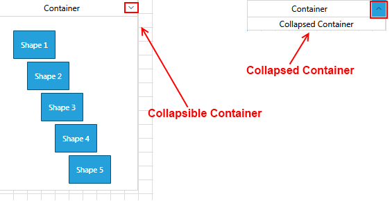
With Q2 2013, you can make your RadDiagramContainerShape collapsible. In order to use such a container in your solution, you simply need to set the IsCollapsible property of the container to True.
For instance, if you take the above RadDiagramContainerShape data-bound definition, you can extend it to set the IsCollapsible property to True in the following manner:
Example 7: Set IsCollapsible in XAML
<telerik:RadDiagram x:Name="xDiagram">
    <telerik:RadDiagram.ShapeStyle>
        <Style TargetType="telerik:RadDiagramShape">
            <Setter Property="Position" Value="{Binding Position, Mode=TwoWay}" />
        </Style>
    </telerik:RadDiagram.ShapeStyle>
    <telerik:RadDiagram.ShapeTemplate>
        <DataTemplate>
            <TextBlock Text="{Binding Content}" />
        </DataTemplate>
    </telerik:RadDiagram.ShapeTemplate>
    <telerik:RadDiagramContainerShape x:Name="cShape"
                                      Content="Container"
                                      IsCollapsible="True"
                                      ItemsSource="{Binding Nodes}" />
</telerik:RadDiagram>
This should result in the following layout:

Below you can find a list of all RadDiagramContainerShape members that are related to the collapsible feature of the shape:
IsCollapsible: A property of type bool that controls the collapsible state of a RadDiagramContainerShape.
IsCollapsed: A property of type bool that controls whether a collapsible RadDiagramContainerShape is currently collapsed.
CollapsedContent: A property of type object that gets or sets an object that defines the content displayed inside a collapsed RadDiagramContainerShape.
Example 8: Set CollapsedContent property in XAML
<telerik:RadDiagram x:Name="xDiagram">
    <telerik:RadDiagram.ShapeStyle>
        <Style TargetType="telerik:RadDiagramShape">
            <Setter Property="Position" Value="{Binding Position, Mode=TwoWay}" />
        </Style>
    </telerik:RadDiagram.ShapeStyle>
    <telerik:RadDiagram.ShapeTemplate>
        <DataTemplate>
            <TextBlock Text="{Binding Content}" />
        </DataTemplate>
    </telerik:RadDiagram.ShapeTemplate>
    <telerik:RadDiagramContainerShape x:Name="cShape"
                                      Content="Container"
                                      CollapsedContent="Collapsed!"
                                      IsCollapsible="True"
                                      ItemsSource="{Binding Nodes}" />
</telerik:RadDiagram>

CollapsedContentTemplate: Gets or sets a DataTemplate used to display the content inside a collapsed RadDiagramContainerShape.
IsCollapsedChanged: An event that is raised by a RadDiagramContainerShape to inform that the collapsed state of the shape is changed.
Interaction
Below you can find a list of the interactions supported by the RadDiagramContainerShape:
Rotation: You can rotate only the RadDiagramContainerShape. This means that the rotation won't affect the container's children. You can find more information about shapes rotation in this tutorial.
Translation: You can translate the ContainerShape along with its children.
Scaling: You can scale only the ContainerShape without affecting its children scale. You can find more information about RadDiagramItems resizing in this tutorial.
Cut and Copy: These clipboard operations work only on the ContainerShape. The shapes inside the container won't be cut or copied. You can find more information about the clipboard operations supported in the RadDiagram in this tutorial.
If you do wish to rotate, scale, cut or copy both the container and its children simultaneously, you can do so by dragging a selection rectangle around the container (instead of just clicking-selecting the container). This selection will contain both the container and the children thus allowing you to perform the aforementioned actions on all items at the same time.
Customize the ContainerShape Appearance
You can easily customize the visual appearance of the RadDiagramContainerShape by using the following properties:
Background: Gets or sets the brush that specifies the RadDiagramContainerShape background color.
BorderBrush: Gets or sets the brush that specifies the RadDiagramContainerShape border color.
BorderThickness: Gets or sets the width of the RadDiagramContainerShape outline.
You can use the RadDiagram.ContainerShapeStyle property to explicitly apply a style on all RadDiagramContainerShapes in a RadDiagram instance.
Container Service
The ContainerService is a static class which can be used to manipulate the container shapes. This static class expose the following methods.
- CompleteManipulation: A void method that completes a given manipulation. Accepts a parameter of type CompositeAsyncStateCommand.
- DetachItemsFromContainer: A void method that detaches items from a container.
- GetChildrenBounds: This method returns a Rect element which wraps the items inside the container.
- GetContainerChildrenRecursively: This method searches recursively and returns all children of the container.
- GetFloatingChildren: This method returns all shapes and connections which are not attached to shapes.
- GetParentContainersRecursively: This method searches recursively and returns all parent containers.
- GetRootItems: A void method that returns all root containers if any exist.
- UpdateContainerLayout: A void method that updates the container layout. Accepts a parameter of type IDragDropAware.
Prevent Dropping Shape in Container
- Prevent dropping a shape in container: To prevent dropping a shape inside a container, you can set the IsDropEnabled property of the RadDiagramContainerShape to False.
Example : Setting IsDropEnabled property to False
<telerik:RadDiagramContainerShape IsDropEnabled="False" />
Customize drag and drop actions
RadDiagramContainerShape implements IDragDropAware interface. This interface allows you to get notified when a shape is dragged over a container. The interface implements the following events and property:
- IsDropPossible: A property of type bool that gets whether drag-drop items in this container is possible.
- OnDragEnter: This event is called when a dragged shape is over a container.
- OnDragLeave: This event is called when a dragged shape leave the boundary of the currently hover container.
- OnDrop: This event is called when a dragged shape is drop over a container.
To subscribe to the drag/drop events you can create a custom class which derives from RadDiagramContainerShape and override the corresponding methods.
Example : Overriding event handlers
public class CustomShape : RadDiagramContainerShape
{
    protected override void OnDragEnter(DragItemsEventArgs args)
    {
        base.OnDragEnter(args);
    }
    protected override void OnDragLeave(DragItemsEventArgs args)
    {
        base.OnDragLeave(args);
    }
    protected override void OnDrop(DragItemsEventArgs args)
    {
        base.OnDrop(args);
    }
}