Template Structure
Like most controls, the RadDataFilter also allows you to template it in order to change the control from the inside. Except for templating the whole control, you can also template only parts of it.
For more information about templating and how to modify the default templates of the RadControls read the article on different approaches on how to extract the ControlTemplates.
RadDataFilter

[ScrollViewer] - wraps the elements of the RadDataFilter's template and enables scrolling, when the RadDataFilter exceeds the available space. It is of type ScrollViewer.
[DataFilterPresenter] - represents the control that wraps the visual elements of the RadDataFilter. It is of type DataFilterPresenter and inherits the HeaderedItemsControl.
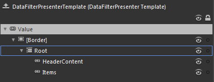
DataFilterPresenter

[Border]
Root - layouts the elements of the DataFilterPresenter's template.
HeaderContent - displays the header of the DataFilterPresenter and is of type ContentControl.
Items - displays the items of the DataFilterPresenter and is of type ItemsPresenter.
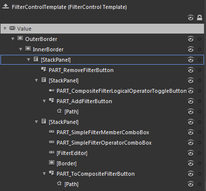
FilterControl

OuterBorder - represents the color of the outer border of the FilterControl and is of type Border.
InnerBorder - represents the inner border and the background of the FilterControl and is of type Border.
[StackPanel] - layouts the visual elements of the FilterControl and is of type StackPanel.
PART_RemoveFilterButton - represents the delete button and is of type RadButton.
[StackPanel] - layouts the visual elements for the composite filter and is of type StackPanel.
PART_CompositeFilterLogicalOperatorToggleButton - represents the toggle button for the logical operator of the composite filter and is of type RadToggleButton.
PART_AddFilterButton - represents the button for adding new filter criteria and is of type RadButton.
[Path] - represents the shape inside the button and is of type Path.
[StackPanel] - layouts the visual elements for the simple filter and is of type StackPanel.
PART_SimpleFilterMemberComboBox - represents the drop down for the available members and is of type RadComboBox.
PART_SimpleFilterOperatorComboBox - represents the drop down for the available filter operators and is of type RadComboBox.
[FilterEditor] - represents the element for the user's input and is of type FilterEditor.
[Border]
PART_ToCompositeFilterButton - represents the button for creating nested filter criteria and is of type RadButton.
[Path] - represents the shape inside the button and is of type Path.