Multiple Selection
With the R3 2016 release version of UI for WPF, multiple items can be selected from RadComboBox. To enable this functionality, you have to set the AllowMultipleSelection property to True. This article will provide some detailed information about the available properties, commands and other features that are available when multiple selection is allowed.
Properties
This section will provide information about the following properties connected with the multiple selection functionality of RadComboBox:
AllowMultipleSelection
MultipleSelectionSeparator
MultipleSelectionSeparatorStringFormat
SelectedItems
AllowMultipleSelection
Using the AllowMultipleSelection property you can enable or disable the multiple selection functionality of RadComboBox. The default value of this property is False. To enable the multiple selection, set the AllowMultipleSelection property to True as shown in Example 1.
Example 1: Allowing multiple selection
<telerik:RadComboBox x:Name="radComboBox" AllowMultipleSelection="True"/>
MultipleSelectionSeparator
When multiple items are selected in RadComboBox they are separated from each other with a specific separator: the default separator is a comma. To change that separator, use the MultipleSelectionSeparator property. This property is of type char, so any character could be set as a separator.
Example 2 demonstrates how to change the default separator to a dash.
Example 2: Changing multiple selection separator
<telerik:RadComboBox AllowMultipleSelection="True" MultipleSelectionSeparator="-">
    <telerik:RadComboBoxItem Content="Alapattah" />
    <telerik:RadComboBoxItem Content="Brickell Avenue" />
    <telerik:RadComboBoxItem Content="Downtown Miami" />
    <telerik:RadComboBoxItem Content="El Portal" />
</telerik:RadComboBox>
Figure 1: Selected items separated by dash set in Example 2
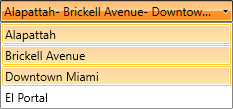
If RadComboBox is Editable and the IsTextSearchEnabled is True pressing the separator while typing inside the input area of the control will autocomplete the item to its end.
MultipleSelectionSeparatorStringFormat
You can use the MultipleSelectionSeparatorStringFormat string property for formatting the representation of the char that separates the selected items. By using it, the current format of the char separator could easily be changed.
If the provided MultipleSelectionSeparatorStringFormat is not a valid format, a FormatException will be thrown.
Example 3 demonstrates how to set the MultipleSelectionSeparatorStringFormat property.
Example 3: Changing multiple selection separator StringFormat
<telerik:RadComboBox AllowMultipleSelection="True" MultipleSelectionSeparator="-"
MultipleSelectionSeparatorStringFormat="{}*{0}*">
<telerik:RadComboBoxItem Content="Alapattah" />
<telerik:RadComboBoxItem Content="Brickell Avenue" />
<telerik:RadComboBoxItem Content="Downtown Miami" />
<telerik:RadComboBoxItem Content="El Portal" />
</telerik:RadComboBox>
Figure 2: Selected items separated by the MultipleSelectionSeparatorStringFormat set in Example 3
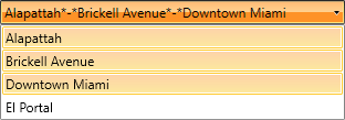
If RadComboBox is Editable, the MultipleSelectionSeparatorStringFormat will be applied only when the focus is not inside the input area of the control. If the input area is focused, only the MultipleSelectionSeparator will be applied and visualized.
SelectedItems
Using the SelectedItems property, you could get a collection of all the items that are currently selected - the property is read-only. This property is provided by the MultiSelector class that is inherited by RadComboBox.
To learn how to bind the SelectedItems collection to a property in your ViewModel, check out the SelectedItemsBinding SDK example.
When multiple selection is allowed the SelectedItem, SelectedValue and SelectedIndex properties are being set as explained below:
SelectedItem: The first item in the current selection that you could get or set. If there is no selection the returned value is null.
SelectedValue: It gets or sets the value of the SelectedItem that is obtained using the SelectedValuePath.
SelectedIndex: This is the index of the first item of the current selection. If the selection is empty, negative one (-1) is returned.
Commands
With multiple selection the following commands could be executed:
SelectAll
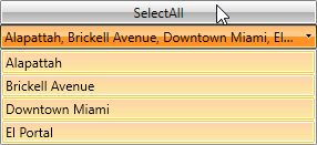
The SelectAll command is part of the static class RadComboBoxCommands. After executing it, all items in RadComboBox will be selected.
In Example 4 a Button is linked to the RadComboBoxCommands.SelectAll command - after execution all items in RadComboBox get selected:
Example 4: SelectAll command
<telerik:RadButton Content="SelectAll" Command="{x:Static telerik:RadComboBoxCommands.SelectAll}"
                CommandTarget="{Binding ElementName=radComboBox}"/>
<telerik:RadComboBox x:Name="radComboBox" AllowMultipleSelection="True">
    <telerik:RadComboBoxItem Content="Alapattah" />
    <telerik:RadComboBoxItem Content="Brickell Avenue" />
    <telerik:RadComboBoxItem Content="Downtown Miami" />
    <telerik:RadComboBoxItem Content="El Portal" />
</telerik:RadComboBox>
Figure 3: RadCombobBox after executing SelectAll command
UnselectAll
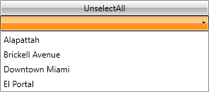
The UnselectAll command deselects all currently selected items - the command is part of the RadComboBoxCommands static class.
Example 5 demonstrates how UnselectAll command could be attached to the Command property of a Button.
Example 5: UnselectAll command
<telerik:RadButton Content="UnselectAll" Command="{x:Static telerik:RadComboBoxCommands.UnselectAll}"
                   CommandTarget="{Binding ElementName=radComboBox}"/>
<telerik:RadComboBox x:Name="radComboBox" AllowMultipleSelection="True">
    <telerik:RadComboBoxItem Content="Alapattah" />
    <telerik:RadComboBoxItem Content="Brickell Avenue" />
    <telerik:RadComboBoxItem Content="Downtown Miami" />
    <telerik:RadComboBoxItem Content="El Portal" />
</telerik:RadComboBox>
Figure 4: Before executing UnselectAll command
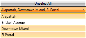
Figure 5: After executing UnselectAll command
ToggleSelectAll
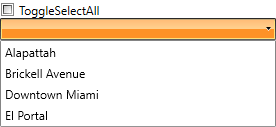
Using the ToggleSelectAll command, you could switch between selection and deselection of the items - it selects/deselects all of the items in the multiple selection RadComboBox depending on the command parameter.
Example 6 demonstrates how ToggleSelectAll command could be attached and executed through a CheckBox.
Example 6: ToggleSelectAll command
<CheckBox Content="ToggleSelectAll" Command="{x:Static telerik:RadComboBoxCommands.ToggleSelectAll}"
          CommandParameter="{Binding RelativeSource={RelativeSource Self}, Path=IsChecked}"
          CommandTarget="{Binding ElementName=radComboBox}"/>
<telerik:RadComboBox x:Name="radComboBox" AllowMultipleSelection="True">
    <telerik:RadComboBoxItem Content="Alapattah" />
    <telerik:RadComboBoxItem Content="Brickell Avenue" />
    <telerik:RadComboBoxItem Content="Downtown Miami" />
    <telerik:RadComboBoxItem Content="El Portal" />
</telerik:RadComboBox>
Figure 6: After checking the CheckBox with ToggleSelectAll command
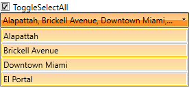
Figure 7: After unchecking the CheckBox with ToggleSelectAll command
MultipleSelectionBoxTemplate
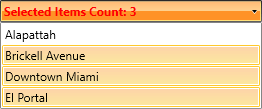
The MultipleSelectionBoxTemplate gives you the ability to define a separate template for the selected items of a Non-Editable RadComboBox when multiple selection is allowed.
The MultipleSelectionBoxTemplate is used only in a Non-Editable RadComboBox.
The following steps demonstrate how to apply the MultipleSelectionBoxTemplate to a RadComboBox.
You can create a custom DataTemplate as shown in Example 7.
Example 7: Custom DataTemplate
<UserControl.Resources>
    <DataTemplate x:Key="MultipleSelectionBoxTemplate">
        <TextBlock Text="{Binding ElementName=radComboBox, Path=SelectedItems.Count, StringFormat='Selected Items Count: {0}'}" Foreground="Red" FontWeight="Bold" />
    </DataTemplate>
</UserControl.Resources>
Example 8: Set the MultipleSelectionBoxTemplate
<telerik:RadComboBox x:Name="radComboBox" AllowMultipleSelection="True"
                 MultipleSelectionBoxTemplate="{StaticResource MultipleSelectionBoxTemplate}">
    <telerik:RadComboBoxItem Content="Alapattah" />
    <telerik:RadComboBoxItem Content="Brickell Avenue" />
    <telerik:RadComboBoxItem Content="Downtown Miami" />
    <telerik:RadComboBoxItem Content="El Portal" />
</telerik:RadComboBox>
Figure 8: RadComboBox after applying MultipleSelectionBoxTemplate
Keyboard support
CanKeyboardNavigationSelectItems has no affect when multiple selection is used.
This section describes the specific keyboard shortcuts used by RadComboBox when multiple selection is allowed.
Space: Selects the current highlighted item when RadComboBox is Non-Editable.
Enter: Selects the current highlighted item both when RadComboBox is Editable or Non-Editable.
Back: Deselects the current highlighted item when RadComboBox is Non-Editable.