Custom Item Style
This feature allows you to create a custom style and apply it to a number of chart items. The feature is represented by a delegate which should create and return the desired style. This allows you to create custom styles for the individual chart items depending on your custom logic. To learn more read on.
The delegate accepts four parameters:
Control item - represents the chart item that is currently processed. This could be either a derivative of the BaseChartItem ( Bar, Bubble, Pie, Stick, etc.), or a derivative of the SelfDrawingSeries ( LineSeries, SplineSeries, AreaSeries, SplineAreaSeries, etc). or a SeriesItemLabel, or a ChartLegendItem.
Style style - represents the style that would be applied to the respective chart item by default. You can use it to set the Style.BasedOn property of the style created by the delegate.
DataPoint dataPoint - represents the DataPoint associated with the processed chart item. Note that its value will be null if the chart item is of type SelfDrawingSeries.
DataSeries dataSeries - represents the DataSeries associated with the chart item.
To set the delegate you have to use the CreateItemStyleDelegate property. Here is an example of how to set it.
The Style style argument will have the following TargetType depending on the different values of the Control item argument:
BaseChartItem - Shape
SelfDrawingSeries - SelfDrawingSeries
SeriesItemLabel - SeriesitemLabel
ChartLegendItem - Path
public Sample()
{
    InitializeComponent();
    this.radChart.CreateItemStyleDelegate = this.BuildCustomItemStyle;
}
public Style BuildCustomItemStyle(Control item, Style style, DataPoint point, DataSeries dataSeries )
{
    Style newStyle = new Style();
    newStyle.BasedOn = style;
    return newStyle;
}
Public Sub New()
    InitializeComponent()
    Me.radChart.CreateItemStyleDelegate = AddressOf Me.BuildCustomItemStyle
End Sub
Public Function BuildCustomItemStyle(item As Control, style As Style, point As DataPoint, dataSeries As DataSeries) As Style
    Dim newStyle As New Style()
    newStyle.BasedOn = Style
    Return Style
End Function
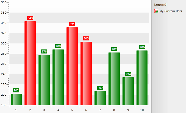
The following sample demonstrates a more complex logic inside the delegate - how to color the bars in a specific color, depending on their value. If the Bar's YValue is greater than 300 the Bar will be colored red, otherwise it should be green. Since changing the colors of the Bars won't affect their Labels (they will remain with the default color) another CustomItemStyle is used to color them accordingly. Finally the LegendItem's color is changed so that it corresponds to the Bar's colors.
public partial class MainPage : UserControl
{
    public MainPage()
    {
        InitializeComponent();
        int maxItems = 10;
        Random r = new Random();

        List<Company> sampleData = new List<Company>();

        for (int i = 0; i < maxItems; i++)
        {
            sampleData.Add(new Company(r.Next(200, 400)));
        }

        SeriesMapping seriesMapping = new SeriesMapping();
        seriesMapping.LegendLabel = "My Custom Bars";
        seriesMapping.SeriesDefinition = new BarSeriesDefinition();
        seriesMapping.ItemMappings.Add(new ItemMapping("PurchasePrice", DataPointMember.YValue));

        this.RadChart1.ItemsSource = sampleData;
        this.RadChart1.SeriesMappings.Add(seriesMapping);

        this.RadChart1.CreateItemStyleDelegate = BuildCustomItemStyle;

    }

    public class Company
    {
        public double PurchasePrice { get; set; }

        public Company(double price)
        {
            PurchasePrice = price;
        }
    }

    public Style BuildCustomItemStyle(Control item, Style style, DataPoint point, DataSeries dataSeries)
    {
        Style newStyle = new Style(style.TargetType);
        newStyle.BasedOn = style;
        Brush brush;

        if (item is BaseChartItem)
        {
            if (dataSeries[(item as BaseChartItem).CurrentIndex].YValue > 300)
            {
                brush = new SolidColorBrush(Colors.Red);
            }
            else
            {
                brush = new SolidColorBrush(Colors.Green);
            }
            newStyle.Setters.Add(new Setter(Shape.FillProperty, brush));
        }

        if (item is SeriesItemLabel)
        {
            if ((item as SeriesItemLabel).DataPoint.YValue > 300)
                brush = new SolidColorBrush(Colors.Red);
            else
                brush = new SolidColorBrush(Colors.Green);
            newStyle.Setters.Add(new Setter(SeriesItemLabel.FillProperty, brush));
            newStyle.Setters.Add(new Setter(SeriesItemLabel.StrokeProperty, brush));
        }
        if (item is ChartLegendItem)
        {
            brush = this.Resources["LegendItemStyle"] as Brush;
            newStyle.Setters.Add(new Setter(Path.FillProperty, brush));
        }

        return newStyle;
    }
}
Partial Public Class MainPage
    Inherits UserControl
    Public Sub New()
        InitializeComponent()
        Dim maxItems As Integer = 10
        Dim r As New Random()
        Dim sampleData As New List(Of Company)()
        For i As Integer = 0 To maxItems - 1
            sampleData.Add(New Company(r.Next(200, 400)))
        Next i
        Dim seriesMapping As New SeriesMapping()
        seriesMapping.LegendLabel = "My Custom Bars"
        seriesMapping.SeriesDefinition = New BarSeriesDefinition()
        seriesMapping.ItemMappings.Add(New ItemMapping("PurchasePrice", DataPointMember.YValue))
        RadChart1.ItemsSource = sampleData
        RadChart1.SeriesMappings.Add(seriesMapping)
        Me.RadChart1.CreateItemStyleDelegate = AddressOf BuildCustomItemStyle
    End Sub
    Public Class Company
        Public Property PurchasePrice() As Double
        Public Sub New(ByVal price As Double)
            PurchasePrice = price
        End Sub
    End Class
    Public Function BuildCustomItemStyle(ByVal item As Control, ByVal style As Style, ByVal point As DataPoint, ByVal dataSeries As DataSeries) As Style
        Dim newStyle As New Style(style.TargetType)
        newStyle.BasedOn = style
        Dim brush As Brush
        If TypeOf item Is BaseChartItem Then
            If dataSeries((TryCast(item, BaseChartItem)).CurrentIndex).YValue > 300 Then
                brush = New SolidColorBrush(Colors.Red)
            Else
                brush = New SolidColorBrush(Colors.Green)
            End If
            newStyle.Setters.Add(New Setter(Shape.FillProperty, brush))
        End If

        If TypeOf item Is SeriesItemLabel Then
            If (TryCast(item, SeriesItemLabel)).DataPoint.YValue > 300 Then
                brush = New SolidColorBrush(Colors.Red)
            Else
                brush = New SolidColorBrush(Colors.Green)
            End If
            newStyle.Setters.Add(New Setter(SeriesItemLabel.FillProperty, brush))
            newStyle.Setters.Add(New Setter(SeriesItemLabel.StrokeProperty, brush))
        End If
        If TypeOf item Is ChartLegendItem Then
            brush = TryCast(Me.Resources("LegendItemStyle"), Brush)
            newStyle.Setters.Add(New Setter(Path.FillProperty, brush))
        End If
        Return newStyle
    End Function
End Class
The LegendItemStyle used :
<LinearGradientBrush x:Key="LegendItemStyle" EndPoint="1,1" StartPoint="0,0">
<GradientStop Color="Red" Offset="0"/>
<GradientStop Color="Red" Offset="0.5"/>
<GradientStop Color="Green" Offset="0.51"/>
<GradientStop Color="Green" Offset="1"/>
</LinearGradientBrush>
The picture below demonstrates the result: