ToolTips
RadChart provides support for displaying tooltips when the mouse cursor hovers over the respective series items.
The tooltips are disabled by default but you can enable them by setting the SeriesDefinition.ShowItemToolTips to True. Moreover, you can enable the functionality for one series and disable it for another in the same chart area. Additionally, you can change the default tooltip format by using SeriesDefinition.ItemToolTipFormat property or you can completely customize the tooltip content by using the ChartArea.ItemToolTipOpening and ChartArea.ItemToolTipClosing events.
The example below shows candlestick chart bound to a collection of TradeData objects, where the TradeData object has the following structure:
public class TradeData
{
    public string Emission
    {
        get;
        set;
    }
    public DateTime FromDate
    {
        get;
        set;
    }
    public DateTime ToDate
    {
        get;
        set;
    }
    public double Open
    {
        get;
        set;
    }
    public double High
    {
        get;
        set;
    }
    public double Low
    {
        get;
        set;
    }
    public double Close
    {
        get;
        set;
    }
    public double Volume
    {
        get;
        set;
    }

    public static ObservableCollection<TradeData> GetWeeklyData( string code )
    {
        ObservableCollection<TradeData> tradeData;
        tradeData = new ObservableCollection<TradeData>() {
            new TradeData() { Emission="MSFT", FromDate = new DateTime( 2009, 8, 10 ), Open = 23.4600, High = 23.5500, Low = 23.3000, Close = 23.4200, Volume = 35258950 },
            new TradeData() { Emission="MSFT", FromDate = new DateTime( 2009, 8, 11 ), Open = 23.3200, High = 23.4000, Low = 23.0500, Close = 23.1300, Volume = 33611790 },
            new TradeData() { Emission="MSFT", FromDate = new DateTime( 2009, 8, 12 ), Open = 23.1300, High = 23.9000, Low = 23.0300, Close = 23.5300, Volume = 61936270 },
            new TradeData() { Emission="MSFT", FromDate = new DateTime( 2009, 8, 13 ), Open = 23.6300, High = 23.8500, Low = 23.4000, Close = 23.6200, Volume = 38951990 },
            new TradeData() { Emission="MSFT", FromDate = new DateTime( 2009, 8, 14 ), Open = 23.6200, High = 23.8000, Low = 23.5100, Close = 23.6900, Volume = 46328540 },
            new TradeData() { Emission="MSFT", FromDate = new DateTime( 2009, 8, 17 ), Open = 23.3200, High = 23.6000, Low = 23.2300, Close = 23.2500, Volume = 42462890 },
            new TradeData() { Emission="MSFT", FromDate = new DateTime( 2009, 8, 18 ), Open = 23.2900, High = 23.6520, Low = 23.2700, Close = 23.5800, Volume = 38831620 },
            new TradeData() { Emission="MSFT", FromDate = new DateTime( 2009, 8, 19 ), Open = 23.2500, High = 23.7200, Low = 23.2500, Close = 23.6500, Volume = 41814320 },
            new TradeData() { Emission="MSFT", FromDate = new DateTime( 2009, 8, 20 ), Open = 23.6000, High = 23.8700, Low = 23.5400, Close = 23.6700, Volume = 39502680 },
            new TradeData() { Emission="MSFT", FromDate = new DateTime( 2009, 8, 21 ), Open = 23.9300, High = 24.4200, Low = 23.7700, Close = 24.4100, Volume = 68995700},
            new TradeData() { Emission="MSFT", FromDate = new DateTime( 2009, 8, 24 ), Open = 24.4100, High = 24.7326, Low = 24.2800, Close = 24.6400, Volume = 54159300 },
            new TradeData() { Emission="MSFT", FromDate = new DateTime( 2009, 8, 25 ), Open = 24.6000, High = 24.8200, Low = 24.4600, Close = 24.6400, Volume = 43961480 },
            new TradeData() { Emission="MSFT", FromDate = new DateTime( 2009, 8, 26 ), Open = 24.5900, High = 24.7500, Low = 24.4200, Close = 24.5500, Volume = 41060010 },
            new TradeData() { Emission="MSFT", FromDate = new DateTime( 2009, 8, 27 ), Open = 24.4100, High = 24.7800, Low = 24.3000, Close = 24.6900, Volume = 45433940 },
            new TradeData() { Emission="MSFT", FromDate = new DateTime( 2009, 8, 28 ), Open = 25.0700, High = 25.4900, Low = 24.6100, Close = 24.6800, Volume = 55789640 },
            new TradeData() { Emission="MSFT", FromDate = new DateTime( 2009, 8, 31 ), Open = 24.5700, High = 24.8500, Low = 24.2900, Close = 24.6500, Volume = 49582950 },
            new TradeData() { Emission="MSFT", FromDate = new DateTime( 2009, 9, 1 ), Open = 24.3500, High = 24.7400, Low = 23.9000, Close = 24.0000, Volume = 62571800 },
            new TradeData() { Emission="MSFT", FromDate = new DateTime( 2009, 9, 2 ), Open = 23.8200, High = 24.1400, Low = 23.7800, Close = 23.8600, Volume = 40726040 },
            new TradeData() { Emission="MSFT", FromDate = new DateTime( 2009, 9, 3 ), Open = 23.9100, High = 24.1400, Low = 23.7600, Close = 24.1100, Volume = 34110810 },
            new TradeData() { Emission="MSFT", FromDate = new DateTime( 2009, 9, 4 ), Open = 24.0900, High = 24.8001, Low = 24.0800, Close = 24.6200, Volume = 44987570 },
            new TradeData() { Emission="MSFT", FromDate = new DateTime( 2009, 9, 8 ), Open = 24.6200, High = 24.8400, Low = 24.4100, Close = 24.8200, Volume = 52243880 } };
        return tradeData;
    }
}
Public Class TradeData
    Public Property Emission() As String
        Get
            Return m_Emission
        End Get
        Set(value As String)
            m_Emission = value
        End Set
    End Property
    Private m_Emission As String
    Public Property FromDate() As DateTime
        Get
            Return m_FromDate
        End Get
        Set(value As DateTime)
            m_FromDate = value
        End Set
    End Property
    Private m_FromDate As DateTime
    Public Property ToDate() As DateTime
        Get
            Return m_ToDate
        End Get
        Set(value As DateTime)
            m_ToDate = value
        End Set
    End Property
    Private m_ToDate As DateTime
    Public Property Open() As Double
        Get
            Return m_Open
        End Get
        Set(value As Double)
            m_Open = value
        End Set
    End Property
    Private m_Open As Double
    Public Property High() As Double
        Get
            Return m_High
        End Get
        Set(value As Double)
            m_High = value
        End Set
    End Property
    Private m_High As Double
    Public Property Low() As Double
        Get
            Return m_Low
        End Get
        Set(value As Double)
            m_Low = value
        End Set
    End Property
    Private m_Low As Double
    Public Property Close() As Double
        Get
            Return m_Close
        End Get
        Set(value As Double)
            m_Close = value
        End Set
    End Property
    Private m_Close As Double
    Public Property Volume() As Double
        Get
            Return m_Volume
        End Get
        Set(value As Double)
            m_Volume = value
        End Set
    End Property
    Private m_Volume As Double

    Public Shared Function GetWeeklyData(code As String) As ObservableCollection(Of TradeData)
        Dim tradeData As ObservableCollection(Of TradeData)
        tradeData = New ObservableCollection(Of TradeData)() From { _
            New TradeData() With { _
                .Emission = "MSFT", _
                .FromDate = New DateTime(2009, 8, 10), _
                .Open = 23.46, _
                .High = 23.55, _
                .Low = 23.3, _
                .Close = 23.42, _
                .Volume = 35258950 _
            }, _
            New TradeData() With { _
                .Emission = "MSFT", _
                .FromDate = New DateTime(2009, 8, 11), _
                .Open = 23.32, _
                .High = 23.4, _
                .Low = 23.05, _
                .Close = 23.13, _
                .Volume = 33611790 _
            }, _
            New TradeData() With { _
                .Emission = "MSFT", _
                .FromDate = New DateTime(2009, 8, 12), _
                .Open = 23.13, _
                .High = 23.9, _
                .Low = 23.03, _
                .Close = 23.53, _
                .Volume = 61936270 _
            }, _
            New TradeData() With { _
                .Emission = "MSFT", _
                .FromDate = New DateTime(2009, 8, 13), _
                .Open = 23.63, _
                .High = 23.85, _
                .Low = 23.4, _
                .Close = 23.62, _
                .Volume = 38951990 _
            }, _
            New TradeData() With { _
                .Emission = "MSFT", _
                .FromDate = New DateTime(2009, 8, 14), _
                .Open = 23.62, _
                .High = 23.8, _
                .Low = 23.51, _
                .Close = 23.69, _
                .Volume = 46328540 _
            }, _
            New TradeData() With { _
                .Emission = "MSFT", _
                .FromDate = New DateTime(2009, 8, 17), _
                .Open = 23.32, _
                .High = 23.6, _
                .Low = 23.23, _
                .Close = 23.25, _
                .Volume = 42462890 _
            }, _
            New TradeData() With { _
                .Emission = "MSFT", _
                .FromDate = New DateTime(2009, 8, 18), _
                .Open = 23.29, _
                .High = 23.652, _
                .Low = 23.27, _
                .Close = 23.58, _
                .Volume = 38831620 _
            }, _
            New TradeData() With { _
                .Emission = "MSFT", _
                .FromDate = New DateTime(2009, 8, 19), _
                .Open = 23.25, _
                .High = 23.72, _
                .Low = 23.25, _
                .Close = 23.65, _
                .Volume = 41814320 _
            }, _
            New TradeData() With { _
                .Emission = "MSFT", _
                .FromDate = New DateTime(2009, 8, 20), _
                .Open = 23.6, _
                .High = 23.87, _
                .Low = 23.54, _
                .Close = 23.67, _
                .Volume = 39502680 _
            }, _
            New TradeData() With { _
                .Emission = "MSFT", _
                .FromDate = New DateTime(2009, 8, 21), _
                .Open = 23.93, _
                .High = 24.42, _
                .Low = 23.77, _
                .Close = 24.41, _
                .Volume = 68995700 _
            }, _
            New TradeData() With { _
                .Emission = "MSFT", _
                .FromDate = New DateTime(2009, 8, 24), _
                .Open = 24.41, _
                .High = 24.7326, _
                .Low = 24.28, _
                .Close = 24.64, _
                .Volume = 54159300 _
            }, _
            New TradeData() With { _
                .Emission = "MSFT", _
                .FromDate = New DateTime(2009, 8, 25), _
                .Open = 24.6, _
                .High = 24.82, _
                .Low = 24.46, _
                .Close = 24.64, _
                .Volume = 43961480 _
            }, _
            New TradeData() With { _
                .Emission = "MSFT", _
                .FromDate = New DateTime(2009, 8, 26), _
                .Open = 24.59, _
                .High = 24.75, _
                .Low = 24.42, _
                .Close = 24.55, _
                .Volume = 41060010 _
            }, _
            New TradeData() With { _
                .Emission = "MSFT", _
                .FromDate = New DateTime(2009, 8, 27), _
                .Open = 24.41, _
                .High = 24.78, _
                .Low = 24.3, _
                .Close = 24.69, _
                .Volume = 45433940 _
            }, _
            New TradeData() With { _
                .Emission = "MSFT", _
                .FromDate = New DateTime(2009, 8, 28), _
                .Open = 25.07, _
                .High = 25.49, _
                .Low = 24.61, _
                .Close = 24.68, _
                .Volume = 55789640 _
            }, _
            New TradeData() With { _
                .Emission = "MSFT", _
                .FromDate = New DateTime(2009, 8, 31), _
                .Open = 24.57, _
                .High = 24.85, _
                .Low = 24.29, _
                .Close = 24.65, _
                .Volume = 49582950 _
            }, _
            New TradeData() With { _
                .Emission = "MSFT", _
                .FromDate = New DateTime(2009, 9, 1), _
                .Open = 24.35, _
                .High = 24.74, _
                .Low = 23.9, _
                .Close = 24.0, _
                .Volume = 62571800 _
            }, _
            New TradeData() With { _
                .Emission = "MSFT", _
                .FromDate = New DateTime(2009, 9, 2), _
                .Open = 23.82, _
                .High = 24.14, _
                .Low = 23.78, _
                .Close = 23.86, _
                .Volume = 40726040 _
            }, _
            New TradeData() With { _
                .Emission = "MSFT", _
                .FromDate = New DateTime(2009, 9, 3), _
                .Open = 23.91, _
                .High = 24.14, _
                .Low = 23.76, _
                .Close = 24.11, _
                .Volume = 34110810 _
            }, _
            New TradeData() With { _
                .Emission = "MSFT", _
                .FromDate = New DateTime(2009, 9, 4), _
                .Open = 24.09, _
                .High = 24.8001, _
                .Low = 24.08, _
                .Close = 24.62, _
                .Volume = 44987570 _
            }, _
            New TradeData() With { _
                .Emission = "MSFT", _
                .FromDate = New DateTime(2009, 9, 8), _
                .Open = 24.62, _
                .High = 24.84, _
                .Low = 24.41, _
                .Close = 24.82, _
                .Volume = 52243880 _
            } _
}
        Return tradeData
    End Function
End Class
You can set the ShowItemToolTips property to True declaratively or in the code-behind.
Note that ShowItemToolTips is a property of the SeriesMapping.SeriesDefinition, which means that you can control the tooltips for each series separately.
<telerik:RadChart x:Name="radChart">
    <telerik:RadChart.SeriesMappings>
        <telerik:SeriesMapping>
            <telerik:SeriesMapping.SeriesDefinition>
                <telerik:CandleStickSeriesDefinition ShowItemToolTips="True" />
            </telerik:SeriesMapping.SeriesDefinition>
            <telerik:SeriesMapping.ItemMappings>
                <telerik:ItemMapping DataPointMember="Open" FieldName="Open" />
                <telerik:ItemMapping DataPointMember="High" FieldName="High" />
                <telerik:ItemMapping DataPointMember="Low" FieldName="Low" />
                <telerik:ItemMapping DataPointMember="Close" FieldName="Close" />
            </telerik:SeriesMapping.ItemMappings>
        </telerik:SeriesMapping>
    </telerik:RadChart.SeriesMappings>
</telerik:RadChart>
On the snapshot below you can see the default tooltip for the CandleStick chart type:
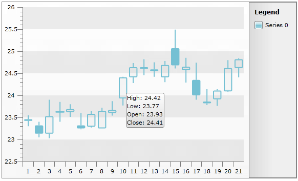
The default tooltip depends on the type of the RadChart:
The tooltip for Range charts shows DataPoint.High and DataPoint.Low values.
The tooltip for Stick and Candlestick charts shows DataPoint.High, DataPoint.Low, DataPoint.Open and DataPoint.Close values.
For all the other chart types, DataPoint.YValue is used.
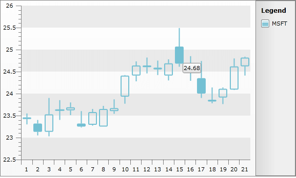
If the default tooltip does not fit your needs, you can use DataPoint.Tooltip to explicitly specify the exact tooltip text for each data series item. Notice that when DataPoint.Tooltip is set, RadChart will ignore the values set for ItemToolTipFormat.
You can also bind to DataPoint.Tooltip property, using SeriesMapping/ItemMapping with DataPointMember set to Tooltip. Below you can see how to bind the tooltip to the Close property of the underlying TradeData object:
<telerik:RadChart x:Name="radChart">
    <telerik:RadChart.SeriesMappings>
        <telerik:SeriesMapping>
            <telerik:SeriesMapping.SeriesDefinition>
                <telerik:CandleStickSeriesDefinition ItemToolTipFormat="Open: #OPEN{C4}" ShowItemToolTips="True" />
            </telerik:SeriesMapping.SeriesDefinition>
            <telerik:SeriesMapping.ItemMappings>
                <telerik:ItemMapping DataPointMember="Open" FieldName="Open" />
                <telerik:ItemMapping DataPointMember="High" FieldName="High" />
                <telerik:ItemMapping DataPointMember="Low" FieldName="Low" />
                <telerik:ItemMapping DataPointMember="Close" FieldName="Close" />
                <telerik:ItemMapping DataPointMember="Tooltip" FieldName="Close" />
            </telerik:SeriesMapping.ItemMappings>
        </telerik:SeriesMapping>
    </telerik:RadChart.SeriesMappings>
</telerik:RadChart>
And on the snapshot below you can see that the tooltip for each data point is taken directly from the Close property of the underlying TradeData, ignoring the value specified in ItemToolTipFormat.
Formatting the Tooltip
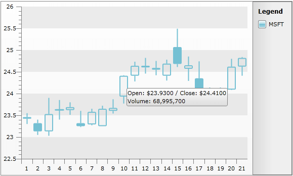
RadChart allows you to use Format Expressions to format the tooltip text. Use the SeriesDefinition.ItemToolTipFormat property to set the tooltip format for each data series. By using format expressions, you can also add some context data in the tooltip text using tokens.
For example, "#OPEN{0.0000}" means that the tooltip will take the value from the DataPoint.Open property and will format the value using "0.000". When the tooltip is shown, the open value will be formatted with four digits after the decimal point: "147.2746".
You can construct more complex tooltips combining several tokens, for example: "Open: #OPEN{C4}/Close: #CLOSE{C4}1 #DATAITEM.Volume{###,###,##0}". This format expression uses three tokens to obtain the values from the underlying DataPoint object's properties Open, Close and DataItem.Volume. For more about #DATAITEM token take a look at Format Expressions.
<telerik:RadChart x:Name="radChart">
<telerik:RadChart.SeriesMappings>
<telerik:SeriesMapping LegendLabel="MSFT">
<telerik:SeriesMapping.SeriesDefinition>
<telerik:CandleStickSeriesDefinition ItemToolTipFormat="Open: #OPEN{C4} / Close: #CLOSE{C4}
Volume: #DATAITEM.Volume{###,###,##0}" ShowItemToolTips="True" />
</telerik:SeriesMapping.SeriesDefinition>
<telerik:SeriesMapping.ItemMappings>
<telerik:ItemMapping DataPointMember="Open" FieldName="Open" />
<telerik:ItemMapping DataPointMember="High" FieldName="High" />
<telerik:ItemMapping DataPointMember="Low" FieldName="Low" />
<telerik:ItemMapping DataPointMember="Close" FieldName="Close" />
</telerik:SeriesMapping.ItemMappings>
</telerik:SeriesMapping>
</telerik:RadChart.SeriesMappings>
</telerik:RadChart>
RadChart radChart = new RadChart();
SeriesMapping seriesMapping = new SeriesMapping();
seriesMapping.SeriesDefinition = new CandleStickSeriesDefinition();
seriesMapping.SeriesDefinition.ShowItemToolTips = true;
seriesMapping.SeriesDefinition.ItemToolTipFormat = "Open: #OPEN{C4} / Close: #CLOSE{C4}\nVolume: #DATAITEM.Volume{###,###,##0}";
seriesMapping.ItemMappings.Add( new ItemMapping( "Open", DataPointMember.Open) );
seriesMapping.ItemMappings.Add( new ItemMapping( "High", DataPointMember.High) );
seriesMapping.ItemMappings.Add( new ItemMapping( "Low", DataPointMember.Low) );
seriesMapping.ItemMappings.Add( new ItemMapping( "Close", DataPointMember.Close) );
radChart.SeriesMappings.Add( seriesMapping );
Dim radChart As New Telerik.Windows.Controls.RadChart()
Dim seriesMapping As New SeriesMapping()
seriesMapping.SeriesDefinition = New CandleStickSeriesDefinition()
seriesMapping.SeriesDefinition.ShowItemToolTips = True
seriesMapping.SeriesDefinition.ItemToolTipFormat = "Open: #OPEN{C4} / Close: #CLOSE{C4}" & vbLf & "Volume: #DATAITEM.Volume{###,###,##0}"
seriesMapping.ItemMappings.Add(New ItemMapping("Open", DataPointMember.Open))
seriesMapping.ItemMappings.Add(New ItemMapping("High", DataPointMember.High))
seriesMapping.ItemMappings.Add(New ItemMapping("Low", DataPointMember.Low))
seriesMapping.ItemMappings.Add(New ItemMapping("Close", DataPointMember.Close))
radChart.SeriesMappings.Add(seriesMapping)
The snapshot below shows the customized tooltip:
If you need more information about label formatting take a look at the Format Expressions topic.
To be able to show the ToolTip content separated on new line in XAML you should use the hexidecimally encoded value " " to represent the "\n" literal.
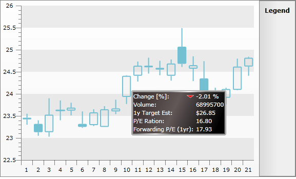
Customizing Tooltip Content
Expression formats are useful when the tooltip represents plain text messages. However, as a ContentControl you can completely customize its appearance using the two events exposed by ChartArea:
ChartArea.ItemToolTipOpening - use to define the content of the tooltip.
ChartArea.ItemToolTipClosing - use to clear any resources related to the shown tooltip.
The next example demonstrates how to use StockToolTipControl - a custom user control as a tooltip on a Candlestick chart. As a RadChart.ItemSource, a list of TradeData objects will be used (more about data binding you can find here).
Now, StockToolTipControl has to be created. It will show additional information in a grid:
<UserControl>
    <UserControl.Resources>
        <Style x:Key="textStyle" TargetType="TextBlock">
            <Setter Property="Foreground" Value="White" />
            <Setter Property="FontSize" Value="10.667" />
        </Style>
    </UserControl.Resources>
    <Border BorderThickness="2">
        <Grid x:Name="LayoutRoot">
            <Grid.ColumnDefinitions>
                <ColumnDefinition />
                <ColumnDefinition Width="Auto" />
            </Grid.ColumnDefinitions>
            <Grid.RowDefinitions>
                <RowDefinition Height="Auto" />
                <RowDefinition Height="Auto" />
                <RowDefinition Height="Auto" />
                <RowDefinition Height="Auto" />
                <RowDefinition Height="Auto" />
            </Grid.RowDefinitions>
            <TextBlock Grid.Row="0"
                       Grid.Column="0"
                       Style="{StaticResource textStyle}"
                       Text="Change [%]: " />
            <Path x:Name="arrow"
                  Grid.Row="0"
                  Grid.Column="0"
                  HorizontalAlignment="Right"
                  VerticalAlignment="Center"
                  Data="M0.000000,0.000000 L20.000000,0.000000 L10.000000,10.000000 z"
                  Fill="Red"
                  RenderTransformOrigin="0.5,0.5"
                  Stroke="White">
                <Path.RenderTransform>
                    <TransformGroup>
                        <ScaleTransform ScaleX="0.65" ScaleY="0.45" />
                        <SkewTransform />
                        <RotateTransform x:Name="rotateTransform" />
                        <TranslateTransform />
                    </TransformGroup>
                </Path.RenderTransform>
            </Path>
            <TextBlock x:Name="changeNetPercent"
                       Grid.Row="0"
                       Grid.Column="1"
                       Style="{StaticResource textStyle}"
                       Text="N/A" />
            <TextBlock Grid.Row="1"
                       Grid.Column="0"
                       Style="{StaticResource textStyle}"
                       Text="Volume:" />
            <TextBlock x:Name="volume"
                       Grid.Row="1"
                       Grid.Column="1"
                       Style="{StaticResource textStyle}"
                       Text="N/A" />
            <TextBlock Grid.Row="2"
                       Grid.Column="0"
                       Style="{StaticResource textStyle}"
                       Text="1y Target Est:" />
            <TextBlock x:Name="oneYearTargetEst"
                       Grid.Row="2"
                       Grid.Column="1"
                       Style="{StaticResource textStyle}"
                       Text="N/A" />
            <TextBlock Grid.Row="3"
                       Grid.Column="0"
                       Style="{StaticResource textStyle}"
                       Text="P/E Ration: " />
            <TextBlock x:Name="peRatio"
                       Grid.Row="3"
                       Grid.Column="1"
                       Style="{StaticResource textStyle}"
                       Text="N/A" />
            <TextBlock Grid.Row="4"
                       Grid.Column="0"
                       Style="{StaticResource textStyle}"
                       Text="Forwarding P/E (1yr): " />
            <TextBlock x:Name="forwardingPE"
                       Grid.Row="4"
                       Grid.Column="1"
                       Style="{StaticResource textStyle}"
                       Text="N/A" />
        </Grid>
    </Border>
</UserControl>
In the code-behind, there are a few properties - each one is setting the value of the appropriate text box:
public partial class StockToolTipControl : UserControl
{
    public StockToolTipControl()
    {
        InitializeComponent();
    }
    public double ChangeNetPercent
    {
        set
        {
            this.changeNetPercent.Text = value.ToString( "p" );
            this.arrow.Fill = new SolidColorBrush( value < 0.0 ? Colors.Red : Colors.Green );
            this.rotateTransform.Angle = value < 0.0 ? 0 : 180;
        }
    }
    public double Volume
    {
        set
        {
            this.volume.Text = value.ToString( ",##0" );
        }
    }
    public double OneYearTargetEst
    {
        set
        {
            this.oneYearTargetEst.Text = value.ToString( "C" );
        }
    }
    public double PERatio
    {
        set
        {
            this.peRatio.Text = value.ToString( "00.00" );
        }
    }
    public double ForwardingPE
    {
        set
        {
            this.forwardingPE.Text = value.ToString( "00.00" );
        }
    }
}
Partial Public Class StockToolTipControl
    Inherits UserControl
    Public Sub New()
        InitializeComponent()
    End Sub

    Public WriteOnly Property ChangeNetPercentProp() As Double
        Set(value As Double)
            Me.changeNetPercent.Text = value.ToString("p")
            Me.arrow.Fill = New SolidColorBrush(If(value < 0.0, Colors.Red, Colors.Green))
            Me.rotateTransform.Angle = If(value < 0.0, 0, 180)
        End Set
    End Property
    Public WriteOnly Property VolumeProp() As Double
        Set(value As Double)
            Me.volume.Text = value.ToString(",##0")
        End Set
    End Property
    Public WriteOnly Property OneYearTargetEstProp() As Double
        Set(value As Double)
            Me.oneYearTargetEst.Text = value.ToString("C")
        End Set
    End Property
    Public WriteOnly Property PERatioProp() As Double
        Set(value As Double)
            Me.peRatio.Text = value.ToString("00.00")
        End Set
    End Property
    Public WriteOnly Property ForwardingPEProp() As Double
        Set(value As Double)
            Me.forwardingPE.Text = value.ToString("00.00")
        End Set
    End Property
End Class
You can play with the colors to give the control a better look and feel.The next step is to assign an event handler to the ChartArea.ItemToolTipOpening event:
<!--  Custom tooltip  -->
<telerik:RadChart x:Name="radChart">
    <telerik:RadChart.DefaultView>
        <telerik:ChartDefaultView>
            <telerik:ChartDefaultView.ChartArea>
                <telerik:ChartArea ItemToolTipOpening="ChartArea_ItemToolTipOpening" />
            </telerik:ChartDefaultView.ChartArea>
        </telerik:ChartDefaultView>
    </telerik:RadChart.DefaultView>
    <telerik:RadChart.SeriesMappings>
        <telerik:SeriesMapping LegendLabel="MSFT">
            <telerik:SeriesMapping.SeriesDefinition>
                <telerik:CandleStickSeriesDefinition ShowItemToolTips="True" />
            </telerik:SeriesMapping.SeriesDefinition>
            <telerik:SeriesMapping.ItemMappings>
                <telerik:ItemMapping DataPointMember="Open" FieldName="Open" />
                <telerik:ItemMapping DataPointMember="High" FieldName="High" />
                <telerik:ItemMapping DataPointMember="Low" FieldName="Low" />
                <telerik:ItemMapping DataPointMember="Close" FieldName="Close" />
            </telerik:SeriesMapping.ItemMappings>
        </telerik:SeriesMapping>
    </telerik:RadChart.SeriesMappings>
</telerik:RadChart>
ItemToolTipOpening event handler has two parameters:
ItemToolTip2D tooltip - the tooltip control to customize.
ItemToolTipEventArgs e - event arguments from where you can take the DataPoint for which the tooltip has to be shown.
The final step is to create a new instance of the StockToolTipControl and to initialize its properties. ItemToolTipEventArgs.DataPoint.DataItem has to be used. It holds the TradingData object associated to this DataPoint:
private void ChartArea_ItemToolTipOpening(ItemToolTip2D tooltip, ItemToolTipEventArgs e)
{
    TradeData tradeData = e.DataPoint.DataItem as TradeData;
    StockToolTipControl stockToolTip = new StockToolTipControl();
    stockToolTip.ChangeNetPercent = 1 - (tradeData.Close / tradeData.Open);
    stockToolTip.Volume = tradeData.Volume;
    //The next three properties shows some fictional data to illustrate the idea
    stockToolTip.OneYearTargetEst = tradeData.Close * 1.1;
    stockToolTip.PERatio = 16.80;
    stockToolTip.ForwardingPE = 17.93;
    tooltip.Content = stockToolTip;
}
Private Sub ChartArea_ItemToolTipOpening(ByVal tooltip As ItemToolTip2D, ByVal e As ItemToolTipEventArgs)
    Dim tradeData As TradeData = TryCast(e.DataPoint.DataItem, TradeData)
    Dim stockToolTip As New StockToolTipControl()
    stockToolTip.ChangeNetPercentProp = 1 - (tradeData.Close / tradeData.Open)
    stockToolTip.VolumeProp = tradeData.Volume
    ' The next three properties shows some fictional data to illustrate the idea'
    stockToolTip.OneYearTargetEstProp = tradeData.Close * 1.1
    stockToolTip.PERatioProp = 16.8R
    stockToolTip.ForwardingPEProp = 17.93

    tooltip.Content = stockToolTip
End Sub
As you can see, the new instance of StockToolTipControl is created, initialized and set to toolTip.Content:
Check out how a Drill Down Chart is created using customized tooltip.