Decorations
Decorations
RadCalendar control allows custom decorations to be applied by setting the following properties:
-
GridLinesVisibility: Gets or sets the value of GridLinesVisibility property that defines which grid lines are currently visible (displayed).
- Both (default): Both horizontal and vertical grid lines are visible.
- Horizontal: Only the horizontal grid lines are visible.
- Vertical: Only the vertical grid lines are visible.
- None: No grid lines are visible.
- GridLinesThickness: Gets or sets the thickness of the calendar grid lines.
- GridLinesBrush: Gets or sets the Brush value that defines the appearance of calendar grid lines.
- Background: Gets or sets the Brush value that defines the background of the calendar grid.
- BorderBrush: Gets or sets the Brush value that defines the border of the calendar.
- BorderThickness: Gets or sets the thickness of the calendar border brush.
Example
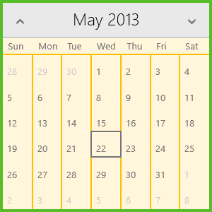
Here is an example of using custom values for the described properties:

And this is the XAML definition:
<telerik:RadCalendar GridLinesVisibility="Vertical"
                     GridLinesBrush="#FFBF00"
                     GridLinesThickness="2"
                     Background="#FFF6DB"
                     BorderBrush="#38AD02"
                     BorderThickness="4"
                     />