Selection
This article describes the selection API exposed by RadTreeView. The control allows you to change the selection mode, to set and get the selection and managing the selection process using events.
- Manual item selection
- Selecting an item via the SelectedItems collection
- Changing the selection mode
- Accessing the selected items
- Events
- Using the SelectedItem, SelectedValue and SelectedValuePath properties
- Binding the IsSelected property
- Binding the IsSelectable property
Manual item selection
You can select a RadTreeViewItem by setting its IsSelected to True.
Example 1: Setting IsSelected in XAML
<telerik:RadTreeViewItem x:Name="radTreeViewItem" IsSelected="True"/>
Example 2: Setting IsSelected in code
radTreeViewItem.IsSelected = true;
radTreeViewItem.IsSelected = True
Note that the code snippets above cover a scenario when the RadTreeView is populated declaratively (with static data). If you want to bind the IsSelected property to a property of a custom business object, check out the Binding the IsSelected Property section at the end of this topic.
Selecting an Item by Using the SelectedItems Collection
Another way to select a treeview item programmatically is to add it in the SelectedItems collection of RadTreeView. There are two possible cases here depending on how the RadTreeView is populated.
-
If RadTreeView is populated in XAML (with static data), then the SelectedItems collection will contain instances of the RadTreeViewItem class.
Example 3: Adding RadTreeViewItem in the SelectedItems collection
radTreeView.SelectedItems.Add( radTreeViewItem );radTreeView.SelectedItems.Add(radTreeViewItem) -
If RadTreeView is data bound to a business object, then the SelectedItems collection will contain instances of the custom business object.
Example 4: Adding a business object in the SelectedItems collection
radTreeView.SelectedItems.Add( myViewModel );radTreeView.SelectedItems.Add(myViewModel)
Changing the Selection Mode
The RadTreeView API allows you to change the selection mode. You can do that via the SelectionMode property. The property is a Telerik.Windows.Controls.SelectionMode enumeration that exposes the following members:
Single: In this mode the user will be able to select only one item at once.
Multiple: This mode allows selection of multiple items. Clicking an item selects or deselects it depending on its current state. Also, the previously selected items will preserve their selection state.
-
Extended: This mode allows the user to select multiple items at once by holding down the Ctrl or Shift keys and clicking multiple items with the mouse or by using the keyboard. A second click on a selected item will unselect that item.
Until Q3 2015 Multiple and Extended SelectionModes worked the same way.
Example 5: Setting SelectionMode in XAML
<telerik:RadTreeView x:Name="radTreeView" SelectionMode="Multiple">
Example 6: Setting SelectionMode in code
private void ChangeSelectionMode()
{
    radTreeView.SelectionMode = Telerik.Windows.Controls.SelectionMode.Multiple;
}
Private Sub ChangeSelectionMode()
    radTreeView.SelectionMode = Telerik.Windows.Controls.SelectionMode.Multiple
End Sub
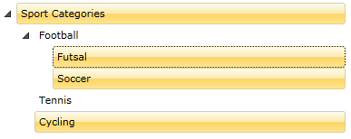
As you can see in Figure 1, when the SelectionMode is set to Multiple you are able to select more than one item.
Figure 1: Multiple selection enabled
The default selection mode of the RadTreeView is Single.
Accessing the Selected Items
The RadTreeView class exposes several properties that allow you to access the currently selected item(s).
- SelectedItem: The currently selected item. In a multiple selection scenario the property will hold the first selected item.
- SelectedItems: A collection representing the currently selected items. It is appropriate to use the SelectedItems property when you have multiple selected items. SelectedItems is an ObservableCollection of objects.
-
SelectedContainer: Gets the current selected item container. This property is always of type RadTreeViewItem.
The SelectedItem and SelectedItems properties will contain different objects depending on the scenario.
If RadTreeView is populated declaratively with RadTreeViewItems the SelectedItem and SelectedContainer properties will return objects of type RadTreeViewItem. The SelectedItems collection also contains RadTreeViewItems.
If RadTreeView is data bound to a business object the SelectedItem property will contain an instance of the custom business object. The SelectedItems collection will also contain instances of the business object. In this case, the SelectedContainer property still returns RadTreeViewItem.
When you have multiple selected items, the SelectedItem property will return the first selected item in the treeview.
When you reset the RadTreeView's Items collection (when you invoke the RadTreeView.Items.Clear() method), that will also clear the SelectedItems collection.
The RadTreeView class inherits from ItemsControl. The Items collection of the ItemsControl is a collection of data objects, not of RadTreeViewItems. There is a very important concept about the items and item containers. For more information read here.
Each ItemsControl provides two additional properties for working with selection - SelectedValue and SelectedValuePath. If want to learn how to use these two properties, please check out the Using SelectedItem, SelectedValue and SelectedValuePath section at the end of this topic.
Events
RadTreeView and RadTreeViewItem classes have several events for managing the selection process.
Example 7: RadTreeView selection events
<telerik:RadTreeView x:Name="radTreeView"
        PreviewSelected="radTreeView_PreviewSelected"
        Selected="radTreeView_Selected"
        PreviewUnselected="radTreeView_PreviewUnselected"
        Unselected="radTreeView_Unselected"
        PreviewSelectionChanged="radTreeView_PreviewSelectionChanged"
        SelectionChanged="radTreeView_SelectionChanged"/>
The PreviewSelected event occurs when the treeview item is about to be selected. The Selected event is fired when the treeview item is already selected. The type of the passed event arguments for both of the events is RadRoutedEventArgs. In the event handlers you can place some code.
Example 8: Setting the FontSize of the selected RadTreeViewItem
private void radTreeView_Selected( object sender, RadRoutedEventArgs e )
{
    ( e.Source as RadTreeViewItem ).FontSize = 14;
}
Private Sub radTreeView_Selected(ByVal sender As Object, ByVal e As RadRoutedEventArgs)
    TryCast(e.Source, RadTreeViewItem).FontSize = 14
End Sub
Note that the e.Source property in Example 8 from the event arguments will have a different value depending on if the RadTreeView is bound. In Example 8 the e.Source property will be of type RadTreeViewitem if the RadTreeView is not data-bound (the RadTreeViewItem is declared in XAML or added in code). When we bind the control the e.Source property will be the RadTreeView. In this case, you can utilize the PreviewSelectionChanged and SelectionChanged events of the RadTreeView, explained below.
The PreviewUnselected event is fired just before the currently selected item is unselected. The Unselected event occurs when the treeview item is already unselected. The type of the passed event arguments for both of the events is RadRoutedEventArgs.
In order to handle a change in the selection you can use the PreviewSelectionChanged or the SelectionChanged event. They are available only in the RadTreeView class. The events are fired each time an item or multiple items are added/removed from the selection. The type of the passed event arguments for the event is SelectionChangedEventArgs.
Example 9: Working with the SelectionChanged event arguments
private void radTreeView_SelectionChanged( object sender, Telerik.Windows.Controls.SelectionChangedEventArgs e )
{
    // Get a reference to the treeview
    Telerik.Windows.Controls.RadTreeView treeView = sender as Telerik.Windows.Controls.RadTreeView;

    // Get the currently selected items
    ObservableCollection<Object> selectedItems = treeView.SelectedItems;
    // Get the newly added items to the collection
    IList addedItems = e.AddedItems;
    // Get the removed items from the collection
    IList removedItems = e.RemovedItems;
}
Private Sub radTreeView_SelectionChanged(ByVal sender As Object, ByVal e As Telerik.Windows.Controls.SelectionChangedEventArgs)
    ' Get a reference to the treeview '
    Dim treeView As Telerik.Windows.Controls.RadTreeView = TryCast(sender, Telerik.Windows.Controls.RadTreeView)

    ' Get the currently selected items '
    Dim selectedItems As ObservableCollection(Of [Object]) = treeView.SelectedItems

    ' Get the newly added items to the collection '
    Dim addedItems As IList = e.AddedItems

    ' Get the removed items from the collection '
    Dim removedItems As IList = e.RemovedItems
End Sub
Four out of the six events (PreviewSelected, Selected, PreviewUnselected and Unselected) are exposed by both RadTreeView and RadTreeViewItem classes. While the SelectionChanged and PreviewSelectionChanged events are available only in the RadTreeView class.
Handling the PreviewSelected or PreviewSelectionChanged events will cancel the selection. To do this you can set the event arguments' Handled property to True.
Using the SelectedItem, SelectedValue and SelectedValuePath Properties
The SelectedValue property is used when you have linked your RadTreeView to a data source and you want to return a value other than the one that is displayed.
The SelectedValuePath property provides a way to specify a SelectedValue for the SelectedItem in a RadTreeView.
The SelectedItem represents an object from the Items collection and the RadTreeView displays the value of a single property of the selected item. The SelectedValuePath property specifies the path to the property that is used to determine the value of the SelectedValue property. The next example illustrates this concept.
Imagine that you have a business object named MyViewModel, with three members (properties): Title, Price and Children. And a RadTreeView that is data bound to a list of MyViewModel objects. The Title property is the property that is displayed. The Price is set to the SelectedValuePath property.
Example 10: Defining business object's model
private class MyViewModel
{
    public string Title { get; set; }
    public string Price { get; set; }
    public IList<MyViewModel> Children { get; set; }
}
Private Class MyViewModel
Private _Title As String
    Public Property Title() As String
        Get
            Return _Title
        End Get
        Set(ByVal value As String)
            _Title = value
        End Set
    End Property

Private _Price As String
    Public Property Price() As String
        Get
            Return _Price
        End Get
        Set(ByVal value As String)
            _Price = value
        End Set
    End Property

Private _Children As IList(Of MyViewModel)
    Public Property Children() As IList(Of MyViewModel)
        Get
            Return _Children
        End Get
        Set(ByVal value As IList(Of MyViewModel))
            _Children = value
        End Set
    End Property
End Class
Example 11: Setting SelectedValuePath
<telerik:RadTreeView x:Name="radTreeView" SelectedValuePath="Price">
    <telerik:RadTreeView.ItemTemplate>
        <telerik:HierarchicalDataTemplate ItemsSource="{Binding RelatedItems}">
            <TextBlock Text="{Binding Title}" />
        </telerik:HierarchicalDataTemplate>
    </telerik:RadTreeView.ItemTemplate>
</telerik:RadTreeView>
When you select a MyViewModel.Title from the RadTreeView, the SelectedItem property returns the MyViewModel data item that corresponds to the selected Title. However, because the SelectedValuePath of this RadTreeView is set to the MyViewModel's Price property, the SelectedValue will return the Price property of the MyViewModel business object (e.g. 101.56$).
Binding the IsSelected Property
A very common scenario is to have the RadTreeViewItem's IsSelected property bound to a property of a custom business object. The easiest way to achieve this is to use the ItemContainerStyle property of RadTreeView or an implicit style that targets RadTreeViewItem.
Let's use the following example. There is a business object that defines a boolean property named IsSelected and we want to bind it to the IsSelected property of RadTreeViewItem. In this case we can define a Style and set its TargetType to RadTreeViewItem. And then bind the IsSelected property as demonstrated in Example 12.
Example 12: Setting ItemContainerStyle
<Style x:Key="ItemContainerStyle" TargetType="telerik:RadTreeViewItem">
    <Setter Property="IsSelected" Value="{Binding IsSelected, Mode=TwoWay}"/>
</Style>
<!-- -->
<telerik:RadTreeView ItemContainerStyle="{StaticResource ItemContainerStyle}"/>
If you remove the x:Key setting of the style, it will become an implicit style. This means that it will be applied globally to all RadTreeViewItems in the scope where the style is defined. In this case you will also need to remove the ItemContainerStyle setting.
Binding the IsSelectable property
RadTreeViewItem provides the option to control whether the item can be selected through the UI or not. This is done through its IsSelectable property. Similarly to the previous example, the IsSelectable property can be set through a Style targeting RadTreeViewItem.
Example 13: Binding the IsSelectable property
<Style x:Key="ItemContainerStyle" TargetType="telerik:RadTreeViewItem">
    <Setter Property="IsSelectable" Value="{Binding IsSelectable}"/>
</Style>
<!-- -->
<telerik:RadTreeView ItemContainerStyle="{StaticResource ItemContainerStyle}"/>
The IsSelectable property is available since the R3 2018 version.
Performing Selection on the MouseLeftButtonUp Event
RadTreeView exposes the PerformSelectionOnMouseUp property that allows you to specify if the selection will be executed on the MouseLeftButtonUp or the MoseLeftButtonDown event. The default value of this property is False. Setting the PerformSelectionOnMouseUp property to True will execute the selection logic on the MouseLeftButtonUp event.
Example 14: Setting the PerformSelectionOnMouseUp property
<telerik:RadTreeView PerformSelectionOnMouseUp="True"/>