Sparkline Types
The sparkline suite contains several controls that provide different visualization for the plotted data. See how to set up those in the Getting Started article.
-
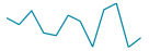
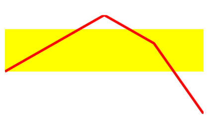
Line: You can display the data as a set of points connected by a line via the RadLinearSparkline control.
-
Scatter point: You can display the data as a set of points via the RadScatterSparkline control.

-
Area: You can display the data as a set of points connected by a line forming a colored area via the RadAreaSparkline control.

-
Column: You can display the data as a set of columns (bars) via the RadColumnSparkline control.

-
Win/Loss: You can display the data as a set of equally sized columns (bars) that indicate positive/negative values, via the RadColumnSparkline control.

Type-Specific Properties
This section will go over the properties that are specific for each type of sparkline. For the purposes of the next examples, we will setup the model and viewmodel shown in Example 1.
Example 1: Setting up the model and viewmodel
public class MyCost
{
    public double Cost { get; set; }
    public double UnitCost { get; set; }
}

public class ViewModel
{
    private ObservableCollection<MyCost> costs;

    public ObservableCollection<MyCost> Costs
    {
        get
        {
            if (this.costs == null)
            {
                this.costs = new ObservableCollection<MyCost>()
                            {
                                new MyCost() { Cost = 1, UnitCost = 2},
                                new MyCost() { Cost = 2, UnitCost = 4},
                                new MyCost() { Cost = 3, UnitCost = 6 },
                                new MyCost() { Cost = 4, UnitCost = 4},
                                new MyCost() { Cost = 5, UnitCost = -1},
                            };
            }

            return this.costs;
        }
    }
}
Public Class MyCost
    Public Property Cost() As Double
    Public Property UnitCost() As Double
End Class

Public Class ViewModel
    Private _costs As ObservableCollection(Of MyCost)

    Public ReadOnly Property Costs() As ObservableCollection(Of MyCost)
        Get
            If Me._costs Is Nothing Then
                Me._costs = New ObservableCollection(Of MyCost)() From {
                    New MyCost() With {
                        .Cost = 1,
                        .UnitCost = 2
                    },
                    New MyCost() With {
                        .Cost = 2,
                        .UnitCost = 4
                    },
                    New MyCost() With {
                        .Cost = 3,
                        .UnitCost = 6
                    },
                    New MyCost() With {
                        .Cost = 4,
                        .UnitCost = 4
                    },
                    New MyCost() With {
                        .Cost = 5,
                        .UnitCost = -1
                    }
                }
            End If

            Return Me._costs
        End Get
    End Property
End Class
RadLinearSparkline
- ShowNormalRange: A boolean property indicating whether or not to display a rectangle indicating what is the normal range for the displayed values. In order for the normal range to be displayed, you have to set the NormalRangeTop and NormalRangeBottom properties as well.
- NormalRangeTop: The value used as the top of the normal range.
- NormalRangeBottom: The value used as the bottom of the normal range.
- NormalRangeFill: The brush used as the fill of the normal range.
- LineStroke: The brush used for the line representing the data.
- LineShapeStyle: The style, which will be applied to the line. The TargetType of the Style should be Polyline.
If the Stroke property is set through the LineShapeStyle along with the LineStroke property, the value of the LineStroke property will be respected.
Example 2: Setting up the RadLinearSparkline
<Grid>
    <Grid.DataContext>
        <local:ViewModel />
    </Grid.DataContext>
    <Grid.Resources>
        <Style x:Key="LineShapeStyle" TargetType="Polyline">
            <Setter Property="StrokeThickness" Value="5" />
        </Style>
    </Grid.Resources>

    <telerik:RadLinearSparkline Width="400"
                                Height="200"
                                ItemsSource="{Binding Costs}"
                                ShowNormalRange="True"
                                NormalRangeTop="5"
                                NormalRangeBottom="2"
                                NormalRangeFill="Yellow"
                                LineStroke="Red"
                                LineShapeStyle="{StaticResource LineShapeStyle}"
                                XValuePath="Cost"
                                YValuePath="UnitCost" />
</Grid>
Figure 1: Result from Example 2
RadScatterSparkline
- ShowNormalRange: A boolean property indicating whether or not to display a rectangle indicating what is the normal range for the displayed values. In order for the normal range to be displayed, you have to set the NormalRangeTop and NormalRangeBottom properties as well.
- NormalRangeTop: The value used as the top of the normal range.
- NormalRangeBottom: The value used as the bottom of the normal range.
- NormalRangeFill: The brush used as the fill of the normal range.
- ItemFill: The brush that will be used for the fill of the ellipses representing the data.
- ItemStyle: This property allows you to apply a style for the items representing the data. The TargetType of the Style should be telerik:ScatterItem. Use this property, if you want to change the shape with which the data points are visualized.
Example 3: Setting up the RadScatterSparkline
<Grid>
    <Grid.DataContext>
        <local:ViewModel />
    </Grid.DataContext>
    <Grid.Resources>
        <Style x:Key="ItemStyle" TargetType="telerik:ScatterItem">
            <Setter Property="Template">
                <Setter.Value>
                    <ControlTemplate TargetType="telerik:ScatterItem">
                        <Rectangle Fill="{TemplateBinding Fill}"
                        Height="15" Width="15"  />
                    </ControlTemplate>
                </Setter.Value>
            </Setter>
        </Style>
    </Grid.Resources>

    <!-- Set the ItemStyle property, if you want to change how the data points are represented-->
    <!-- ItemStyle="{StaticResource ItemStyle}" -->
    <telerik:RadScatterSparkline Width="400"
                                 Height="100"
                                 ItemsSource="{Binding Costs}"
                                 ShowNormalRange="True"
                                 NormalRangeTop="5"
                                 NormalRangeBottom="2"
                                 NormalRangeFill="Yellow"
                                 ItemFill="Red"
                                 XValuePath="Cost"
                                 YValuePath="UnitCost" />
</Grid>
Figure 2: Result from Example 3
RadAreaSparkline
- PositiveAreaFill: The brush that will be used for the fill of the positive part of the data.
- PositiveAreaStroke: The brush that will be used for the line surrounding the positive part of the data.
- PositiveLineShapeStyle: The style that will be applied to the polyline surrounding the positive part of the data. The TargetType of this style should be Polyline.
- PositiveAreaShapeStyle: The style that will be applied to the shape representing the positive part of the data. The TargetType of this style should be Polyline.
- NegativeAreaFill: The brush that will be used for the fill of the negative part of the data.
- NegativeAreaStroke: The brush that will be used for the line surrounding the negative part of the data.
- NegativeLineShapeStyle: The style that will be applied to the polyline surrounding the negative part of the data. The TargetType of this style should be Polyline.
- NegativeAreaShapeStyle: The style that will be applied to the shape representing the negative part of the data. The TargetType of this style should be Polyline.
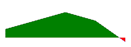
Example 4: Setting up the RadAreaSparkline
<Grid>
    <Grid.DataContext>
        <local:ViewModel />
    </Grid.DataContext>
    <Grid.Resources>
        <Style x:Key="PositiveLineShapeStyle" TargetType="Polyline">
            <Setter Property="StrokeDashArray" Value="5" />
        </Style>
        <Style x:Key="NegativeLineShapeStyle" TargetType="Polyline">
            <Setter Property="StrokeDashArray" Value="5" />
        </Style>
    </Grid.Resources>

    <telerik:RadAreaSparkline Width="400"
                              Height="100"
                              ItemsSource="{Binding Costs}"
                              PositiveAreaFill="Green"
                              PositiveAreaStroke="Black"
                              PositiveLineShapeStyle="{StaticResource PositiveLineShapeStyle}"
                              NegativeAreaFill="Red"
                              NegativeAreaStroke="Blue"
                              NegativeLineShapeStyle="{StaticResource NegativeLineShapeStyle}"
                              XValuePath="Cost"
                              YValuePath="UnitCost" />
</Grid>
Figure 3: Result from Example 4
RadColumnSparkline
- ColumnLayoutMode: Determines how the column representing the data points will be positioned. Takes a ColumnLayoutMode as a value.
- ColumnWidthPercent: Specifies how much of the allocated space will the columns take. The space available for one column is calculated by dividing the entire space by the number of items.
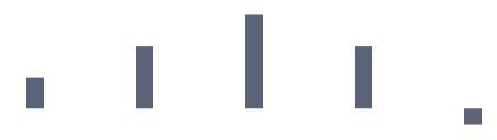
Example 5: Setting up the RadColumnSparkline
<Grid>
    <Grid.DataContext>
        <local:ViewModel />
    </Grid.DataContext>

    <telerik:RadColumnSparkline Width="400"
                                Height="100"
                                ItemsSource="{Binding Costs}"
                                ColumnLayoutMode="Normal"
                                ColumnWidthPercent="0.2"
                                XValuePath="Cost"
                                YValuePath="UnitCost" />
</Grid>
Figure 4: Result from Example 5