Indicators
The controls from the RadSparkline suite support several types of indicators which can be used to highlight the plotted data.
Markers
The markers are visual indicators showing the location of each data point along the graph line. This setting is applicable to sparkline controls deriving from RadLinearSparklineBase - RadLinearSparkline and RadAreaSparkline. To enable the markers set the ShowMarkers property to True.
Example 1: Show markers of RadLinearSparkline in XAML
<telerik:RadLinearSparkline ShowMarkers="True" />
Example 2: Show markers of RadLinearSparkline in code
this.sparklineControl.ShowMarkers = true;
Figure 1: RadLinearSparkline and RadAreaSparkline with shown markers

You can change the color of the marker via the MarkersBrush property.
The markers can be customized via the MarkersStyle property of the control.
Example 3: Setting MarkersStyle
<telerik:RadLinearSparkline.MarkersStyle>
    <Style TargetType="telerik:IndicatorItem">
        <Setter Property="telerik:RadToolTipService.ToolTipContent" Value="{Binding DataItem}" />
        <Setter Property="Template">
            <Setter.Value>
                <ControlTemplate TargetType="telerik:IndicatorItem">
                    <Rectangle Fill="{TemplateBinding Fill}" Width="10" Height="10" />
                </ControlTemplate>
            </Setter.Value>
        </Setter>
    </Style>
</telerik:RadLinearSparkline.MarkersStyle>
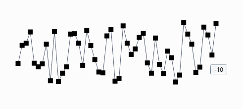
Figure 2: RadLinearSparkline with custom MarkersStyle
High Point
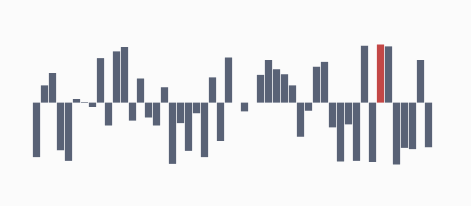
This is a visual indicator which highlights the single highest-value datapoint in a series. In case there is more than one high point, all such points are highlighted. If the spark line is of type RadColumnSparkline or RadWinLossSparkLine, the bar which represents the highest value is highlighted. The highpoint is enabled by setting the ShowHighPointIndicator property to True.
Example 4: Show high point indicator of RadColumnSparkline in XAML
<telerik:RadColumnSparkline ShowHighPointIndicators="True" />
Example 5: Show high point indicator of RadColumnSparkline in code
this.sparklineControl.ShowHighPointIndicators = true;
Figure 3: RadColumnSparkline with shown high point indicator
You can change the color of the high point indicator via the HighPointBrush property.
You can customize the appearance of the data point via the HighPointStyle property.
Example 6: Setting HighPointStyle
<telerik:RadColumnSparkline.HighPointStyle>
    <Style TargetType="telerik:Column">
        <Setter Property="Opacity" Value="0.5" />
    </Style>
</telerik:RadColumnSparkline.HighPointStyle>
Figure 4: RadColumnSparkline with custom HighPointStyle

Low Point
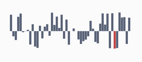
This is a visual indicator which highlights the single lowest-value datapoint in a series. In case there is more than one such point, all similar points are highlighted. If the spark line is of type RadColumnSparkline or RadWinLossSparkLine, the bar which represents the lowest value is highlighted. The low point is enabled by setting the ShowLowPointIndicator property to True.
Example 7: Show low point indicator of RadColumnSparkline in XAML
<telerik:RadColumnSparkline ShowLowPointIndicators="True" />
Example 8: Show low point indicator of RadColumnSparkline in code
this.sparklineControl.ShowLowPointIndicators = true;
Figure 5: RadColumnSparkline with shown low point indicator
You can change the color of the low point indicator via the LowPointBrush property.
You can customize the appearance of the data point via the LowPointStyle property.
Example 9: Setting LowPointStyle
<telerik:RadColumnSparkline.LowPointStyle>
    <Style TargetType="telerik:Column">
        <Setter Property="Opacity" Value="0.5" />
    </Style>
</telerik:RadColumnSparkline.LowPointStyle>
Figure 6: RadColumnSparkline with custom LowPointStyle

Negative Points
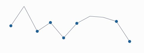
These visual indicators highlight all negative data points in a series. If the spark line is of type RadColumnSparkline or RadWinLossSparkLine the bars which represent negative values are highlighted. The negative points indicators are enabled by setting the ShowNegativePointsIndicator to True.
Example 10: Show negative points of RadLinearSparkline in XAML
<telerik:RadLinearSparkline ShowNegativePointIndicators="True" />
Example 11: Show negative points of RadLinearSparkline in code
this.sparklineControl.ShowNegativePointIndicators = true;
Figure 7: RadLinearSparkline with shown negative point indicators
You can change the color of the negative points via the NegativePointBrush property.
The negative points can be customized via the NegativePointStyle property of the control.
Example 12: Setting NegativePointStyle (see Figure 7)
<telerik:RadLinearSparkline.NegativePointStyle>
    <Style TargetType="telerik:IndicatorItem">
        <Setter Property="Template">
            <Setter.Value>
                <ControlTemplate TargetType="telerik:IndicatorItem">
                    <Ellipse Fill="{TemplateBinding Fill}" Width="10" Height="10" />
                </ControlTemplate>
            </Setter.Value>
        </Setter>
    </Style>
</telerik:RadLinearSparkline.NegativePointStyle>
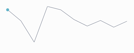
First Point
This is a visual indicator, which highlights the first data point in a series. If the spark line is of type RadColumnSparkline or RadWinLossSparkLine the bar which represents the first data point is highlighted. If the spark line is of type RadColumnSparkline or RadWinLossSparkLine the first bar is highlighted.
The first point is enabled in the series by setting the ShowFirstPointIndicator property to True.
Example 13: Show first point of RadLinearSparkline in XAML
<telerik:RadLinearSparkline ShowFirstPointIndicator="True" />
Example 14: Show first point of RadLinearSparkline in code
this.sparklineControl.ShowFirstPointIndicator = true;
Figure 8: RadLinearSparkline with shown first point indicator
You can change the color of the first point via the FirstPointBrush property.
The first point can be customized via the FirstPointStyle property of the control.
Example 15: Setting FirstPointStyle (see Figure 8)
<telerik:RadLinearSparkline.FirstPointStyle>
    <Style TargetType="telerik:IndicatorItem">
        <Setter Property="Template">
            <Setter.Value>
                <ControlTemplate TargetType="telerik:IndicatorItem">
                    <Ellipse Fill="{TemplateBinding Fill}" Width="10" Height="10" />
                </ControlTemplate>
            </Setter.Value>
        </Setter>
    </Style>
</telerik:RadLinearSparkline.FirstPointStyle>
Last Point
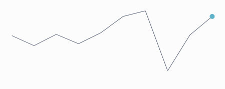
This is a visual indicator which highlights the last data point in a series. If the spark line is of type RadColumnSparkline or RadWinLossSparkLine the bar which represents the last value is highlighted. The last point is indicated in the series, by setting the ShowLastPointIndicator property to True.
Example 16: Show last point of RadLinearSparkline in XAML
<telerik:RadLinearSparkline ShowFirstPointIndicator="True" />
Example 17: Show last point of RadLinearSparkline in code
this.sparklineControl.ShowFirstPointIndicator = true;
Figure 9: RadLinearSparkline with shown last point indicator
You can change the color of the last point via the LastPointBrush property.
The last point can be customized via the LastPointStyle property of the control.
Example 18: Setting LastPointStyle (see Figure 9)
<telerik:RadLinearSparkline.LastPointStyle>
    <Style TargetType="telerik:IndicatorItem">
        <Setter Property="Template">
            <Setter.Value>
                <ControlTemplate TargetType="telerik:IndicatorItem">
                    <Ellipse Fill="{TemplateBinding Fill}" Width="10" Height="10" />
                </ControlTemplate>
            </Setter.Value>
        </Setter>
    </Style>
</telerik:RadLinearSparkline.LastPointStyle>
Empty Points
There are cases when the collection of data to which the Sparkline is bound may contain empty elements (null values) with no data to which the control can bind and visualize. The behavior of the control in such cases is governed by the EmptyPointBehavior property of the control. There are two possible settings:
- DropPoint: The empty point is removed. This is the default value.
- ShowAsZero: The empty point visualizes as though its original value was zero.
Example 19: Setting EmptyPointBehavior
<telerik:RadColumnSparkline EmptyPointBehavior="ShowAsZero" />
Figure 10: RadLinearSparkline and RadColumnSparkline with a single null value shown as zero
