Styling the ApplicationButton
To style the ApplicationButton of the RadRibbonView you can set an appropriate Style to the RadRibbonView.ApplicationButtonStyle property. In order to modify the default style of the ApplicationButton you can:
Create an empty style and set it up on your own
Modify some of the resources generated for the RadRibbonView's style.
Modify the default style of the ApplicationButton
This article will demonstrate how to implement the last two approaches.
Modifying the resources generated for the RadRibbonView's style.
Here is the list of resources that are used to control the appearance of the ApplicationButton.
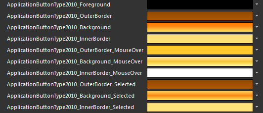
ApplicationButtonType2010_Foreground - a brush that represents the foreground of the ApplicationButton.
ApplicationButtonType2010_OuterBorder - a brush that represents the color of the ApplicationButton's border.
ApplicationButtonType2010_Background - a brush that represents the background of the ApplicationButton.
ApplicationButtonType2010_InnerBorder - a brush that represents the color of the ApplicationButton's inner border.
ApplicationButtonType2010_OuterBorder_MouseOver - a brush that represents the color of the ApplicationButton's border, when the mouse is over it.
ApplicationButtonType2010_Background_MouseOver - a brush that represents the background of the ApplicationButton, when the mouse is over it.
ApplicationButtonType2010_InnerBorder_MouseOver - a brush that represents the color of the ApplicationButton's inner border, when the mouse is over it.
ApplicationButtonType2010_OuterBorder_Selected - a brush that represents the color of the ApplicationButton's border, when the button is selected.
ApplicationButtonType2010_Background_Selected - a brush that represents the background of the ApplicationButton, when the button is selected.
ApplicationButtonType2010_InnerBorder_Selected - a brush that represents the color of the ApplicationButton's inner border, when the button is selected.
Changing the value of the resources can be done by clicking on the color indicator or the icon next to them.
Modify the resource to bring the desired appearance to the ApplicationButton. For more detailed information, please, view the Example section below.
Modifying the default style of the ApplicationButton
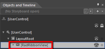
To copy the default style of the ApplicationButton, load your project in Expression Blend and open the UserControl that holds the RadRibbonView. In the 'Objects and Timeline' pane select the RadRibbonView, whose ApplicationButton you want to style.
From the menu choose Object -> Edit Style -> Edit a Copy. You will be prompted for the name of the style and where to be placed.
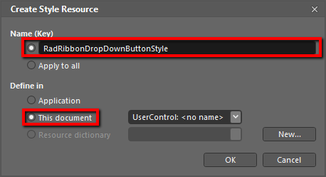
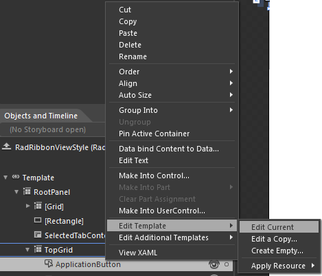
After clicking 'OK', Expression Blend will generate the default style of the ApplicationButton control along with the RibbonView style in the Resources section of your User Control. In order to edit it you need to locate the ApplicationButton element and right click on it to choose Edit Template -> Edit Current.
The properties available for the style will be loaded in the 'Properties' pane and you will be able to modify their default values.
If you go to the 'Resources' pane, you will see an editable list of resources generated together with the style and used by it. In this list you will find the brushes, styles and templates needed to change the visual appearance of the ApplicationButton. Their names indicate to which part of the ApplicationButton's appearance they are assigned. The full list of these resources is given above - those are the same resource generated by the RadRibbonView's style.
ApplicationButton default ControlTemplate structure
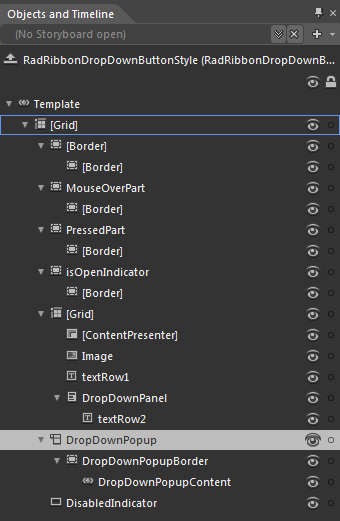
-
[Grid] - a Grid control, that represents the main layout control in the ApplicationButton's template.
-
[Border] - a Border control that represents the background of the ApplicationButton.
-
[Border] - a Border control that represents the inner background of the ApplicationButton.
-
[Border] - a Border control that represents the inner background of the ApplicationButton.
-
MouseOverPart - a Border control that represents the background of the ApplicationButton, when the mouse is over it.
-
[Border] - a Border control that represents the inner background of the ApplicationButton, when the mouse is over it
-
[Border] - a Border control that represents the inner background of the ApplicationButton, when the mouse is over it
-
PressedPart - a Border control that represents the background of the ApplicationButton, when the button is pressed.
-
[Border] - a Border control that represents the inner background of the ApplicationButton, when the button is pressed.
-
[Border] - a Border control that represents the inner background of the ApplicationButton, when the button is pressed.
-
IsOpenIndicator - a Border control that represents the background of the ApplicationButton, when the application/backstage menu is open
-
[Border] - a Border control that represents the inner background of the ApplicationButton, when the application/backstage menu is open
-
[Border] - a Border control that represents the inner background of the ApplicationButton, when the application/backstage menu is open
-
[Grid] - a Grid control that hosts the ApplicationButton content
- [ContentPresenter] - a ContentPresenter control, that is used to display the ApplicationButton content
- Image - an Image control that represents the ApplicationButtonImage
- textRow1 - a TextBlock control that represents the content of the ApplicationButton
-
DropwDownPanel - a StackPanel control hosting the second row of the ApplicationButton content
- textRow2 - a TextBlock control that represents the second row of the content of the ApplicationButton
-
DropDownPopup - is a Popup control that hosts the DropDownContent (ApplicationMenu/BackstageMenu) of the ApplicationButton
-
DropDownPopupBorder - is a Border control that represents the background color of the ApplicationButton DropDownContent
- DropDownPopupContent - is a ContentControl hosthe ApplicationButton DropDownContent (ApplicationMenu/BackstageMenu)
-
DisabledIndicator - is a Rectangle that represents the background of the ApplicationButton, when it is disabled(ApplicationMenu/BackstageMenu)
-