Getting Started
This tutorial will walk you through the creation of a sample application that contains RadPanelBar.
- Assembly References
- Adding RadPanelBar to the Project
- Declaratively populating the RadPanelBar control Items collection
- Databinding the RadPanelBar control
Assembly References
In order to use RadPanelBar control in your projects you have to add references to the following assemblies:
- Telerik.Windows.Controls
- Telerik.Windows.Controls.Navigation
Adding RadPanelBar to the Project
Example 1 demonstrates how you can add a RadPanelBar in xaml.
Example 1: RadPanelBar with statically declared items in xaml
<telerik:RadPanelBar>
    <telerik:RadPanelBarItem Header="Item 1" />
    <telerik:RadPanelBarItem Header="Item 2" />
    <telerik:RadPanelBarItem Header="Item 3" />
</telerik:RadPanelBar>
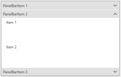
Figure 1: Result from Example 1 in Office2016 Theme

Declaratively Populating the Items Collection of the RadPanelBar Control
Example 2 demonstrates how you can add RadPanelBarItems directly to the Items collection of the RadPanelBar in code behind:
Example 2: Adding RadPanelBarItems in code
RadPanelBar myPanelBar = new RadPanelBar();
RadPanelBarItem item1 = new RadPanelBarItem() { Header = "Item 1" };
RadPanelBarItem item2 = new RadPanelBarItem() { Header = "Item 2" };
RadPanelBarItem item3 = new RadPanelBarItem() { Header = "Item 3" };
myPanelBar.Items.Add(item1);
myPanelBar.Items.Add(item2);
myPanelBar.Items.Add(item3);
Dim myPanelBar As New RadPanelBar()
Dim item1 As New RadPanelBarItem() With {
.Header = "Item 1"
        }
Dim item2 As New RadPanelBarItem() With {
.Header = "Item 2"
        }
Dim item3 As New RadPanelBarItem() With {
.Header = "Item 3"
        }
myPanelBar.Items.Add(item1)
myPanelBar.Items.Add(item2)
myPanelBar.Items.Add(item3)
Databinding the RadPanelBar Control
RadPanelBar can be also be bound to a collection of objects. You can learn more about this in the Bind to Object Data article in our documentation.
Setting a Theme
The controls from our suite support different themes. You can see how to apply a theme different than the default one in the Setting a Theme help article.
Changing the theme using implicit styles will affect all controls that have styles defined in the merged resource dictionaries. This is applicable only for the controls in the scope in which the resources are merged.
To change the theme, you can follow the steps below:
Choose between the themes and add reference to the corresponding theme assembly (ex: Telerik.Windows.Themes.Windows8.dll). You can see the different themes applied in the Theming examples from our Silverlight Controls Examples application.
-
Merge the ResourceDictionaries with the namespace required for the controls that you are using from the theme assembly. For the RadPanelBar, you will need to merge the following resources:
- Telerik.Windows.Controls
- Telerik.Windows.Controls.Navigation
Example 3 demonstrates how to merge the ResourceDictionaries so that they are applied globally for the entire application.
Example 3: Merge the ResourceDictionaries
<Application.Resources>
    <ResourceDictionary>
        <ResourceDictionary.MergedDictionaries>
            <ResourceDictionary Source="/Telerik.Windows.Themes.Windows8;component/Themes/System.Windows.xaml"/>
            <ResourceDictionary Source="/Telerik.Windows.Themes.Windows8;component/Themes/Telerik.Windows.Controls.xaml"/>
            <ResourceDictionary Source="/Telerik.Windows.Themes.Windows8;component/Themes/Telerik.Windows.Controls.Navigation.xaml"/>
        </ResourceDictionary.MergedDictionaries>
    </ResourceDictionary>
</Application.Resources>
Alternatively, you can use the theme of the control via the StyleManager.
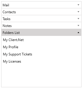
Figure 2 shows a RadPanelBar with the Windows8 theme applied.
Figure 2: RadPanelBar with the Windows8 theme
