Silverlight ListBox Overview
Thank you for choosing Telerik RadListBox!
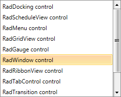
RadListBox is a Silverlight control used to display a list of items from which the user can choose. The control has a number of advanced features like multiple selection, autocomplete, keyboard support, drag and drop, as well as rich customization capabilities.

Key Features:
Selection: RadListBox provides three selection modes - Single, Multiple and Extended. Read more about this in the Selection article.
AutoComplete: When the control is focused, the first matching item is selected while the user is typing. Read more about this in the Autocomplete article.
Drag and Drop: Take advantage of the built-in drag and drop support to reorder items or move them from one RadListBox to another. Read more about this in the Drag and Drop section.
Keyboard Support: RadListBox supports several keyboard shortcuts for performing the most common task. Read more about this in the Keyboard Support article.
Theming: As any other control from the UI for Silverlight suite, RadListBox comes with different themes. Read more about this in the Styling and Appearance section of the documentation.
If you are using NoXaml binaries, and you have custom Style targeting RadListBoxItem, you have to base the style on the default one of the control. Example 1 demonstrates this approach. Example 1 demonstrate this approach.
Example 1: Implicit Style with BasedOn property set
<Style TargetType="telerik:RadListBoxItem" BasedOn="{StaticResource RadListBoxItemStyle}"/>
Get started with the control with its Getting Started help article that shows how to use it in a basic scenario.
Check out the control demos at demos.telerik.com