Hiding the Row Indicator
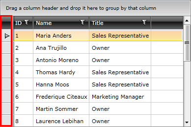
By default the first cell of a row represents the row indicator area. The indicator appears when the row is set as current.

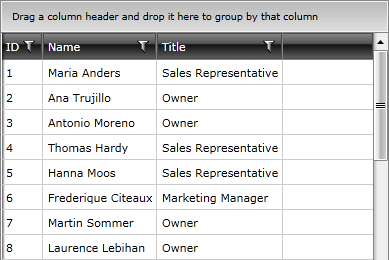
The row indicator visibility is controlled with the RowIndicatorVisibility property of RadGridView.
Example 1: Hiding the row indicator
<telerik:RadGridView RowIndicatorVisibility="Collapsed" />

Changing Rows Height
To limit the height of the rows, set the RowHeight property of RadGridView. The property affects the rows only if their content is measured with a height smaller or equal to the RowHeight value. Otherwise, the measured size takes precedence.
Example 2: Setting RowHeight
<telerik:RadGridView RowHeight="50" />
Example 3: Setting row's MaxHeight
<telerik:RadGridView>
    <telerik:RadGridView.RowStyle>
        <!-- If you use NoXaml dlls set the BasedOn property of the Style: BasedOn="{StaticResource GridViewRowStyle}" -->
        <Style TargetType="telerik:GridViewRow">
            <Setter Property="MaxHeight" Value="36" />
        </Style>
    </telerik:RadGridView.RowStyle>
</telerik:RadGridView>
Styling Row and Alternating Row
To style rows or alternating rows you can use the RowStyle or the AlternateRowStyle properties. To learn how to do this take a look at the Styling Rows topic.
Styling the Group Row
To style the group row you can use the GroupRowStyle property. To learn how to do this take a look at the Styling Group Row topic.
Styling the Header Row
To style the header row you can use the HeaderRowStyle property. To learn how to do this take a look at the Styling Header Row topic.