Select Column
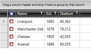
The GridViewSelectColumn derives from GridViewColumn and its content is represented by a CheckBox for each row. Contrary to GridViewCheckBoxColumn, GridViewSelectColumn does not bind to data. Instead, it allows you to select a given row via a checkbox. In other words, the IsChecked property of each CheckBox is bound to the IsSelected property of the corresponding row.
Example 1: Defining GridViewSelectColumn in XAML
<telerik:RadGridView AutoGenerateColumns="False">
    <telerik:RadGridView.Columns>
        <telerik:GridViewSelectColumn />
        <telerik:GridViewDataColumn DataMemberBinding="{Binding Name}" />
    </telerik:RadGridView.Columns>
</telerik:RadGridView>
Figure 1: The GridViewSelectColumn
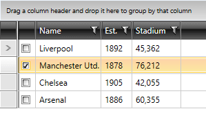
If you set RadGridView's SelectionMode property to either Extended or Multiple, you will be able to:
Select more than one row by clicking on the desired checkbox.
Select all the rows by clicking on the checkbox in the header.
Example 2: Define GridViewDataColumn with Extended SelectionMode
<telerik:RadGridView AutoGenerateColumns="False"
                 SelectionMode="Extended">
    <telerik:RadGridView.Columns>
        <telerik:GridViewSelectColumn />
        <telerik:GridViewDataColumn DataMemberBinding="{Binding Name}" />
    </telerik:RadGridView.Columns>
</telerik:RadGridView>
Figure 2: The GridViewSelectColumn with Extended SelectionMode
CheckBoxStyle and HeaderCheckBoxStyle
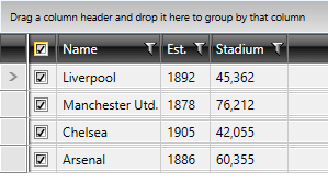
To style the respective checkboxes, you can use the two properties of type style that GridViewSelectColumn exposes:
CheckBoxStyle
HeaderCheckBoxStyle
Example 3: Creating appropriate styles
<Style x:Key="CheckBoxStyle" TargetType="CheckBox">
    <Setter Property="Background" Value="Red" />
</Style>
<Style x:Key="HeaderCheckBoxStyle" TargetType="CheckBox">
    <Setter Property="Background" Value="Blue" />
</Style>
Example 4: Setting RadGridView's CheckBoxStyle and HeaderCheckBoxStyle
<telerik:GridViewSelectColumn CheckBoxStyle="{StaticResource CheckBoxStyle}"
                              HeaderCheckBoxStyle="{StaticResource HeaderCheckBoxStyle}"/>
</telerik:RadGridView.Columns>
Figure 3 shows the final result:
Figure 3: The styled GridViewSelectColumn