Visual Structure
The major control elements of a the standard RadPane are:
-
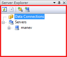
Content Area: This is the area inside of a RadPane where your content will be hosted. To set it or get it just use the RadPane's property Content.
-
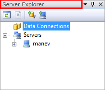
Header: This is the header control of a RadPane. In most cases it displays textual information. To learn how to customize the header, take a look at the Styling the Pane Header and How to Add Buttons to the Pane Header articles.
-
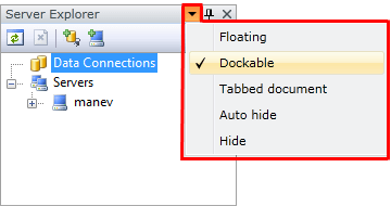
Menu: This menu is created automatically for you and contains the RadPane's most common commands. It allows you to make it floating, docked, part of a tabbed document or just hide it. The menu commands are programmatically accessible via the RadPane's property MenuCommands. To learn how to customize this menu, take a look at the How to Customize or Remove the RadPane's Menu and RadDocking Localization articles.
-
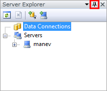
Pin/Unpin Button: This button allows you to pin and unpin the RadPane in case it is docked inside of the RadSplitContainer. It is visible by default but if you want to hide it, and prevent the user from changing the pin state of your pane, just set the pane's CanUserPin property to False and the button will be hidden.
-
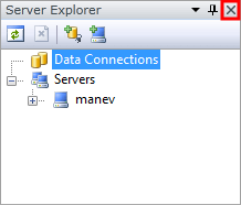
Close button: This button allows you to close the RadPane. It is visible by default but if you want to hide it, and prevent the user from closing your pane, just set the RadPane's property CanUserClose to False and the button will be hidden. You can also have a look at the How to Disable the Close Button topic.
-
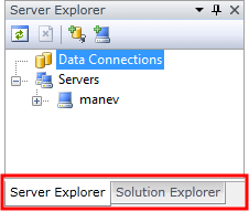
Tab: The tab is visible only when a RadPane is docked inside of a container that hosts more than one pane. In that case each RadPane is placed as a separate tab item. To learn more, take a look at the Pane Groups article.