Overview
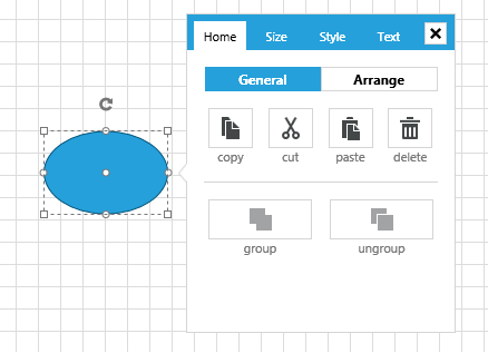
The SettingsPane control allows the users to examine and modify the settings of the diagramming items in run-time.
In order to use the SettingsPane control along with the RadDiagram in your projects you have to add references to the following assemblies:
- Telerik.Windows.Controls
- Telerik.Windows.Controls.Diagrams
- Telerik.Windows.Controls.Diagrams.Extensions
- Telerik.Windows.Controls.Input
- Telerik.Windows.Controls.Navigation
- Telerik.Windows.Diagrams.Core
The SettingsPane control is a standalone control that can be displayed as the content of any ContentControl. Its main purpose is to provide you with a ready-to-use view that contains the most common features and settings of a single RadDiagramItem (Shape or Connection).
In most Diagramming examples you will find the SettingsPane applied as an AdditionalContent on the diagramming surface. This way the control is displayed next to a focused RadDiagramItem thus allowing users to dynamically change the look and feel of the item. In order to display the SettingsPane this way in your application as well, you can add it through the ItemInformationAdorner.AdditionalContent attached property as demonstrated in Example 1, where the primitives namespace is defined like this:
xmlns:primitives="clr-namespace:Telerik.Windows.Controls.Diagrams.Primitives;assembly=Telerik.Windows.Controls.Diagrams"
Example 1: Adding SettingsPane in XAML
<telerik:RadDiagram x:Name="diagram">
    <primitives:ItemInformationAdorner.AdditionalContent>
        <telerik:SettingsPane Diagram="{Binding ElementName=diagram}" />
    </primitives:ItemInformationAdorner.AdditionalContent>
</telerik:RadDiagram>

Customization
The SettingsPane has a default view that can be used out-of-the-box in scenarios where you only need to display the common settings of a RadDiagramItem. However you can also customize the content of the pane to represent more specific information. These are the basic tasks you might need to implement while customizing your SettingsPane instance:
Change the tab headers - in order to change the headers of the tabs in the default SettingsPane, you can change the value of their localization strings. Please take a look at the Localization article to find the localization string of each tab displayed inside the SettingsPane.
Add and remove tabs - in order to add or remove tabs from the default SettingsPane, you need to edit the __ControlTemplate of the SettingsPaneView as this is the control that represents the content of the SettingsPane.
-
Edit the content of an existing tab - The content of each of the four default SettingsPane tabs – Home, Size, Style, Text, is represented by a different control:
SettingsPaneHomeControl: Representing the content of the Home tab
SettingsPaneSizeControl: Representing the content of the Size tab
SettingsPaneStyleControl: Representing the content of the Style tab
SettingsPaneTextControl: Representing the content of the Text tab. Furthermore, the content of each control is described in its ControlTemplate. In order to change the existing content of a SettingsPane tab, you need to edit the ControlTemplate of the appropriate control.
Events
RadDiagram exposes two events that come in handy while working with the default SettingsPane:
-
PreviewAdditionalContentActivated - this event is raised by a RadDiagram to inform layouts that the additional content is going to be activated. The event handler receives two arguments:
The sender argument contains the RadDiagram This argument is of type object, but can be cast to the RadDiagram type.
An AdditionalContentActivatedEventArgs object, that gives you access to a ContextItems collection. This collection of IDiagramItem objects represents the items that have activated the additional content. In most cases it contains a single item - the RadDiagramItem that has activated the SettingsPane.
Please note that you can handle this event in order to disable the SettingsPane from displaying on certain RadDiagramItems.
-
AdditionalContentActivated - this event is raised by a RadDiagram to inform layouts that the additional content has been activated. The event handler receives two arguments:
- The sender argument contains the RadDiagram This argument is of type object, but can be cast to the RadDiagram type.
- An AdditionalContentActivatedEventArgs object, that gives you access to a ContextItems collection. This collection of IDiagramItem objects represents the items that have activated the additional content. In most cases it contains a single item - the RadDiagramItem that has activated the SettingsPane.
- The sender argument contains the RadDiagram This argument is of type object, but can be cast to the RadDiagram type.