Date Items
When you use the RadDateTimePicker control you can customize the date items included in the Calendar view. You can define start and end dates for the entries in the calendar. You do this using the following properties:
DisplayDateStart - it is of type DateTime and represents the starting date of the date items in your Calendar.
DisplayDateEnd - it is again of type DateTime and represents the ending date of the items in your Calendar.
If you specify these properties you will be able to select a date only in the range of the chosen start and end dates.
Here is an example of setting these properties in XAML:
<telerik:RadDateTimePicker DisplayDateStart="1/1/2010" DisplayDateEnd="11/15/2010"/>
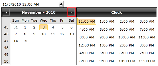
Here is the result:

The Next Month button is not active because of the DisplayDateEnd property's value set in the example.
You can further restrict the input by indicating a selectable start and end dates. These dates will allow you to select only within a predefined range, but you would still have the ability to browse within the range of the display start and end dates. Read more here
Using a default display date
You can also set the default date visible when the calendar appears. The property you have to use is called DisplayDate and is of type DateTime.
Notice that the DisplayDate is different from the SelectedDate property. The DisplayDate points out just the default month and year visible when the calendar first pops up, nothing is selected.
For example:
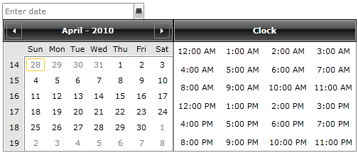
<telerik:RadDateTimePicker DisplayDate="4/1/2010"/>
The result of this example will be that when you click on the RadDateTimePicker's drop-down button for the first time in the calendar you will not see the current month and year but instead the month and year defined in the DisplayDate property.

If you set the DisplayDate property to a value which is not in the range of the DisplayDateStart and DisplayDateEnd properties you will end up with a parse error exception.