Template Structures
Like most controls, the RadButtons also allow you to template them in order to be changed from the inside. Except for templating the whole control, you can template only parts of it. This topic will make you familiar with the structure of the RadButtons' templates.
RadButton
Here is a snapshot from Expression Blend.

The template contains the following parts.
-
[Grid] - hosts the layout of the RadButton and is of type Grid.
-
OuterBorder - a Border control that represents the outer border of the RadButton
- InnerBorder - a Border control that represents the background and the inner border of the RadButton
Content - displays the button's content and is of type ContentPresenter.
-
CommonStatesWrapper - a Border control that hosts the RadButton's focused visual state control elements
-
FocusVisual - a Border control that represents the background and the outer border of the RadButton, when it is focused
-
FocusInnerVisual - a Border control that represents the inner border of the RadButton, when it is focused
-
FocusInnerVisual - a Border control that represents the inner border of the RadButton, when it is focused
-
FocusVisual - a Border control that represents the background and the outer border of the RadButton, when it is focused
-
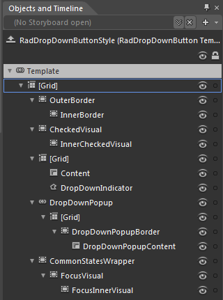
RadDropDownButton
Here is a snapshot from Expression Blend.

The template contains the following parts.
-
[Grid] - hosts the layout of the RadDropDownButton and is of type Grid.
-
OuterBorder - a Border control that represents the outer border of the RadDropDownButton.
- InnerBorder - a Border control that represents the background and the inner border of the RadDropDownButton.
-
CheckedVisual - a Border control that represents the outer border of the RadDropDownButton, when its DropDownContent is opened.
- InnerCheckedVisual - a Border control that represents the background and the inner border of the RadDropDownButton, when its DropDownContent is opened.
-
[Grid] - a Grid control that hosts the layout for the drop down and the button parts of the RadDropDownButton.
- Content - displays the content of the button and is of type ContentPresenter.
- DropDownIndicator - represents the arrow indicator for the drop down part and is of type Path.
-
DropDownPopup - represents the drop down area and is of type Popup.
-
[Grid] - a Grid control that hosts the RadDropDownButton.DropDownContent elements.
-
DropDownPopupBorder - represents the background and the border of the drop down area and is of type Border.
- DropDownPopupContent - displays the content of the drop down area and is of type ContentPresenter.
-
DropDownPopupBorder - represents the background and the border of the drop down area and is of type Border.
-
[Grid] - a Grid control that hosts the RadDropDownButton.DropDownContent elements.
-
CommonStatesWrapper - a Border control that hosts the RadDropDownButton's focused visual state control elements.
-
FocusVisual - a Border control that represents the background and the outer border of the RadDropDownButton, when it is focused.
- FocusInnerVisual - a Border control that represents the inner border of the RadDropDownButton, when it is focused.
-
FocusVisual - a Border control that represents the background and the outer border of the RadDropDownButton, when it is focused.
-
RadRadioButton
Here is a snapshot from Expression Blend.

The template contains the following parts.
-
[Grid] - hosts the layout of the RadRadioButton and is of type Grid.
-
OuterBorder - a Border control that represents the outer border of the RadRadioButton.
- InnerBorder - a Border control that represents the background and the inner border of the RadRadioButton.
-
CheckedVisual - a Border control that represents the outer border of the RadRadioButton, when it is checked.
- InnerCheckedVisual - a Border control that represents the background and the inner border of the RadRadioButton, when it is checked.
Content - displays the button's content and is of type ContentPresenter.
-
CommonStatesWrapper - a Border control that hosts the RadRadioButton's focused visual state control elements.
-
FocusVisual - a Border control that represents the background and the outer border of the RadRadioButton, when it is focused.
- FocusInnerVisual - a Border control that represents the inner border of the RadRadioButton, when it is focused.
-
FocusVisual - a Border control that represents the background and the outer border of the RadRadioButton, when it is focused.
-
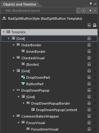
RadSplitButton
Here is a snapshot from Expression Blend.

The template contains the following parts.
-
[Grid] - hosts the layout of the RadSplitButton and is of type Grid.
-
OuterBorder - a Border control that represents the outer border of the RadSplitButton.
- InnerBorder - a Border control that represents the background and the inner border of the RadSplitButton.
-
CheckedVisual - a Border control that represents the outer border of the RadSplitButton, when its DropDownContent is opened.
- [Border] - a Border control that represents the background and the inner border of the RadSplitButton, when its DropDownContent is opened.
-
[Grid] - a Grid control that hosts the layout for the drop down and the button parts of the RadSplitButton.
- DropDownPart - represents the part responsible for opening the drop down area and is of type RadToggleButton.
- ButtonPart - represents the clickable part of the split button and is of type RadButton.
-
DropDownPopup - represents the drop down area and is of type Popup.
-
[Grid] - a Grid control that hosts the RadSplitButton.DropDownContent elements.
-
DropDownPopupBorder - represents the background and the border of the drop down area and is of type Border.
- DropDownPopupContent - displays the content of the drop down area and is of type ContentPresenter.
-
DropDownPopupBorder - represents the background and the border of the drop down area and is of type Border.
-
[Grid] - a Grid control that hosts the RadSplitButton.DropDownContent elements.
-
CommonStatesWrapper - a Border control that hosts the RadSplitButton's focused visual state control elements.
-
FocusVisual - a Border control that represents the background and the outer border of the RadSplitButton, when it is focused.
- FocusInnerVisual - a Border control that represents the inner border of the RadSplitButton, when it is focused.
-
FocusVisual - a Border control that represents the background and the outer border of the RadSplitButton, when it is focused.
-
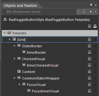
RadToggleButton
Here is a snapshot from Expression Blend.

The template contains the following parts.
-
[Grid] - hosts the layout of the RadToggleButton and is of type Grid.
-
OuterBorder - a Border control that represents the outer border of the RadToggleButton
- InnerBorder - a Border control that represents the background and the inner border of the RadToggleButton
-
CheckedVisual - a Border control that represents the outer border of the RadToggleButton, when it is checked
-
InnerCheckedVisual - a Border control that represents the background and the inner border of the RadToggleButton, when it is checked
-
InnerCheckedVisual - a Border control that represents the background and the inner border of the RadToggleButton, when it is checked
Content - displays the button's content and is of type ContentPresenter.
-
CommonStatesWrapper - a Border control that hosts the RadToggleButton's focused visual state control elements
-
FocusVisual - a Border control that represents the background and the outer border of the RadToggleButton, when it is focused
-
FocusInnerVisual - a Border control that represents the inner border of the RadToggleButton, when it is focused
-
FocusInnerVisual - a Border control that represents the inner border of the RadToggleButton, when it is focused
-
FocusVisual - a Border control that represents the background and the outer border of the RadToggleButton, when it is focused
-