Styling the ButtonChrome
ButtonChrome is a Control that has no input functionality. It was part of the template of the RadButtons. It was responsible for the visual appearance of the button. If you're using an older version of the RadControls, this article will help you style the ButtonChrome control. It can be styled by creating an appropriate Style and setting it to the Style property of the control.
Properties
The Button chrome’s appearance is controlled by several Boolean typed properties:
- RenderMouseOver: renders as MouseOvered button;
- RenderPressed: renders as Pressed button;
- RenderEnabled: default True. When set to False render as Disabled button;
- RenderNormal: default True. When set to False render transparent as toolbar button;
- RenderChecked: renders as checked ToggleButton;
- RenderActive: used in SplitButtons;
- RenderActive: renders as MouseOvered ListBoxItem;
- RenderSelected: renders as Selected ListBoxItem;
- RenderFocused: renderes as Focused item;
- Orientation: default Horizontal can be set to Vertical to rotate the gradients in some states;
- CornerRadius: used to set the outer corners;
- InnerCornerRadius: readonly. Computed as decreased CornerRadius.
Create an empty implicit style and set it up on your own.
The ButtonChrome is located in the following namespace: xmlns:chromes="clr-namespace:Telerik.Windows.Controls.Chromes;assembly=Telerik.Windows.Controls"
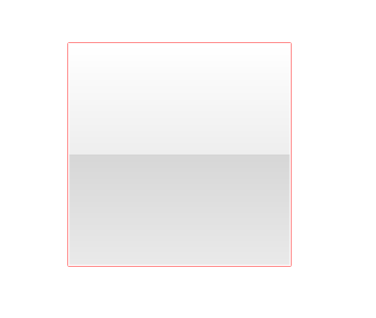
Example 1: Create custom implicit style
<Window.Resources>
    <Style TargetType="chromes:ButtonChrome">
        <Setter Property="Opacity" Value="0.5"/>
        <Setter Property="BorderBrush" Value="Red"/>
        <Setter Property="BorderThickness" Value="1"/>
    </Style>
</Window.Resources>
<Grid>
    <chromes:ButtonChrome Width="200" Height="200"  VerticalAlignment="Center" HorizontalAlignment="Center"/>
</Grid>
Edit the default template of the control
If you prefer, you can manually extract the needed style from the respective XAML file in the Themes.Implicit folder of your Telerik UI installation and modify its code to suit your needs.
If you choose to define the style in the App.xaml file, it would be available for the entire application. This allows you to define a style only once and then reuse it where needed.
Note that when changing a ControlTemplate you should include all required parts. Even if your code compiles, some of the functionality may be impacted due to the omission of the required parts. The required parts are usually marked with the prefix "PART_".