Separators
You can use the RadToolBarButton objects that appear in drop-down lists as separators. By using separators, you can divide the items in a drop-down list into two or more groups, making them easier for a user to interpret.
To set a given button as a separator, set its IsSeparator property to True. When IsSeparator is True, the separator is rendered as a horizontal line. Its Text and ImageUrl properties are ignored.
If you set the IsSeparator property to True on a button that is in the toolbar rather than a drop-down list, it has no effect on the appearance of the toolbar. The toolbar appears as if the button did not exist in its Items collection.
The example below shows a drop-down list with a separator:
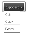
<telerik:RadToolBar RenderMode="Lightweight" ID="RadToolBar1" runat="server">
    <Items>
        <telerik:RadToolBarDropDown runat="server" Text="Clipboard">
            <Buttons>
                <telerik:RadToolBarButton runat="server" Text="Cut" />
                <telerik:RadToolBarButton runat="server" Text="Copy" />
                <telerik:RadToolBarButton runat="server" IsSeparator="True" Text="This does not appear" />
                <telerik:RadToolBarButton runat="server" Text="Paste" />
            </Buttons>
        </telerik:RadToolBarDropDown>
    </Items>
</telerik:RadToolBar>