Structure
The RadSplitter control defines a region that can be divided into resizable frame-like regions called panes, as shown below:
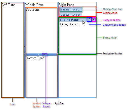
Panes
Each pane is implemented by the RadPane control. Panes can contain any kind of content, including HTML elements, content from external sources, or other ASP.NET controls: even other RadSplitter controls, to subdivide the region the pane defines into additional resizable regions.
Depending on the orientation of the splitter, panes are laid out from left to right or top to bottom.
Split Bars
Between the panes appear split bars, which are implemented by the RadSplitBar control. Split bars represent the borders that can be dragged in order to resize the panes. Each split bar can have up to two collapse buttons, used to collapse and expand the adjacent panes.
Sliding Zones
Sliding zones, which are implemented by the RadSlidingZone control, hold panes (called sliding panes) that slide in and out, like the user interface of Visual Studio. RadSlidingZone must be placed inside a RadPane control.
Sliding zones represent the sliding panes they hold as sliding zone tabs. The user uses these tabs to collapse and expand the sliding panes. You can configure the direction in which the sliding zone expands its tabs. This direction determines the way the sliding zone lays out its sliding zone tabs.
Sliding Panes
Sliding panes are placed inside sliding zones to define their content. Each sliding pane is implemented by a RadSlidingPane control. RadSlidingPane must be placed inside a RadSlidingZone control.
A sliding pane, like a regular pane, can contain any HTML elements, including ASP.NET controls (but not externally loaded content). Sliding panes, unlike regular panes, have a title bar that displays the title of the pane (which also appears on its tab). The title bar optionally contains control buttons as well: a dock/undock button, which pins the sliding pane in place, and a collapse button that collapses the sliding pane. The edge of the sliding pane farthest from the sliding zone tab optionally has a resizable border, that the user can drag to expand or contract the size of the sliding pane.
Example
The ASP.NET declaration for the RadSplitter shown above is as follows:
<telerik:RadSplitter RenderMode="Lightweight" ID="RadSplitter1" runat="server" Skin="Office2007">
 <telerik:RadPane ID="LeftPane" runat="server">
    Left Pane
 </telerik:RadPane>
 <telerik:RadSplitBar ID="RadSplitBar1" runat="server" CollapseMode="Both" />
 <telerik:RadPane ID="MiddlePane" runat="server" Scrolling="None">
   Middle Pane
   <telerik:RadSplitter RenderMode="Lightweight" ID="NestedSplitter" runat="server"
                        Orientation="Horizontal" Skin="Office2007" >
     <telerik:RadPane ID="TopPane" runat="server">
       Top Pane
     </telerik:RadPane>
     <telerik:RadSplitBar ID="RadSplitBar3" runat="server" CollapseMode="Both" />
     <telerik:RadPane ID="BottomPane" runat="server">
       Bottom Pane
     </telerik:RadPane>
   </telerik:RadSplitter>
 </telerik:RadPane>
 <telerik:RadSplitBar ID="RadSplitBar2" runat="server" CollapseMode="Both" />
 <telerik:RadPane ID="RightPane" runat="server">
   Right Pane
   <telerik:RadSlidingZone ID="RadSlidingZone1" runat="server" SlideDirection="Bottom">
     <telerik:RadSlidingPane ID="RadSlidingPane1" runat="server" Title="Sliding Pane 1">
       Sliding Pane1
     </telerik:RadSlidingPane>
     <telerik:RadSlidingPane ID="RadSlidingPane2" runat="server" Title="Sliding Pane 2">
       Sliding Pane 2
     </telerik:RadSlidingPane>
   </telerik:RadSlidingZone>
 </telerik:RadPane>
</telerik:RadSplitter>