Fluid Design
This article explains the fluid design capabilities RadProgressBar offers. RadProgressBar is built semantically, using CSS for defining rounded corners, shadows and gradients. The example bellow shows how you can set its size in percent so it can resize with its parent element.
Generally, responsive design means that the page and its content are able to adapt to different screen resolutions without deteriorating the user experience. This often includes changing the font size and having dimensions set in percent.
Fluid Design with RadProgressBar
Figure 1: RadProgressBar with dimensions set to 100% that occupies its entire parent element
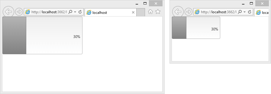
You can set the Width and Height properties of the RadProgressBar in percent. This lets it resize together with its parent element size. The control is usually used with its default height and so the value label is designed for this scenario. To accommodate heights that can change, you can override some of its CSS rules as shown in Example 1.
Example 1: Markup and CSS that provide a fluid RadProgressBar that changes size with the browser view-port
<style type="text/css">
    html, body, form
    {
        margin: 0;
        padding: 0;
        height: 100%;
    }

    .fluidProgressBar .rpbLabelWrapper .rpbLabel
    {
        position: absolute;
        right: 0;
        top: 50%;
        margin-top: -0.5em;
    }
</style>
<div style="width: 50%; height: 50%">
    <telerik:RadProgressBar RenderMode="Lightweight" Width="100%" Height="100%" CssClass="fluidProgressBar" runat="server" Value="30" ID="RadProgressBar1" BarType="Percent" />
</div>