Adding Buttons
Adding a generic button
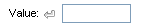
You can easily add a button to any of the RadInput controls by setting the ShowButton property to True. When you set ShowButton to True, a button appears on the right side of the input control. The button appears as a small bent arrow:
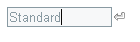
The appearance of the arrow varies, depending on the Skin of the input control. To change the image of the button to something other than a bent arrow, use the ButtonCssClass property:
- Define a CSS class that provides an image for the button. You can link in your own CSS file, or define the CSS class by adding a <style> section to the <head> element of your Web page:
<head runat="server">
    <title>Untitled Page</title>
    <style>
        .MyButton
        {
            background: url('~/App_Data/CustomButton.gif') 0 0 no-repeat !important;
        }
    </style>
</head>
- Set the ButtonCssClass property:
<telerik:RadTextBox RenderMode="Lightweight" ID="RadTextBox1" runat="server" ShowButton="True" Skin="WebBlue"
    ButtonCssClass="MyButton">
    <ClientEvents OnButtonClick="HandleButtonClick" />
</telerik:RadTextBox>
Adding a Spin button
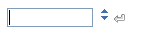
In addition to a generic button, you can add spin buttons to the the RadNumericTextBox control. To add a set of spin buttons, set the ShowSpinButtons property to True. The spin buttons appear as two arrows:
As with generic buttons, the appearance of the spin buttons varies, depending on the Skin property. You can further customize the appearance of the spin buttons using the SpinUpCssClass and SpinDownCssClass properties.
Specifying the button position
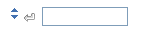
By default, the buttons you add appear on the right of the input control. If you have added both a generic button and a set of spin buttons, the generic button appears to the left of the spin buttons:
To move the buttons to the left of the input control, change the ButtonsPosition property to "Left":
If the input control has a label, setting ButtonsPosition to "Left" positions the button after the label:
Implementing the button behavior
Spin buttons have built-in behavior: when the user clicks the up arrow, the value in the text box increases by the amount of the IncrementSettings.Step property; when the user clicks the down arrow, the value decreases by the same amount.
Generic buttons have no such built-in behavior. To implement the behavior of a generic button, write a JavaScript function that is called when the user clicks the button, and assign it as the value of the OnButtonClick client-side event:
<script type="text/javascript">
    function ShowSelectionForm(sender, eventArgs)
    {
        window.radopen("SelectionForm.aspx", "Specify a Value");
    }
</script>
<telerik:RadTextBox RenderMode="Lightweight" ID="RadTextBox1" runat="server" ShowButton="True">
    <ClientEvents OnButtonClick="ShowSelectionForm" />
</telerik:RadTextBox>