RadMenu Item Builder
The RadMenu Item Builder lets you populate your menu with a hierarchy of items that do not come from a separate data source. There are two ways to bring up the RadMenu Item Builder:
From the RadMenu Smart Tag, click on the Build RadMenu link.
Right-click on the RadMenu component and select Build RadMenu from its context menu.
RadMenu Item Builder
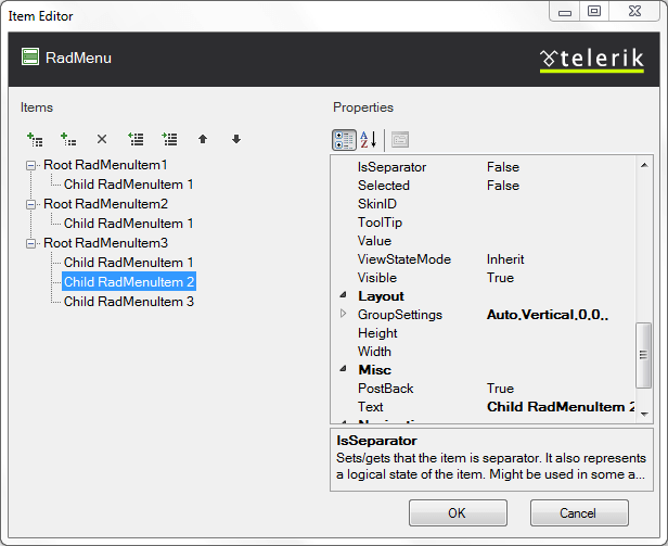
The RadMenu Item builder lets you add, rearrange, configure, and delete menu items. These actions are initiated using the tool bar at the upper left of the Item builder:
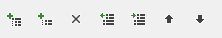
The following table describes the controls in the tool bar:
| Button | Function |
|---|---|
 |
Adds a root item to the menu in the next available position. Root items are the top-level items (menu items with no parent item). |
 |
Adds a child item to the currently selected menu item. The child can belong to either a root item or another child item. |
 |
Deletes the currently selected menu item. When you delete a menu item, its child items are deleted as well. |
 |
Moves the currently selected menu item up a level, making it a sibling to its parent item (following the parent item). |
 |
Moves the currently selected menu item down a level, making it the child of its previous sibling. |
 |
Moves the currently selected menu item backward in its current list of siblings, so that it precedes the previous sibling. |
 |
Moves the currently selected menu item forward in its current list of siblings, so that it follows the next sibling. |
When a menu item (either a root item or a child item) is selected, the properties pane on the right of the RadMenu Item Builder lets you configure the item by setting its properties. For each item,
Text is the text of the item as it appears in the menu.
ToolTip is the text of a tooltip that appears when the user hovers the mouse over the item.
Enabled controls whether the item is initially enabled or disabled.
GroupSettings lets you specify how the child items are laid out.
IsSeparator specifies whether the menu item acts as a separator.
Value lets you associate a text value with the menu item that you can use when programming the menu behavior.
NavigateUrl and Target cause the menu item to automatically launch another Web page (specified by NavigateUrl) in the window specified by Target. If the Target property is not set, the new Web page uses the current browser window.
PostBack specifies whether the item causes a postback.
CssClass, ClickedCssClass, DisabledCssClass, ExpandedCssClas, and FocusedCssClass control the appearance of the menu item when it is in its normal state, clicked, disabled, expanded, and holds input focus, respectively.
ImageUrl, ImageClickedUrl, DisabledImageUrl, ExpandedImageUrl, and HoveredImageUrl let you specify an image that appears on the left of the menu item when it is in its normal state, clicked, disabled, expanded, and when the mouse hovers over it, respectively.