RadLabel vs asp:Label vs Built-in Label
Common Overview of Labels
In general, the Label controls are used to provide short descriptive text or other helpful information in a set location on the page, usually next to a value holder like a text field. Their common purpose is to hint the users about the data they need to enter or view. Unlike static text, you can customize the displayed text through properties allowing its programmatic manipulation. Basically, you can also use the Literal and PlaceHolder controls to display text on the Web Forms page. However, unlike the Label control, these controls do not render any additional tags. Of course, there are also the standard HTML label, span, etc. elements.
With such vast choice of displaying a simple text on your page, it may get confusing which way is the best to go. Therefore, we introduced the RadLabel control to provide a themeable alternative solution, coherently matching the consistent look and feel of the built-in Telerik skins and functionality.
The main property of the RadLabel control is AssociatedControlID. The control renders as an HTML label element, with the “for” attribute set to the ID of the associated control. The ID should be set relatively – if the Label and the associated control are placed within the same INamingContainer or document, the direct ID of the control is set to the AssociatedControlID property, e.g. “RadDateTimePicker1”. However, if they are located in separate INamingContainers, the UniqueID of the associated control should be used instead.
By standard, each Label control is explicitly associated with exactly one form control, but more than one Label may be associated with the same control by creating multiple references via the underlying “for” attribute. When a Label (or its inner content) is clicked, it passes the focus on to its associated control. Labels can be helpful also when using keyboard navigation via the AccessKey property. Again, the focus will be set on the associated control. Note that the AccessKey navigation requires different key combinations in different browsers.
Advantages over asp:Label
We suggest that you use and leverage RadLabel when need to display a descriptive text next to your form controls. Here are some of the advantages:
Nice appearance and skins specific to Telerik AJAX controls. This will save you the effort to manually modify the style of the displayed text to match your other controls on the page.
Seamless integration with the ASP.NET and Telerik Web Forms components. For example, a regular asp:Label cannot access the input control of RadDateTimePicker automatically just by setting the AssociatedControlID property, while the RadLabel is specifically designed to achieve that.
Provides HtmlEncode property.
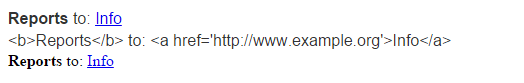
<telerik:RadLabel runat="server" ID="RadLabel1" Text="<b>Reports</b> to: <a href='http://www.example.org'>Info</a>"
    AssociatedControlID="RadTextBox1" Skin="Bootstrap">
</telerik:RadLabel>
<br />
<telerik:RadLabel runat="server" ID="RadLabel2" Text="<b>Reports</b> to: <a href='http://www.example.org'>Info</a>"
    AssociatedControlID="RadTextBox1" Skin="Bootstrap" HtmlEncode="true">
</telerik:RadLabel>
<br />
<asp:Label ID="Label1" runat="server" Text="<b>Reports</b> to: <a href='http://www.example.org'>Info</a>"
    AssociatedControlID="RadTextBox1">
</asp:Label>
The code snippet above displays the following layout:
- Easy combination of Image with text. If you want to display an Image or Icon next to the text, you can add them as content within the RadLabel.
<telerik:RadLabel runat="server" ID="RadLabel1"
Text="Reports To:" AssociatedControlID="RadTextBox1">
    <img alt="Arrow Up" src="arrowUp.png" />
</telerik:RadLabel>
RequiredMark and OptionalMark. These properties will enable you to automatically display additional text at the end of the label Text.
-
Represents a control from the Telerik suite:
- Coherent functionality with RadSkinManager. You can change the entire Skin/Theme of the page just with a single click or depending on the currently logged user.
- Easier to maintain since it does not require any additional CSS, decorations or extensions.
- You can directly drag and drop RadLabel from the Telerik ASP.NET AJAX section under the VS Toolbox.
Advantages over built-in Label
Some of the Telerik controls like RadTextBox, RadDateTimePicker, RadComboBox, RadSearchBox, etc. provide built-in Label property. We suggest that you use the new RadLabel control instead. Since the RadLabel is a separate control, it has the following advantages:
- It is easier to control the width of RadLabel. The built-in Label is part of the main control wrapper and thus, requires additional handling using the WrapperCssClass and custom CSS. Altering the Width of RadLabel won’t affect the Width of the associated form control, unlike the built-in label.
- You can define its position in regards to the associated control and place it before, after, top, below, etc.
- All the properties offered by the individual control – HtmlEncode, RequiredMark, OptionalMark, etc.