Legend Settings
This help article discusses how to configure the ASP NET AJAX Chart legend.
- Appearance
- Position and Alignment
- Orientation
- Client Templates
- Visual Templates
- Troubleshooting (Legend is not visible)
Appearance
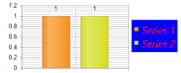
You can control the background color of the legend with the Legend.Appearance.BackgroundColor property. To control the color and the font of the text you can use the Legend.Appearance.TextStyle inner property (Example 1).
You can find all the available options for the TextStyle inner property in the Labels and Titles Font Settings help article.
Figure 1: Chart legend with customized background and text styles.
Example 1: Configure the appearance of the chart legend.
<telerik:RadHtmlChart ID="RadHtmlChart1" runat="server" Width="350" Height="150">
    <Legend>
        <Appearance BackgroundColor="Blue">
            <TextStyle Color="Red" FontFamily="Segoe UI" FontSize="20" Italic="true" />
        </Appearance>
    </Legend>
</telerik:RadHtmlChart>
protected void Page_Init(object sender, EventArgs e)
{
    int seriesNum = 2;
    for (int i = 1; i <= seriesNum; i++)
    {
        ColumnSeries cs1 = new ColumnSeries() { Name = "Series " + i };
        cs1.SeriesItems.Add(new CategorySeriesItem() { Y = 1 });
        RadHtmlChart1.PlotArea.Series.Add(cs1);
    }
}
Protected Sub Page_Init(sender As Object, e As EventArgs)
    Dim seriesNum As Integer = 2
    For i As Integer = 1 To seriesNum
        Dim cs1 As New ColumnSeries() With { _
            Key .Name = "Series " & i _
        }
        cs1.SeriesItems.Add(New CategorySeriesItem() With { _
            Key .Y = 1 _
        })
        RadHtmlChart1.PlotArea.Series.Add(cs1)
    Next
End Sub
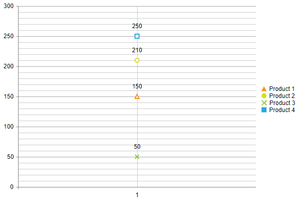
The color of the markers is automatically detected from the series colors.
Legend Marker Shapes
To customize the Legend items' marker size and type, you have a few options:
- Use visual templates as demonstrated in the Example 2
- Use the overwrite shared in the Automatic Legend marker shape customization KB article.
Figure 2: Legend shape customized via VisualTemplate.
Example 2: The code that creates Figure 2.
<telerik:RadHtmlChart runat="server" ID="RadHtmlChart1" Font-Size="14px" Width="600px" Height="400px">
    <PlotArea>
        <Series>
            <telerik:LineSeries Name="Product 1">
                <MarkersAppearance MarkersType="Triangle" />
                <SeriesItems>
                    <telerik:CategorySeriesItem Y="150" />
                </SeriesItems>
            </telerik:LineSeries>
            <telerik:LineSeries Name="Product 2">
                <MarkersAppearance MarkersType="Circle" />
                <SeriesItems>
                    <telerik:CategorySeriesItem Y="210" />
                </SeriesItems>
            </telerik:LineSeries>
            <telerik:LineSeries Name="Product 3">
                <MarkersAppearance MarkersType="Cross" />
                <SeriesItems>
                    <telerik:CategorySeriesItem Y="50" />
                </SeriesItems>
            </telerik:LineSeries>
            <telerik:LineSeries Name="Product 4">
                <MarkersAppearance MarkersType="Square" />
                <SeriesItems>
                    <telerik:CategorySeriesItem Y="250" />
                </SeriesItems>
            </telerik:LineSeries>
        </Series>
        <XAxis>
            <Items>
                <telerik:AxisItem LabelText="1" />
            </Items>
        </XAxis>
    </PlotArea>
    <Legend>
        <Appearance Visible="True"></Appearance>
        <Item Visual="legendItemVisual" />
    </Legend>
</telerik:RadHtmlChart>
<script>
    var drawing = kendo.drawing,
        geometry = kendo.geometry,
        columnWidth;

    function legendItemVisual(e) {
        var column;
        var color = e.options.markers.background;
        var labelColor = e.options.labels.color ? e.options.labels.color : "#000";
        var rect = new kendo.geometry.Rect([0, 0], [100, 50]);
        var layout = new drawing.Layout(rect, {
            spacing: 5,
            alignItems: "center"
        });

        var markersType = e.series.markers.type;
        var marker;
        console.log(markersType);
        if (markersType == "triangle") {
            marker = new kendo.drawing.Path({
                fill: {
                    color: color
                },
                stroke: { color: color, width: 0 }
            }).moveTo(10, 0).lineTo(15, 10).lineTo(5, 10).close();
        }
        else if (markersType == "cross") {
            var svgPath = "M32.78,0.50 L42.22,0.50 L42.22,32.78 L74.50,32.78 L74.50,42.22 L42.22,42.22 L42.22,74.50 L32.78,74.50 L32.78,42.22 L0.50,42.22 L0.50,32.78 L32.78,32.78 z";
            marker = drawing.Path.parse(svgPath, {
                fill: {
                    color: color,
                },
                stroke: {
                    color: color,
                    width: 1
                }
            });
            marker.transform(geometry.transform().scale(0.18, 0.18).rotate(45, 0)); //resize and rotate the path
        }
        else if (markersType == "square") {
            var rectGeom = new geometry.Rect([5, 5], [10, 10]);
            marker = new drawing.Rect(rectGeom, {
                fill: {
                    color: color
                },
                stroke: { color: color, width: 0 }
            });

        }
        else { //cicle
            var CircGeometry = new kendo.geometry.Circle([10, 5], 5);
            marker = new kendo.drawing.Circle(CircGeometry, {
                stroke: { color: color, width: 0 },
                fill: { color: color }
            });
        }

        var label = new kendo.drawing.Text(e.series.name, [0, 0], {
            fill: {
                color: labelColor
            }
        });

        layout.append(marker, label);
        layout.reflow();
        return layout;
    };
</script>
Position and Alignment
You can control the position and the alignment of the legend with the following properties exposed by the Legend.Appearance tag:
-
Position- The position of the chart, relative to the plot area (Example 3). The supported values are:-
Top- The legend is positioned on the top of the chart area. -
Bottom- The legend is positioned on the bottom of the chart area. -
Left- The legend is positioned on the left of the chart area. -
Right- The legend is positioned on the right of the chart area. -
Custom- The legend can be positioned on a custom position through theOffsetXandOffsetYproperties.
-
-
Align- The alignment of the legend, relative to the position (Example 3). When the legend isToporBottompositioned it can be horizontally aligned. When the legend isLeftorRightpositioned in can be vertically aligned. The supported values are:-
Start- The legend is left or top aligned according to its position. -
End- The legend is right or bottom aligned according to its position. -
Center- The legend is centered according to its position.
-
-
OffsetX- The x offset of the legend. The x value is relative to the current position of the legend. A positive and negative value can be set. -
OffsetY- The y offset of the legend. The y value is relative to the current position of the legend. A positive and negative value can be set.
Figure 3: Legend with Position=Bottom and Align=End.

Example 3: The code that creates Figure 3.
<telerik:RadHtmlChart ID="RadHtmlChart1" runat="server" Width="350" Height="150">
    <Legend>
        <Appearance Position="Bottom" Align="End">
        </Appearance>
    </Legend>
</telerik:RadHtmlChart>
protected void Page_Init(object sender, EventArgs e)
{
    int seriesNum = 2;
    for (int i = 1; i <= seriesNum; i++)
    {
        ColumnSeries cs1 = new ColumnSeries() { Name = "Series " + i };
        cs1.SeriesItems.Add(new CategorySeriesItem() { Y = 1 });
        RadHtmlChart1.PlotArea.Series.Add(cs1);
    }
}
Protected Sub Page_Init(sender As Object, e As EventArgs)
    Dim seriesNum As Integer = 2
    For i As Integer = 1 To seriesNum
        Dim cs1 As New ColumnSeries() With { _
            Key .Name = "Series " & i _
        }
        cs1.SeriesItems.Add(New CategorySeriesItem() With { _
            Key .Y = 1 _
        })
        RadHtmlChart1.PlotArea.Series.Add(cs1)
    Next
End Sub
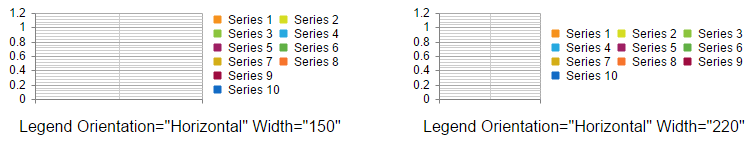
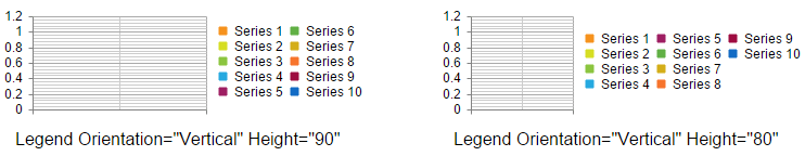
Orientation
The Legend.Appearance.Orientation property lets you distribute the legend items vertically or horizontally. You can also define distribution constraints by setting particular dimensions for the legend via the Legend.Appearance.Width and Legend.Appearance.Height properties.
-
Orientation- The orientation of the legend items.-
Horizontal- Legend items are added horizontally. -
Vertical- Legend items are added vertically.
-
-
Width- The legend width when the legend orientation is set toHorizontal. -
Height- The legend height when the legend orientation is set toVertical.
You can see the difference of both orientations with different legend dimensions in Figure 4 and Figure 4.
Figure 4: Compare the legend of two charts with horizontal orientation and different width.
Example 4: The code that creates Figure 4.
<telerik:RadHtmlChart ID="RadHtmlChart1" runat="server" Width="350" Height="150">
    <Legend>
        <Appearance Orientation="Horizontal" Width="150">
        </Appearance>
    </Legend>
    <ChartTitle Text='Legend Orientation="Horizontal" Width="150"'>
        <Appearance Position="Bottom" Align="Left"></Appearance>
    </ChartTitle>
</telerik:RadHtmlChart>
<telerik:RadHtmlChart ID="RadHtmlChart2" runat="server" Width="350" Height="150">
    <Legend>
        <Appearance Orientation="Horizontal" Width="220">
        </Appearance>
    </Legend>
    <ChartTitle Text='Legend Orientation="Horizontal" Width="220"'>
        <Appearance Position="Bottom" Align="Left"></Appearance>
    </ChartTitle>
</telerik:RadHtmlChart>
protected void Page_Init(object sender, EventArgs e)
{
    int seriesNum = 10;
    for (int i = 1; i <= seriesNum; i++)
    {
        ColumnSeries cs1 = new ColumnSeries() { Name = "Series " + i };
        RadHtmlChart1.PlotArea.Series.Add(cs1);
        RadHtmlChart2.PlotArea.Series.Add(cs1);
    }
}
Protected Sub Page_Init(sender As Object, e As EventArgs)
    Dim seriesNum As Integer = 10
    For i As Integer = 1 To seriesNum
        Dim cs1 As New ColumnSeries() With { _
            Key .Name = "Series " & i _
        }
        RadHtmlChart1.PlotArea.Series.Add(cs1)
        RadHtmlChart2.PlotArea.Series.Add(cs1)
    Next
End Sub
Figure 5: Compare the legend of two charts with vertical orientation and different height.
Example 5: The code that creates Figure 5.
<telerik:RadHtmlChart ID="RadHtmlChart1" runat="server" Width="350" Height="150">
    <Legend>
        <Appearance Orientation="Vertical" Height="90">
        </Appearance>
    </Legend>
    <ChartTitle Text='Legend Orientation="Vertical" Height="90"'>
        <Appearance Position="Bottom" Align="Left"></Appearance>
    </ChartTitle>
</telerik:RadHtmlChart>
<telerik:RadHtmlChart ID="RadHtmlChart2" runat="server" Width="350" Height="150">
    <Legend>
        <Appearance Orientation="Vertical" Height="80">
        </Appearance>
    </Legend>
    <ChartTitle Text='Legend Orientation="Vertical" Height="80"'>
        <Appearance Position="Bottom" Align="Left"></Appearance>
    </ChartTitle>
</telerik:RadHtmlChart>
protected void Page_Init(object sender, EventArgs e)
{
    int seriesNum = 10;
    for (int i = 1; i <= seriesNum; i++)
    {
        ColumnSeries cs1 = new ColumnSeries() { Name = "Series " + i };
        RadHtmlChart1.PlotArea.Series.Add(cs1);
        RadHtmlChart2.PlotArea.Series.Add(cs1);
    }
}
Protected Sub Page_Init(sender As Object, e As EventArgs)
    Dim seriesNum As Integer = 10
    For i As Integer = 1 To seriesNum
        Dim cs1 As New ColumnSeries() With { _
            Key .Name = "Series " & i _
        }
        RadHtmlChart1.PlotArea.Series.Add(cs1)
        RadHtmlChart2.PlotArea.Series.Add(cs1)
    Next
End Sub
Client Templates
You can use client-side templates to display custom text in the legend labels since the Q2 2016 release.
The functionality is available through the ClientTemplate inner property exposed by the Legend.Appearance tag. The fields that can be used inside the template are available in the legend.labels.template article.
You can also execute JavaScript in the
ClientTemplate. More information is available in the Execute JavaScript with a ClientTemplate article.
Figure 6: You can define client templates for the legend labels.
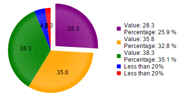
Example 6: Configure a sample client template for the legend.
<telerik:RadHtmlChart runat="server" ID="PieChart1" Width="400px" Height="400px">
    <Legend>
        <Appearance>
            <ClientTemplate>
                #if(value > 20){#
                        Value: #=value# \n
                        Percentage: #=kendo.format(\'{0:P1}\',percentage)#
                    #} else {# Less than 20% #}
                #
            </ClientTemplate>
        </Appearance>
    </Legend>
    <PlotArea>
        <Series>
            <telerik:PieSeries>
                <SeriesItems>
                    <telerik:PieSeriesItem BackgroundColor="Purple" Exploded="true" Name="Internet Explorer" Y="28.3" />
                    <telerik:PieSeriesItem BackgroundColor="Orange" Exploded="false" Name="Firefox" Y="35.8" />
                    <telerik:PieSeriesItem BackgroundColor="Green" Exploded="false" Name="Chrome" Y="38.3" />
                    <telerik:PieSeriesItem BackgroundColor="Blue" Exploded="false" Name="Safari" Y="4.5" />
                    <telerik:PieSeriesItem BackgroundColor="Red" Exploded="false" Name="Opera" Y="2.3" />
                </SeriesItems>
                <LabelsAppearance Position="Center"></LabelsAppearance>
            </telerik:PieSeries>
        </Series>
    </PlotArea>
</telerik:RadHtmlChart>