Circular
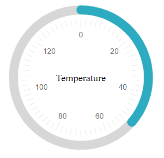
The Telerik RadCircularGauge is a Control representing a value on a circular arc. It offers a customizable scale and appearance. RadCircularGauge extends the RadArcGauge Control by modifying its appearance to a complete circle.
The CircularGauge UI Control for ASP.NET AJAX is available as of R2 2023. The RadCircularGauge is a server-side WebForms wrapper over the Kendo UI CircularGauge for jQuery widget.

To get an idea which element corresponds to which tag check the RadGauge Structure article. The above gauge was created with the following simple markup:
<telerik:RadCircularGauge runat="server" ID="RadCircularGauge1" Height="300" Width="300" Value="51" Skin="Silk">
    <CenterTemplate>
        Temperature
    </CenterTemplate>
    <Scale Min="0" Max="140">
        <MajorTicks Visible="true" />
        <MinorTicks Visible="true" />
        <Labels Visible="true" />
    </Scale>
</telerik:RadCircularGauge>
The control offers more customization options than the ones shown above:
Center Template - You can customize the content inside the center of the CircularGauge by using the center template. RadCircularGauge uses Kendo UI Templates to provide full control over the rendering of center element. To evaluate the current value of the Gauge in its center element use
#:value#.Basic Scale configuration - the
Scaleis the main wrapper of the control and details are configurable through inner properties. The mainScaletag, however, offers the basic functionality - theMinandMaxvalues of the gauge, theMajorUnitandMinorUnitproperties that control the ticks and label distance,and theReverseproperty which shows the higher values first when set to true. The specific properties here isStartAnglewhich controls the angle from which the gauge's dial starts.Labels configuration - you can choose the
BackgroundColor,ColorandFontto customize their appearance. TheVisibleproperty controls if they are shown and theFormattakes a format string that will be applied to the text according to the value. The format string uses the{0}placeholder to indicate the value. TheTemplateproperty is a client template similar to the format - it takes a similar string to show in the labels, but the value placeholder is#=value#. ThePositionproperty controls whether the labels are inside or outside of the dial.Ticks configuration - the
MajorTicksandMinorTicksinner tags expose the small lines that protrude from the ranges to show the value. They offer various options for customization -Color,SizeorWidth(in pixels) andVisible(boolean).Color Ranges configuration - the
ColorsCollectiontag can contain multipleCircularGaugeColortags that represent the areas of the gauge that will show differently than the regular scale. Each color range has theFromandToproperties that control is positioning on the scale and also theColorproperty that can be used to specify their fill.Main gauge configuration - the
Appearancetag of the control allows for customizing its entire look. It offers theBackgroundColorproperty which sets the wrapper's background fill and alsoHeight,Width, andMargindefining the size of the wrapper and the distance between the Gauge itself and the contour of its wrapper.