Configuration Manager
The designers for the Linear and Radial gauges are very similar. On the left a series of tabs exposes the main visual elements of the control so that the developer can configure their properties (or collections) on the right.
Radial Gauge Specific Configuration
Pointer

The Pointer tab exposes the pointer and its cap, so they can be configured in terms of value, color and size.
Scale
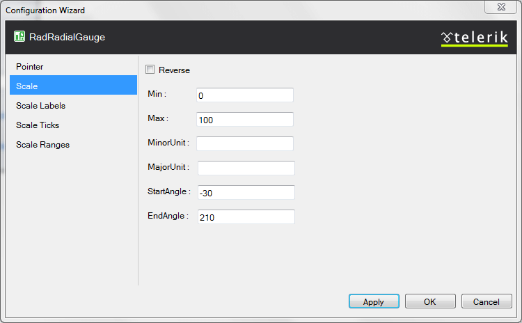
The Scale tab exposes the main properties of the scale. Its inner tags are exposed in other tabs to simplify the designer.
Linear Gauge Specific Configuration
Pointer
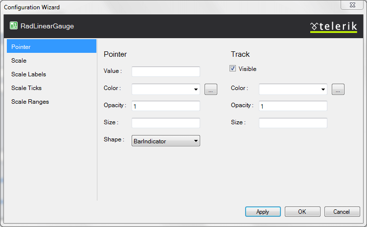
The Pointer tab exposes the pointer and its track, so they can be configured in terms of value, visibility, opacity, shape color and size.
Scale
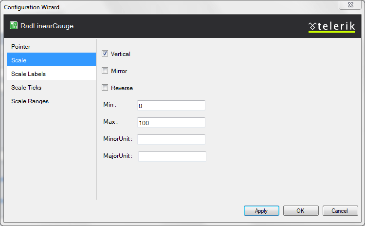
The Scale tab exposes the main properties of the scale. Its inner tags are exposed in other tabs to simplify the designer.
Common configuration
Scale Labels
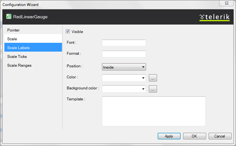
The properties the labels have are exposed in one tab that is common for both gauge types
Ticks

The Ticks tab allows for configuration of the minor and major ticks - size, color, visibility.
Scale Ranges
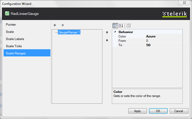
The scale ranges collection items can be added/removed with the buttons in above the list and on the right their configuration is exposed - their From and To properties, as well as the color picker Microsoft provide.