Elastic Design
This article explains the elastic design capabilities RadCheckBoxList offers. Example 1 shows the basic approach to scale the control by only changing its default font size.
Generally, responsive design means that the page and its content are able to adapt to different screen resolutions without deteriorating the user experience. This often includes changing the font size and having dimensions set in percent.
RadCheckBoxList takes the font-size of the page automatically. If the developer does not set it explicitly (Example 1), this is up to the client's browser and a common default value is 16px.
Example 1: Setting default font for the page with the default value for the Telerik controls.
body {
    font-size: 20px;
    font-family: "Segoe UI", Arial, Sans-serif;
}
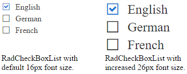
Figure 1: Comparison between appearance of a RadCheckBoxList with regular font size and with increased font size.

Example 2: Shows how to increase the font size of a RadCheckBoxList in Figure 1.
<style type="text/css">
    .RadCheckBoxList button {
        font-size: 26px;
    }
</style>
<telerik:RadCheckBoxList runat="server" ID="RadCheckBoxList1">
    <Items>
        <telerik:ButtonListItem Text="English" Selected="true" />
        <telerik:ButtonListItem Text="German" />
        <telerik:ButtonListItem Text="French" />
    </Items>
</telerik:RadCheckBoxList>