Creating a Custom Skin
The following tutorial demonstrates how you can create custom skin for the ASP NET AJAX Calendar, using the Office2007 skin as base. The tutorial only changes skin CSS classes that affect the RadCalendar control.
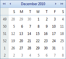
This tutorial creates a new skin that takes the appearance of the calendar control from this look:
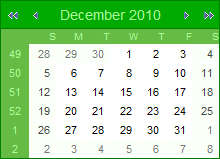
to the following:
See Understanding the Skin CSS File for more information on specific CSS file properties.
Prepare the Project
Drag a RadCalendar control from the toolbox onto a new AJAX-enabled application Web Form.
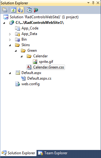
In the Solution Explorer, create new "Skins" folder in your project and then add a "Green" folder inside.
Copy the Office2007 skin files of RadCalendar from the installation directory to the "Green" directory; copy both the \Calendar directory that contains the images for this skin and the Calendar.Office2007.css file that defines the skin styles. The file path will typically be similar to this - \Program Files\Progress\UI for ASP.NET AJAX RX YYYY\Skins\
In Solution Explorer, rename "Calendar.Office2007.css" to "Calendar.Green.css". Solution Explorer should now look something like the following:
 You do not need the Office2007.gif file - this is a preview of the original Office2007 skin, so you can safely delete it.
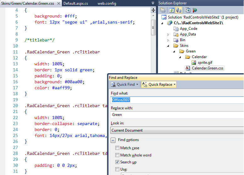
Open Calendar.Green.css and replace all instances of _Office2007 with _Green. You can also edit the skin name in the CSS comment on the first line. Then save the file:
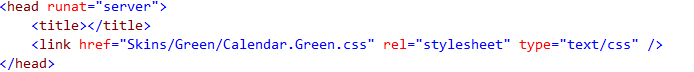
Drag the "Calendar.Green.Css" file from Solution Explorer onto your Web Page. This will automatically add a tag as reference to the new stylesheet on the page <head>:
Change the Skin property of your RadCalendar control to Green.
Set the EnableEmbeddedSkins property of your RadCalendar control to false.
Run the application. The new Green skin looks just like the Office2007 skin:
Editing the CSS classes
-
The class that controls the overall appearance of the RadCalendar title bar is rcTitlebar. In the Calendar.Green.css file, locate the selector .RadCalendar_Green .rcTitlebar and change the border color to green, the background color to #00aa00 and the font color to #aaff99:
.RadCalendar_Green .rcTitlebar { width:100%; border:1px solid green; padding:0; background:#00aa00; color:#aaff99; } -
Another CSS rule, which controls the title area is defined with the selector .RadCalendar_Green .rcTitlebar table. In this case the CSS rule adds a light blue border, which is not needed, so locate the rule and remove the border:
.RadCalendar_Green .rcTitlebar table { width:100%; border-collapse:separate; border:0; font:14px/27px arial,tahoma,sans-serif; } -
The main area of the calendar is wrapped in a table cell, which has the rcMain CSS class applied. This table cell contains a table with the rcMainTable class applied. Locate the two selectors: .RadCalendar_Green .rcMain and .RadCalendar_Green .rcMainTable, and change the border color to green, the width to 100%, and remove the margin (set it to 0):
.RadCalendar_Green .rcMain { width:100%; border:1px solid green; border-top:0; padding:0; background:#fff; } .RadCalendar_Green .rcMainTable { border-collapse:separate; border:0; width:100%; margin:0; font:11px/15px arial,tahoma,sans-serif; } -
The row and column headers are <th> elements wrapped in table rows which have the following CSS classes applied: rcRow and rcWeek (respectively). Locate the selectors .RadCalendar_Green .rcRow th and .RadCalendar_Green .rcWeek th. Change the color to #aaff99 so that the font matches the title bar. Add a rule for the background: "background: #66bb44;". Finally, remove the column headers' bottom border:
.RadCalendar_Green .rcRow th, .RadCalendar_Green .rcWeek th { border:0; padding:0 6px; background:#66bb44; color:#aaff99; font-weight:normal; cursor:default; } .RadCalendar_Green .rcWeek th { padding-top:4px; padding-bottom:3px; font-size:10px; text-align:right; } -
Locate the selector .RadCalendar_Green .rcRow .rcHover. The .rcHover class is applied to cells in the day matrix when the mouse hovers over them. Change the background color and border-color to #eeffee. In case you wonder why the border color is the same as the background color - this is the easiest way to make the border invisible. If we simply remove the border, RadCalendar will start flickering on mouse over, because the date cells have a white border by default. We can remove that also, but the skin modification will become more complex and this is out of the scope of this tutorial.
.RadCalendar_Green .rcRow .rcHover
{
border-color:green;
background: #eeffee;
}
Locate the selector .RadCalendar_Green .rcRow .rcHover a. This provides a different color to the hovered dates. Remove this rule.
-
Locate the selectors .RadCalendar_Green .rcRow .rcSelected and .RadCalendar_Green .rcRow .rcSelected a. The .rcSelected class is applied to selected cells. On these two rules, change the background color and border-color to #aaff99, and set the font color to #009900:
.RadCalendar_Green .rcRow .rcSelected { border-color:#aaff99; background:#aaff99; } .RadCalendar_Green .rcRow .rcSelected a { color:#009900; } -
Locate the selector .RadCalendar_Green .rcRow .rcToday. The .rcToday class is applied to the cell for the "today" special day. Change the border color to green and remove the CSS rule defined by the selector .RadCalendar_Green .rcRow .rcToday a:
.RadCalendar_Green .rcRow .rcToday { border-color:green; } -
The class that controls the cells for the non-current month is rcOtherMonth. The class for cells that are outside the valid range is rcOutOfRange. Create a new CSS rule that contains these classes and add a background color:
.RadCalendar_Green .rcOtherMonth, .RadCalendar_Green .rcOutOfRange { background:#fafff8; } -
The class that controls the cells for weekend days is .rcWeekend. There is currently no rule for table cells with this class. Add the following:
.RadCalendar_Green .rcWeekend { background:#f8fff8; } -
The class that controls the cells for disabled days is .rcDisabled.There is currently no rule for this class. Add the following:
.RadCalendar_Green .rcRow .rcDisabled { color:#ccc; } -
The class for the popup month/year navigation control is RadCalendarMonthView_Green. Change the border color of the wrapper and selected month cells to green:
table.RadCalendarMonthView_Green { border-collapse:separate; border:1px solid green; background:#fff; font:10px verdana,tahoma,sans-serif; color:#333; } .RadCalendarMonthView_Green #rcMView_Feb, .RadCalendarMonthView_Green #rcMView_Apr, .RadCalendarMonthView_Green #rcMView_Jun, .RadCalendarMonthView_Green #rcMView_Aug, .RadCalendarMonthView_Green #rcMView_Oct, .RadCalendarMonthView_Green #rcMView_Dec { border-right:1px solid green; } -
Locate the selector .RadCalendarMonthView_Green .rcButtons. This controls the appearance of the bottom sections of the popup where the "Today", "OK", and "Cancel" buttons go. Change the background color and the top border color to #ddffcd:
.RadCalendarMonthView_Green .rcButtons { border:0; border-top:1px solid #ddffcd; padding:4px 6px; background:#ddffcd; text-align:center; } -
Locate the selector .RadCalendarMonthView_Green input. This controls the appearance of the "Today", "OK", and "Cancel" buttons. Change the background color to green and the color to #ddffcd:
.RadCalendarMonthView_Green input
{
border:1px solid;
border-color:#3a9f09 #2b7507 #2b7507 #3a9f09;
padding:0;
background:green;
color:#ddffcd;
font:10px verdana,arial,sans-serif;
cursor:pointer;
}
Finally, you should edit the sprite.gif image located in the \Green\Calendar\ folder, so that the navigation arrows become white (currently they are blue). Alternatively, you can use your own non-sprite images for RadCalendar. In this case you will either have to set ImagesPath to specify a common location for all images, or declare the location and filename of each image separately.When you run the application, RadCalendar should look as follows:
You may want to make changes to the base stylesheet of the RadCalendar control, which holds the rules that are common for all skins. In order to do so, you need to copy the Calendar.css file from the Skins folder in your installation directory to the Skins folder in your project. Then, you should register it in the head tag and modify it to meet your requirements. Note that, to see the changes, you need to set the EnableEmbeddedBaseStylesheet property of RadCalendar to false .