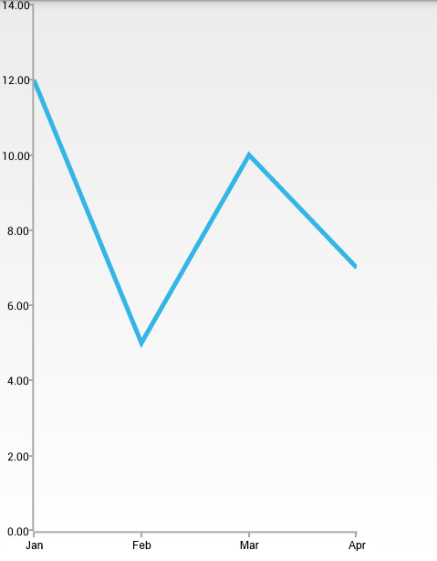
When RadCartesianChartView visualizes CategoricalSeries, it needs an axis that can represent the different categories. The CategoricalAxis extends the base CartesianAxis class and is used to displays a range of categories. Categories are built depending on the Category value of each CategoricalDataPoint present in the owning CategoricalSeries chart series. The axis is divided into discrete slots and each data point is visualized in the slot corresponding to its categorical value.
The CategoricalAxis extends the base CartesianAxis class and is used to displays a range of categories. Categories are built depending on the Category value of each CategoricalDataPoint present in the owning CategoricalSeries chart series. The axis is divided into discrete slots and each data point is visualized in the slot corresponding to its categorical value.
You can read from the Getting Started page how to define the MonthResult type and declare the initData() method.
After you create the method for initialization of sample data, you can create a RadCartesianChartView with LineSeries by adding the following code to the onCreate() method of your Activity.
    initData();

    RadCartesianChartView chartView = new RadCartesianChartView(this);

    LineSeries lineSeries = new LineSeries();
    lineSeries.setCategoryBinding(new PropertyNameDataPointBinding("Month"));
    lineSeries.setValueBinding(new PropertyNameDataPointBinding("Result"));
    lineSeries.setData(this.monthResults);
    chartView.getSeries().add(lineSeries);

    CategoricalAxis horizontalAxis = new CategoricalAxis();
    chartView.setHorizontalAxis(horizontalAxis);

    LinearAxis verticalAxis = new LinearAxis();
    chartView.setVerticalAxis(verticalAxis);

    ViewGroup rootView = (ViewGroup)findViewById(R.id.container);
    rootView.addView(chartView);
    InitData();

    RadCartesianChartView chartView = new RadCartesianChartView(this);

    LineSeries lineSeries = new LineSeries();
    lineSeries.CategoryBinding = new MonthResultDataBinding ("Month");
    lineSeries.ValueBinding = new MonthResultDataBinding ("Result");
    lineSeries.Data = (Java.Lang.IIterable)this.monthResults;

    chartView.Series.Add(lineSeries);

    CategoricalAxis horizontalAxis = new CategoricalAxis();
    chartView.HorizontalAxis = horizontalAxis;

    LinearAxis verticalAxis = new LinearAxis();
    chartView.VerticalAxis = verticalAxis;

    ViewGroup rootView = (ViewGroup)FindViewById(Resource.Id.container);
    rootView.AddView(chartView);
This example assumes that you root container has id
container
Here's the result:

The CategoricalAxis allows you to define how exactly the axis will be plotted on the viewport of the chart. The possible values are:
You can get the current value with the getPlotMode() method and change the value with the setPlotMode(AxisPlotMode) method.
Defines the distance (in logical units) between two adjacent categories. Default value is 0.3. For example if you have BarSeries, you can decrease the space between the bars from the different categories by setting the Gap Length to a value lower than 0.3. You can get the current value with getGapLength() and set a new value with setGapLength(double). The possible values are from the (0, 1) interval.
Defines the step at which major ticks are generated. The default and also minimum value is 1. This property also affects axis labels as they are generated on a per major tick basis.
You can get the current value with the getMajorTicksInterval() method and set a new value with setMajorTickInterval(int). For example, if you don't want to display all ticks, but instead only half of them (display the first, third, fifth, etc. ticks), you should set the major tick interval to 2:
horizontalAxis.setMajorTickInterval(2);
horizontalAxis.MajorTickInterval = 2;